Question: Set up : Your team has performed research analyzing how many annual primary care physician visits are made on average by people living different distances
Set up : Your team has performed research

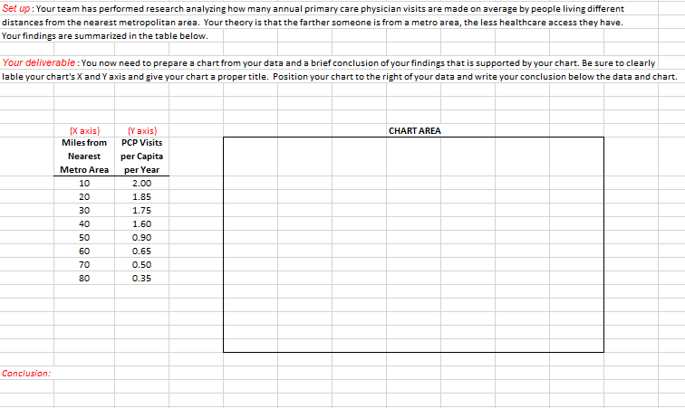
Set up : Your team has performed research analyzing how many annual primary care physician visits are made on average by people living different distances from the nearest metropolitan area. Your theory is that the farther someone is from a metro area, the less healthcare access they have. Your findings are summarized in the table below. Your deliverable: You now need to prepare a chart from your data and a brief conclusion of your findings that is supported by your chart. Be sure to clearly lable your chart's X and Y axis and give your chart a proper title. Position your chart to the right of your data and write your conclusion below the data and chart. CHART AREA IX axis) Miles from Nearest Metro Area 10 20 30 40 50 60 70 80 (Y axis) PCP Visits per Capita per Year 2.00 1.85 1.75 1.60 0.90 0.65 0.50 0.35 Conclusion

Step by Step Solution

There are 3 Steps involved in it

1 Expert Approved Answer
Step: 1 Unlock blur-text-image
Question Has Been Solved by an Expert!

Get step-by-step solutions from verified subject matter experts

Step: 2 Unlock
Step: 3 Unlock

Students Have Also Explored These Related General Management Questions!