

Question: show step-by-step on making the scatter charts. make them on excel Carescript Data (next tab) -- contains all data available to us to help Carescript
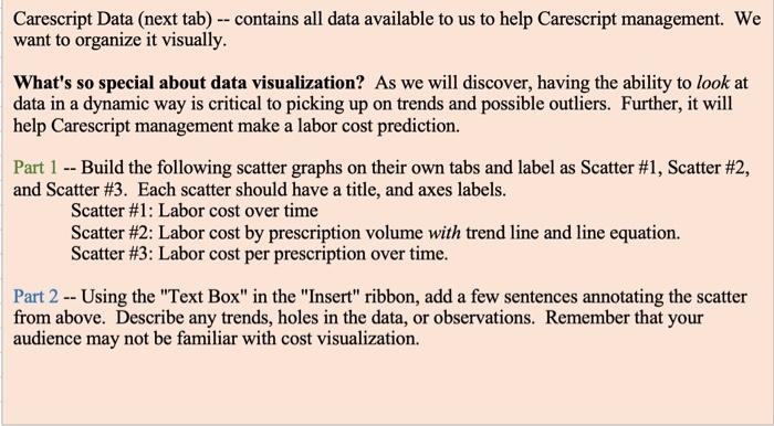
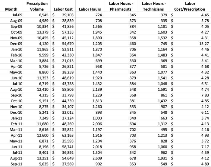
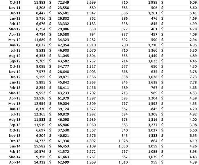
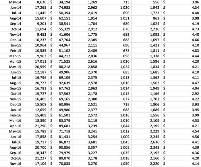
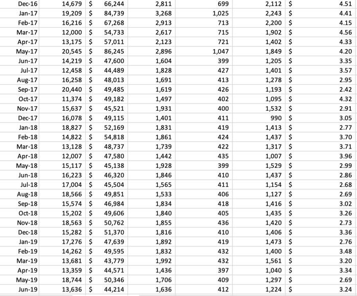
Carescript Data (next tab) -- contains all data available to us to help Carescript management. We want to organize it visually. What's so special about data visualization? As we will discover, having the ability to look at data in a dynamic way is critical to picking up on trends and possible outliers. Further, it will help Carescript management make a labor cost prediction. Part 1 -- Build the following scatter graphs on their own tabs and label as Scatter \#1, Scatter \#2, and Scatter \#3. Each scatter should have a title, and axes labels. Scatter \#1: Labor cost over time Scatter \#2: Labor cost by prescription volume with trend line and line equation. Scatter \#3: Labor cost per prescription over time. Part 2 -- Using the "Text Box" in the "Insert" ribbon, add a few sentences annotating the scatter from above. Describe any trends, holes in the data, or observations. Remember that your audience may not be familiar with cost visualization. Carescript Data (next tab) -- contains all data available to us to help Carescript management. We want to organize it visually. What's so special about data visualization? As we will discover, having the ability to look at data in a dynamic way is critical to picking up on trends and possible outliers. Further, it will help Carescript management make a labor cost prediction. Part 1 -- Build the following scatter graphs on their own tabs and label as Scatter \#1, Scatter \#2, and Scatter \#3. Each scatter should have a title, and axes labels. Scatter \#1: Labor cost over time Scatter \#2: Labor cost by prescription volume with trend line and line equation. Scatter \#3: Labor cost per prescription over time. Part 2 -- Using the "Text Box" in the "Insert" ribbon, add a few sentences annotating the scatter from above. Describe any trends, holes in the data, or observations. Remember that your audience may not be familiar with cost visualization
Step by Step Solution
There are 3 Steps involved in it

Get step-by-step solutions from verified subject matter experts