

Question: Sole and show the solution 4. Consider the following data on 30 different investments and their maturity values after 15 years. Investment ($) Future value
Sole and show the solution
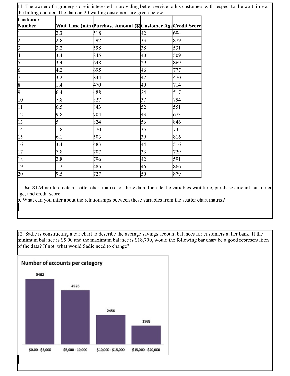
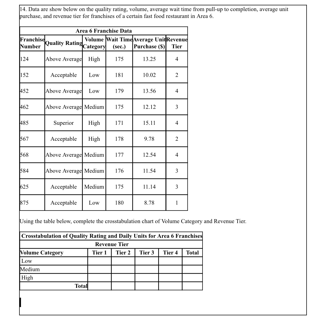
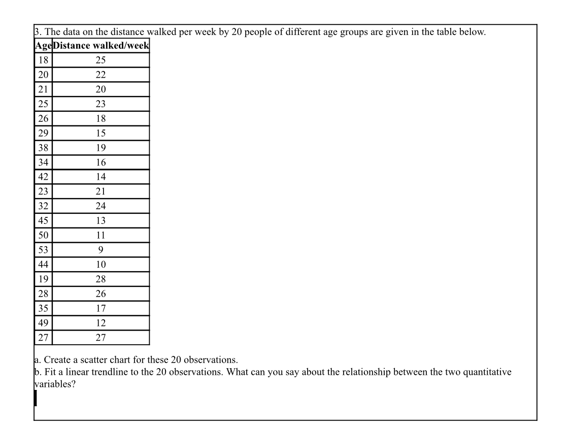
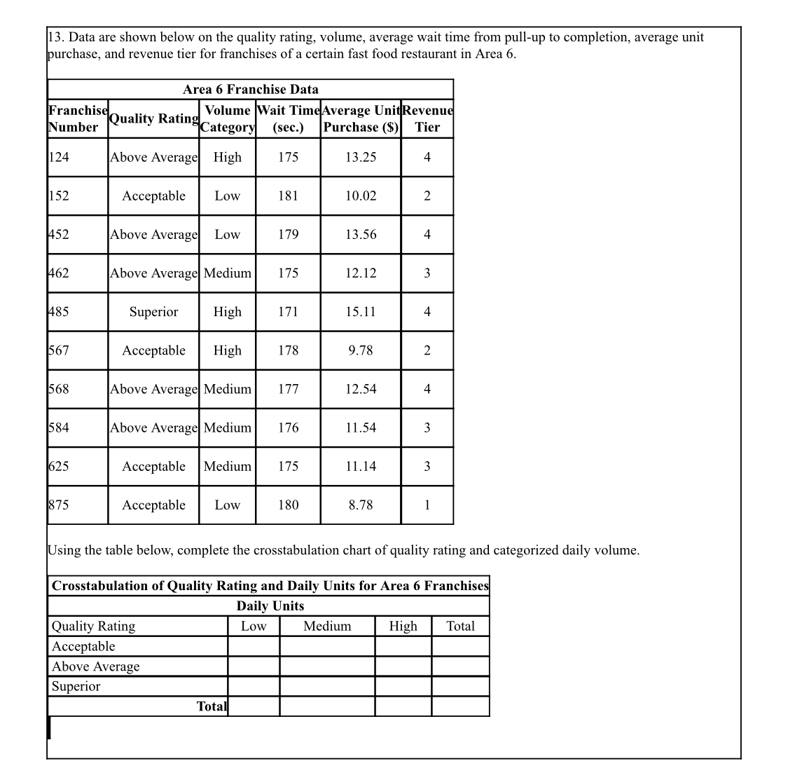
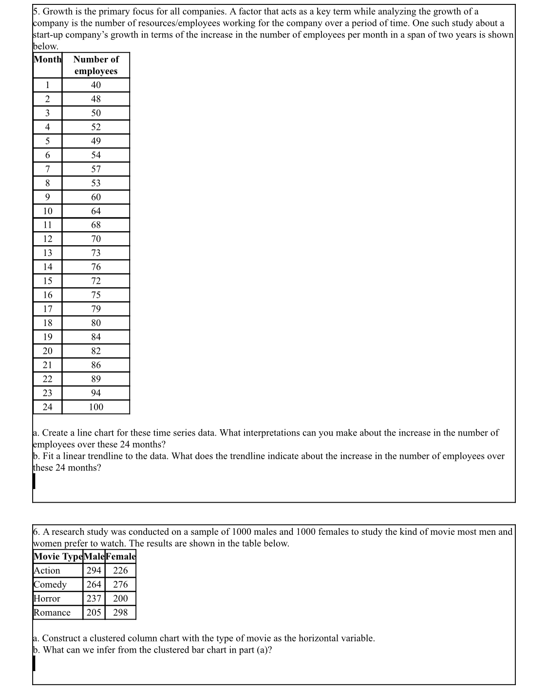
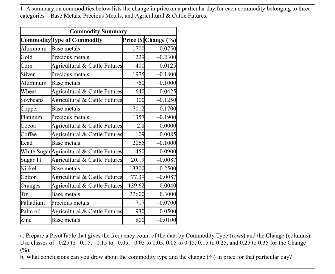
4. Consider the following data on 30 different investments and their maturity values after 15 years. Investment ($) Future value ($) 1500 3119 2000 4158 2200 4574 2480 5156 2850 5925 250 757 3560 7401 3890 8088 4180 8690 4390 9127 4550 9460 1800 9979 5150 10,707 5320 1,060 5510 11,455 5760 1,975 6140 12,765 6300 13,098 6480 13,472 6590 3,701 5712 13,954 6900 14,345 7110 14,782 7480 5,551 7590 5,780 7670 5,946 770 6,008 7840 6,299 8010 6,653 8500 7,671 a. Prepare a scatter diagram to show the relationship between the variables Investment and Future value. Comment on any relationship between the variables. b. Create a trendline for the relationship between Investment and Future value. What does the trendline indicate about this relationship?1 1. The owner of a grocery store is interested in providing better service to his customers with respect to the wait time at the billing counter. The data on 20 waiting customers are given below. Customer Number Wait Time (min) Purchase Amount ($) Customer Age Credit Score 2.3 518 42 694 2.8 592 33 879 3.2 598 38 531 3.4 845 40 509 3.4 648 29 869 4.2 695 46 3.2 777 344 42 1.4 470 470 40 6.4 714 488 10 7.8 24 517 527 37 6.5 794 843 12 9.8 52 551 704 13 15 43 673 824 14 1.8 56 846 570 15 35 6.1 735 503 39 16 3.4 816 483 17 144 7.8 516 707 33 18 729 2.8 796 19 42 1.2 591 485 20 46 9.5 866 727 50 879 age, and credit score. a. Use XLMiner to create a scatter chart matrix for these data. Include the variables wait time, purchase amount, customer b. What can you infer about the relationships between these variables from the scatter chart matrix? 2. Sadie is constructing a bar chart to describe the average savings account balances for customers at her bank. If the minimum balance is $5.00 and the maximum balance is $18,700, would the following bar chart be a good representation of the data? If not, what would Sadie need to change? Number of accounts per category 5462 4526 2456 1568 $0.00 - $5,000 $5,000 - 10,000 $10,000 - $15,000 $15,000 - $20,0007. The regional manager of a company wishes to determine the time spent at each division in the car production process. A study was undertaken over a month that resulted in the following data related to the percentage of time spent at three divisions (car body construction, paint shop, and assembly) at four locations of production plants. Car Body Production Plants Construction (%) Paint Shop (%) Assembly (%) Michigan 35 45 20 Kentucky 37 41 22 Illinois 33 39 28 Ohio 36 40 24 a. Create a stacked-bar chart with production plants along the vertical axis. Reformat the bar chart to best display these data by adding required labels and chart title. b. Create a clustered-bar chart with production plants along the vertical axis and clusters of divisions. Reformat the bar chart to best display these data by adding required labels and chart title. c. Create multiple bar charts where each production plant becomes a single bar chart showing the percentage of time spent at the divisions. Reformat the bar charts to best display these data by adding required labels and chart title. d. Which form of bar chart (stacked, clustered, or multiple) is preferable for these data? Why? 8. A consumer electronics company, after three months of the launch of five new products in the market, arrived at the following results. Products Profit (%) Market share (%) Cost ($) 19 18 4500 28 12 3000 15 25 8750 22 35 6250 16 10 2500 a. Create a bubble chart where the market share is along the horizontal axis, the profit is on the vertical axis, and the size of the bubbles represents the cost. Format this chart for best presentation by adding axes labels and labeling each bubble with the product name. b. The manager of the company is interested in producing the product that increases the profit for a given level of market share and cost. From the bubble chart in part a, identify the product which needs to be produced in larger quantity. c. From the bubble chart in part (a), now identify the product which needs to be produced in larger quantity taking into account its market share, cost, increase in profit.9. The project lead in an MNC decides to assign every member of his team to a new project and monitors their performance on a customized scale of scores. The data on their performance over a period of six months are shown below. Performance Scores Team membersJan Feb Mar Apr May Jun 4 5 2 3 -1 3 2 2 : 4 -1 4 4 4 5 5 1 4 2 5 3 2 2 5 4 4 4 1 2 1 -1 4 1 5 - 1 2 5 12 5 5 4 3 4 2 4 5 2 2 10 4 5 2 2 5 11 5 - 1 5 1 2 2 12 3 2 13 1 4 -1 4 14 2 3 15 5 -1 5 5 16 5 2 5 17 5 4 -1 2 18 3 4 5 4 19 2 3 5 20 4 4 5 3 22 3 1 : 2 23 5 4 2 2 13 2 24 25 3 5 5 4 a. Create a heat map in Excel that shades the cells with negative performance scores. Use Excel's Conditional Formatting function to create this heat map. . For each month, identify the team members who scored negative. Which month has the highest negative performance scores? 10. The following table shows the average monthly distance travelled (in Billions of Miles) by vehicles on urban highways for five different years. Urban Highways - Average Monthly Distance Travelled by Vehicles (Billion Miles) Years Jan Feb Mar Apr May Jun July Aug Sep Oct Nov Dec Year 1 4.22 5.32 5.21 5.12 4.92 4.49 4.55 4.49 4.44 4.39 4.37 14.35 Year 2 4.31 5.44 5.34 5.24 1.98 4.59 1.68 1.65 1.61 4.68 1.74 4.79 Year 3 4.38 5.51 15.41 5.36 4.98 4.63 4.71 4.78 1.82 4.88 4.85 4.89 Year 4 4.45 5.59 15.5 5.01 4.72 4.78 4.79 1.82 1.92 15.06 Year 5 4.51 5.65 5.62 5.49 5.12 4.8 14.88 1.82 1.95 5.12 15.22 5.44 a. Use Excel to create sparklines for the average monthly vehicle distance travelled each year. b. Which year has decreasing trend of the average distance travelled? Which year has increasing trend of the average distance travelled? . Use Excel to create a heat map for the average distance travelled by vehicles. Do you find the heat map or the sparklines to be better at communicating the trend of the average vehicle distance travelled over different years? Why?14. Data are show below on the quality rating, volume, average wait time from pull-up to completion, average unit purchase, and revenue tier for franchises of a certain fast food restaurant in Area 6. Area 6 Franchise Data Franchise Number Quality Rating Category Volume Wait Time Average UnitRevenue (sec.) Purchase ($) Tier 124 Above Average High 175 13.25 152 Acceptable Low 181 10.02 2 452 Above Average Low 179 13.56 4 462 Above Average Medium 175 12.12 485 Superior High 171 15.11 4 567 Acceptable High 178 9.78 2 568 Above Average Medium 177 12.54 4 584 Above Average Medium 176 11.54 3 625 Acceptable Medium 175 11.14 3 875 Acceptable Low 180 8.78 Using the table below, complete the crosstabulation chart of Volume Category and Revenue Tier. Crosstabulation of Quality Rating and Daily Units for Area 6 Franchises Revenue Tier Volume Category Tier 1 Tier 2 Tier 3 Tier 4 Total Low Medium High Tota3. The data on the distance walked per week by 20 people of different age groups are given in the table below. AgeDistance walked/week 18 25 20 22 21 20 25 23 26 18 29 15 38 19 34 16 42 14 23 21 32 24 45 13 50 11 53 9 44 10 9 28 28 26 35 17 49 12 27 27 a. Create a scatter chart for these 20 observations. b. Fit a linear trendline to the 20 observations. What can you say about the relationship between the two quantitative variables?13. Data are shown below on the quality rating, volume, average wait time from pull-up to completion, average unit purchase, and revenue tier for franchises of a certain fast food restaurant in Area 6. Area 6 Franchise Data Franchise Number Quality Rating Volume Wait Time Average Unit Revenue Category (sec.) Purchase ($) Tier 124 Above Average High 175 13.25 152 Acceptable Low 181 10.02 2 452 Above Average Low 179 13.56 4 462 Above Average Medium 175 12.12 3 485 Superior High 171 15.11 567 Acceptable High 178 9.78 2 568 Above Average Medium 177 12.54 4 584 Above Average Medium 176 11.54 3 625 Acceptable Medium 175 11.14 3 875 Acceptable Low 180 8.78 Using the table below, complete the crosstabulation chart of quality rating and categorized daily volume. Crosstabulation of Quality Rating and Daily Units for Area 6 Franchises Daily Units Quality Rating Low Medium High Total Acceptabl Above Average Superior Total5. Growth is the primary focus for all companies. A factor that acts as a key term while analyzing the growth of a company is the number of resources/employees working for the company over a period of time. One such study about a start-up company's growth in terms of the increase in the number of employees per month in a span of two years is shown below. Month Number of employees 40 2 48 3 50 4 52 5 49 6 54 7 57 8 53 9 60 10 64 11 68 12 70 13 73 14 76 15 72 16 75 17 79 18 80 84 20 82 21 86 22 89 23 94 24 100 a. Create a line chart for these time series data. What interpretations can you make about the increase in the number of employees over these 24 months? . Fit a linear trendline to the data. What does the trendline indicate about the increase in the number of employees over these 24 months? 6. A research study was conducted on a sample of 1000 males and 1000 females to study the kind of movie most men and women prefer to watch. The results are shown in the table below. Movie TypeMale Female Action 294 226 Comedy 264 276 Horror 237 200 Romance 205 298 a. Construct a clustered column chart with the type of movie as the horizontal variable. b. What can we infer from the clustered bar chart in part (a)?1. A summary on commodities below lists the change in price on a particular day for each commodity belonging to three categories-Base Metals, Precious Metals, and Agricultural & Cattle Futures. Commodity Summary Commodity Type of Commodity Price ($) Change (%) Aluminum Base metals 70 ).0750 Gold Precious metals 1229 0.2300 Corn Agricultural & Cattle Futures 40( 0.0125 Silver Precious metals 1975 0.1800 Aluminum Base metals 1750 0.1000 Wheat Agricultural & Cattle Futures 640 -0.0425 Soybeans Agricultural & Cattle Futures 130 -0.1250 Copper Base metals 7012 0.1700 Platinum Precious metals 1357 -0.1900 Cocoa Agricultural & Cattle Futures 2.8 0.0000 Coffee Agricultural & Cattle Futures 109 -0.0085 Lead Base metals 2065 0.1000 White SugarAgricultural & Cattle Futures 45( 0.0900 Sugar 11 Agricultural & Cattle Futures 20.10 0.0087 Nickel Base metals 13300 0.2500 Cotton Agricultural & Cattle Futures 77.39 0.0087 Oranges Agricultural & Cattle Futures 139.62 0.0040 Tin Base metals 22600 0.3000 Palladium Precious metals 71; -0.0700 Palm oil Agricultural & Cattle Futures 930 0.0500 Zinc Base metals 180 -0.0100 a. Prepare a PivotTable that gives the frequency count of the data by Commodity Type (rows) and the Change (columns). Use classes of -0.25 to -0.15, -0.15 to -0.05, -0.05 to 0.05, 0.05 to 0.15, 0.15 to 0.25, and 0.25 to 0.35 for the Change %) b. What conclusions can you draw about the commodity type and the change (%) in price for that particular day
Step by Step Solution
There are 3 Steps involved in it

Get step-by-step solutions from verified subject matter experts