

Question: Step - by - Step Guide to Drawing the Graph: Set Up the Axes: Label the Y - axis as Price / Cost (
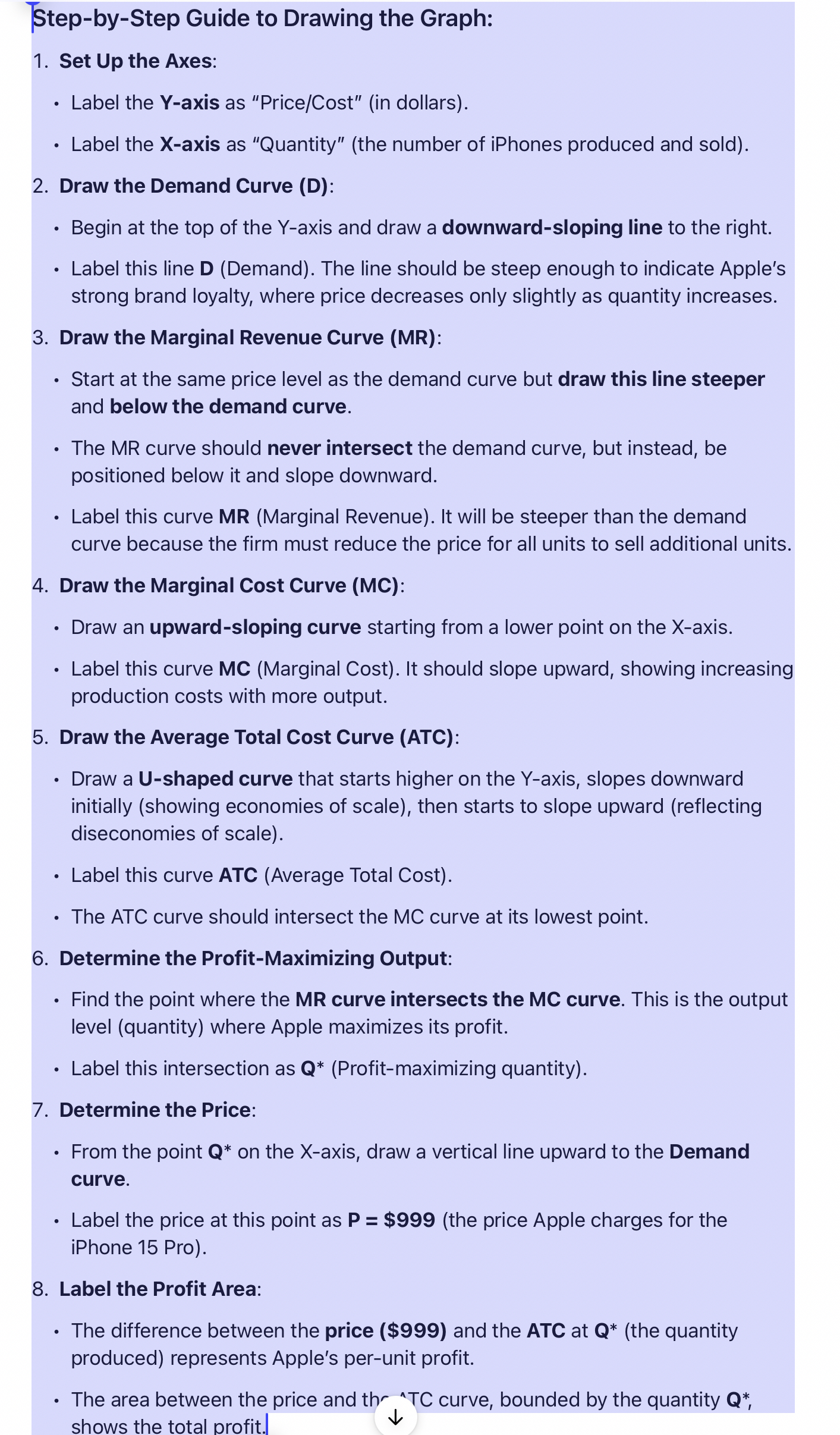
StepbyStep Guide to Drawing the Graph:
Set Up the Axes:
Label the Yaxis as "PriceCostin dollars
Label the Xaxis as "Quantity" the number of iPhones produced and sold
Draw the Demand Curve D:
Begin at the top of the Y axis and draw a downwardsloping line to the right.
Label this line D Demand The line should be steep enough to indicate Apple's strong brand loyalty, where price decreases only slightly as quantity increases.
Draw the Marginal Revenue Curve MR:
Start at the same price level as the demand curve but draw this line steeper and below the demand curve.
The MR curve should never intersect the demand curve, but instead, be positioned below it and slope downward.
Label this curve MR Marginal Revenue It will be steeper than the demand curve because the firm must reduce the price for all units to sell additional units.
Draw the Marginal Cost Curve MC:
Draw an upwardsloping curve starting from a lower point on the Xaxis.
Label this curve MC Marginal Cost It should slope upward, showing increasing production costs with more output.
Draw the Average Total Cost Curve ATC:
Draw a Ushaped curve that starts higher on the Yaxis, slopes downward initially showing economies of scale then starts to slope upward reflecting diseconomies of scale
Label this curve ATC Average Total Cost
The ATC curve should intersect the MC curve at its lowest point.
Determine the ProfitMaximizing Output:
Find the point where the MR curve intersects the MC curve. This is the output level quantity where Apple maximizes its profit.
Label this intersection as Profitmaximizing quantity
Determine the Price:
From the point on the X axis, draw a vertical line upward to the Demand curve.
Label the price at this point as $the price Apple charges for the iPhone Pro
Label the Profit Area:
The difference between the price $ and the ATC at the quantity produced represents Apple's perunit profit.
The area between the price and thr TC curve, bounded by the quantity shows the total profit.
Step by Step Solution
There are 3 Steps involved in it
1 Expert Approved Answer
Step: 1 Unlock

Question Has Been Solved by an Expert!
Get step-by-step solutions from verified subject matter experts
Step: 2 Unlock
Step: 3 Unlock