Question: # # # # test2a.py: Simulate spread of disease through a population using SIR model Based on SIR model: Shiflet&shiflet Module 4.3 Modeling the spread
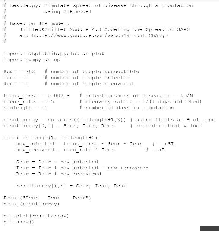
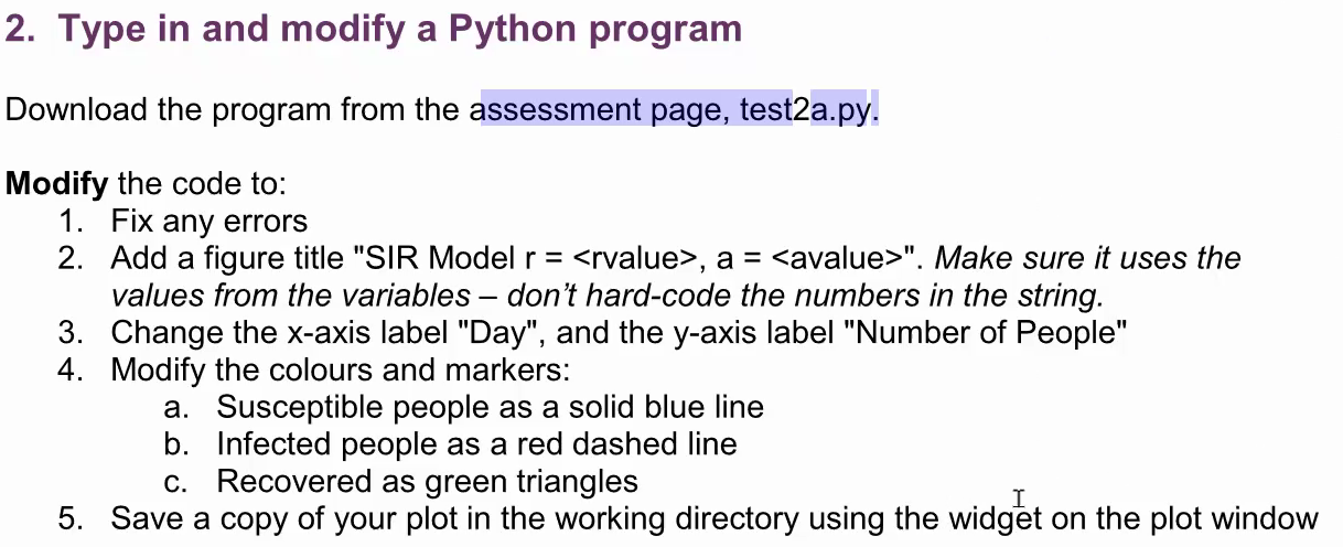
# # # # test2a.py: Simulate spread of disease through a population using SIR model Based on SIR model: Shiflet&shiflet Module 4.3 Modeling the spread of SARS and https://www.youtube.com/watch?v=k6nLfCbAzgo import matplotlib.pyplot as plot import numpy as np Scur = 762 Icur = 1 Rcur = 0 # number of people susceptible # number of people infected # number of people recovered trans_const 0.00218 recov_rate = 0.5 simlength 15 # infectiousness of disease r = kb/N # recovery rate a = 1/(# days infected) # number of days in simulation = resultarray = np.zeros((simlength+1,3)) # using floats as % of popn resultarray(0,:] Scur, Icur, Rcur # record initial values for i in range (1, simlength+2): new_infected = trans_const * Scur * Icur new_recoverd = reco_rate * Icur # = TSI = al # Scur = Scur new_infected Icur = Icur + new_infected - new_recovered Rcur = Rcur + new_recovered resultarray[i, :] = Scur, Icur, Rcur Rcur") Print ("Scur Icur print (resultarray) plt.plot (resultarray) plt.show() 2. Type in and modify a Python program Download the program from the assessment page, test2a.py. Modify the code to: 1. Fix any errors 2. Add a figure title "SIR Model r = , a = ". Make sure it uses the values from the variables don't hard-code the numbers in the string. 3. Change the x-axis label "Day", and the y-axis label "Number of People" 4. Modify the colours and markers: a. Susceptible people as a solid blue line b. Infected people as a red dashed line c. Recovered as green triangles 5. Save a copy of your plot in the working directory using the widget on the plot window # # # # test2a.py: Simulate spread of disease through a population using SIR model Based on SIR model: Shiflet&shiflet Module 4.3 Modeling the spread of SARS and https://www.youtube.com/watch?v=k6nLfCbAzgo import matplotlib.pyplot as plot import numpy as np Scur = 762 Icur = 1 Rcur = 0 # number of people susceptible # number of people infected # number of people recovered trans_const 0.00218 recov_rate = 0.5 simlength 15 # infectiousness of disease r = kb/N # recovery rate a = 1/(# days infected) # number of days in simulation = resultarray = np.zeros((simlength+1,3)) # using floats as % of popn resultarray(0,:] Scur, Icur, Rcur # record initial values for i in range (1, simlength+2): new_infected = trans_const * Scur * Icur new_recoverd = reco_rate * Icur # = TSI = al # Scur = Scur new_infected Icur = Icur + new_infected - new_recovered Rcur = Rcur + new_recovered resultarray[i, :] = Scur, Icur, Rcur Rcur") Print ("Scur Icur print (resultarray) plt.plot (resultarray) plt.show() 2. Type in and modify a Python program Download the program from the assessment page, test2a.py. Modify the code to: 1. Fix any errors 2. Add a figure title "SIR Model r = , a = ". Make sure it uses the values from the variables don't hard-code the numbers in the string. 3. Change the x-axis label "Day", and the y-axis label "Number of People" 4. Modify the colours and markers: a. Susceptible people as a solid blue line b. Infected people as a red dashed line c. Recovered as green triangles 5. Save a copy of your plot in the working directory using the widget on the plot window


