

Question: The data on the worksheet titled Problem 1 contains information regarding six (6) investments that a financial analyst has selected for one of her clients.
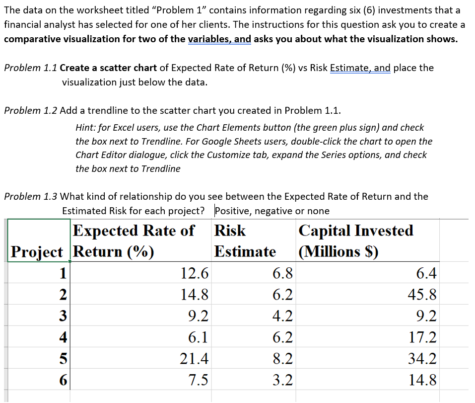
The data on the worksheet titled "Problem 1 contains information regarding six (6) investments that a financial analyst has selected for one of her clients. The instructions for this question ask you to create a comparative visualization for two of the variables, and asks you about what the visualization shows. Problem 1.1 Create a scatter chart of Expected Rate of Return (%) vs Risk Estimate, and place the visualization just below the data. Problem 1.2 Add a trendline to the scatter chart you created in Problem 1.1. Hint: for Excel users, use the Chart Elements button (the green plus sign) and check the box next to Trendline. For Google Sheets users, double-click the chart to open the Chart Editor dialogue, click the Customize tab, expand the Series options, and check the box next to Trendline Problem 1.3 What kind of relationship do you see between the Expected Rate of Return and the Estimated Risk for each project? Positive, negative or none Expected Rate of Risk Capital Invested Project Return (%) Estimate (Millions $) 1 12.6 6.8 6.4 2 14.8 6.2 45.8 3 9.2 4.2 9.2 4 6.1 6.2 17.2 5 21.4 8.2 34.2 6 7.5 3.2 14.8
Step by Step Solution
There are 3 Steps involved in it

Get step-by-step solutions from verified subject matter experts