

Question: The figure below shows the U.S. Aggregate Demand and Aggregate Supply diagram for 2018. price index, P GDP, Y fin trillicns)
The figure below shows the U.S. Aggregate Demand and Aggregate Supply diagram for 2018.
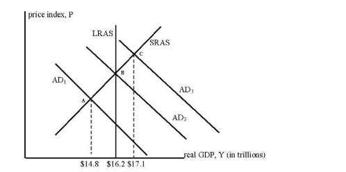
price index, P GDP, Y fin trillicns)
Step by Step Solution
There are 3 Steps involved in it
1 Expert Approved Answer
Step: 1 Unlock

Question Has Been Solved by an Expert!
Get step-by-step solutions from verified subject matter experts
Step: 2 Unlock
Step: 3 Unlock