

Question: The graph to the right illustrates performance differences for rms 1 and 2 (with marginal costs c1 and c2). Assume that both rms face the
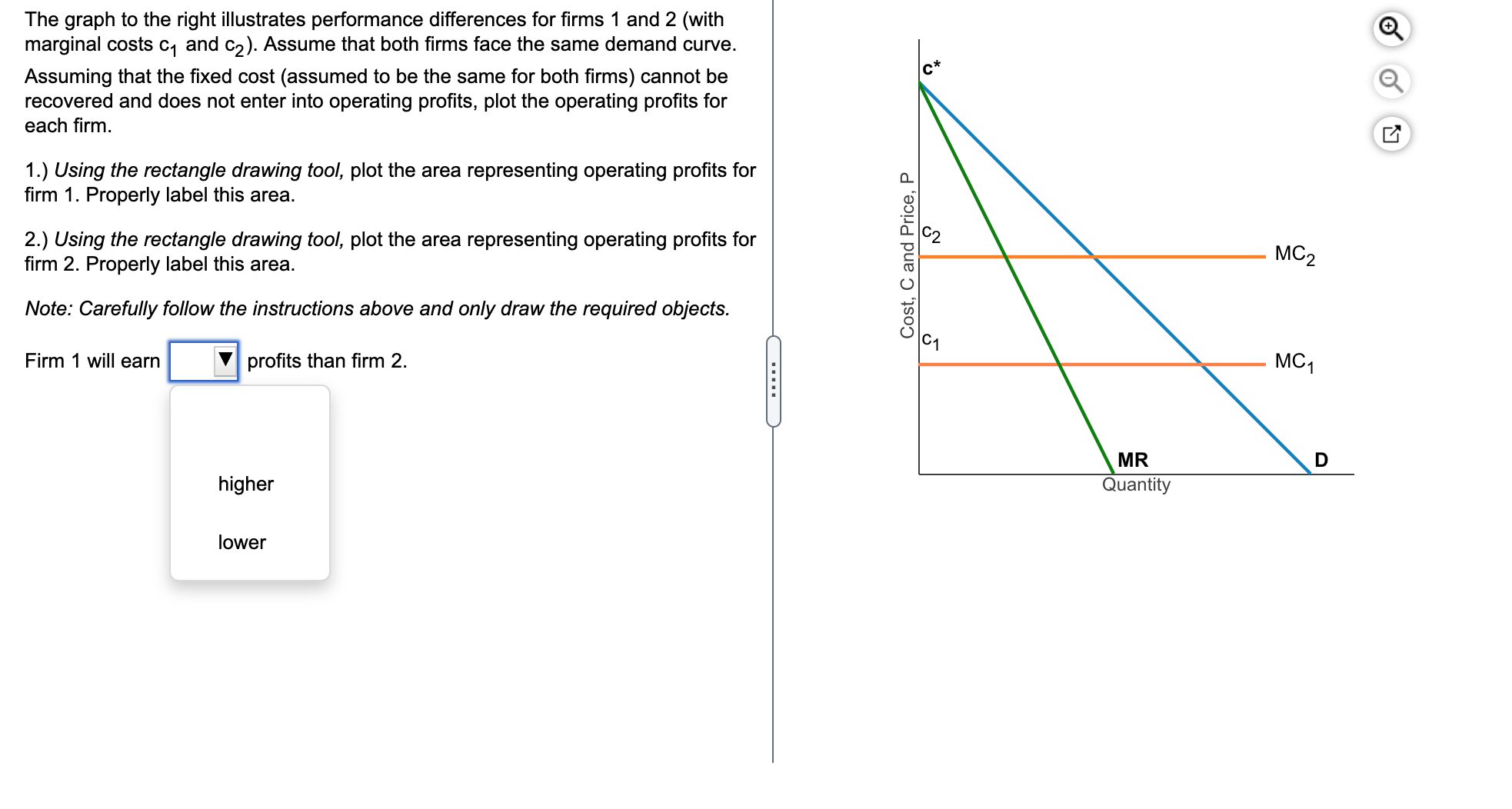

The graph to the right illustrates performance differences for rms 1 and 2 (with marginal costs c1 and c2). Assume that both rms face the same demand curve. Assuming that the xed cost (assumed to be the same for both rms) cannot be recovered and does not enter into operating prots, plot the operating prots for each rm. 1.) Using the rectangle drawing tool, plot the area representing operating prots for rm 1. Properly label this area. 2.) Using the rectangle drawing tool, plot the area representing operating prots for rm 2. Properly label this area. Note: Carefully follow the instructions above and only draw the required objects. Firm 1 will earn E prots than rm 2. higher lower Cost, C and Price, P c* '32 M62 c1 MR Quantity 9,0
Step by Step Solution
There are 3 Steps involved in it

Get step-by-step solutions from verified subject matter experts