

Question: The graph to the right is called a circle graph or pie chart. The circle represents a whole, 100%. This particular graph shows the average
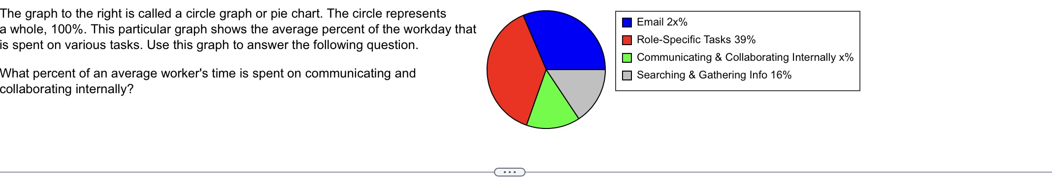
The graph to the right is called a circle graph or pie chart. The circle represents a whole, 100%. This particular graph shows the average percent of the workday that is spent on various tasks. Use this graph to answer the following question. I Email 2x% I Role-Specific Tasks 39% Communicating 8. Collaborating Internally x% _ Searching at Gathering Info 16% What percent of an average worker's time is spent on communicating and collaborating internally
Step by Step Solution
There are 3 Steps involved in it
1 Expert Approved Answer
Step: 1 Unlock

Question Has Been Solved by an Expert!
Get step-by-step solutions from verified subject matter experts
Step: 2 Unlock
Step: 3 Unlock