

Question: The graphs given below depict poverty and inequality measures for developing countries in 2010. Please answer the following questions based on the figures. a.
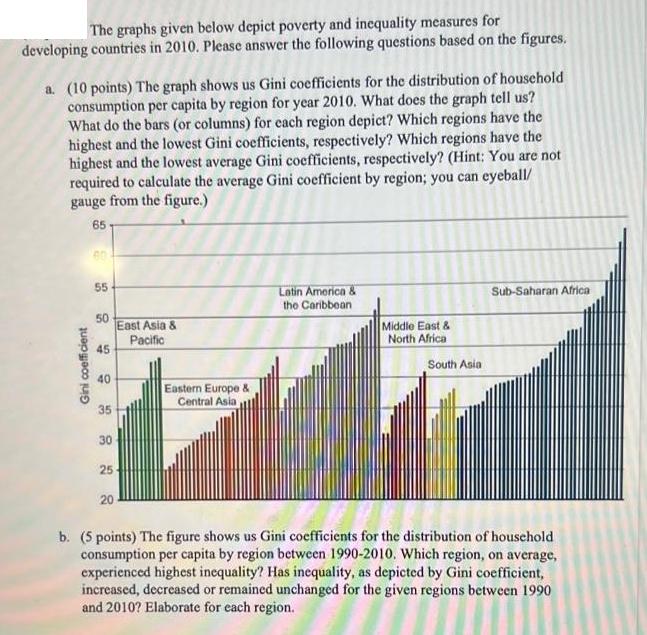
The graphs given below depict poverty and inequality measures for developing countries in 2010. Please answer the following questions based on the figures. a. (10 points) The graph shows us Gini coefficients for the distribution of household consumption per capita by region for year 2010. What does the graph tell us? What do the bars (or columns) for each region depict? Which regions have the highest and the lowest Gini coefficients, respectively? Which regions have the highest and the lowest average Gini coefficients, respectively? (Hint: You are not required to calculate the average Gini coefficient by region; you can eyeball/ gauge from the figure.) 65 Gini coefficient 55 50 45 40 35 30 25 20 East Asia & Pacific Eastern Europe & Central Asia Latin America & the Caribbean Middle East & North Africa South Asia Sub-Saharan Africa b. (5 points) The figure shows us Gini coefficients for the distribution of household consumption per capita by region between 1990-2010. Which region, on average, experienced highest inequality? Has inequality, as depicted by Gini coefficient, increased, decreased or remained unchanged for the given regions between 1990 and 2010? Elaborate for each region.
Step by Step Solution
3.32 Rating (155 Votes )
There are 3 Steps involved in it

Get step-by-step solutions from verified subject matter experts