

Question: The next step to create the example climograph is to plot the temperature data from Table 9.1. We have used an orange line to
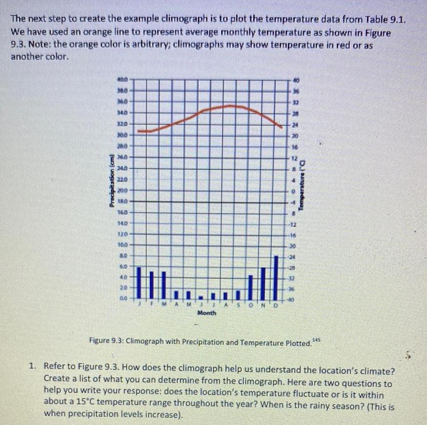
The next step to create the example climograph is to plot the temperature data from Table 9.1. We have used an orange line to represent average monthly temperature as shown in Figure 9.3. Note: the orange color is arbitrary; climographs may show temperature in red or as another color. Precipitation (cm) 400 360 360 340 320 300 280 360 240 22.0 200 180 160 14.0 32 BAR22 20 16 8 OT B -12 22 120 100 B.D 6.0 40 20 00 ASON D Month 16 20 24 Temperature (O Figure 9.3: Climograph with Precipitation and Temperature Plotted." 145 1. Refer to Figure 9.3. How does the climograph help us understand the location's climate? Create a list of what you can determine from the climograph. Here are two questions to help you write your response: does the location's temperature fluctuate or is it within about a 15C temperature range throughout the year? When is the rainy season? (This is when precipitation levels increase).
Step by Step Solution
There are 3 Steps involved in it

Get step-by-step solutions from verified subject matter experts