

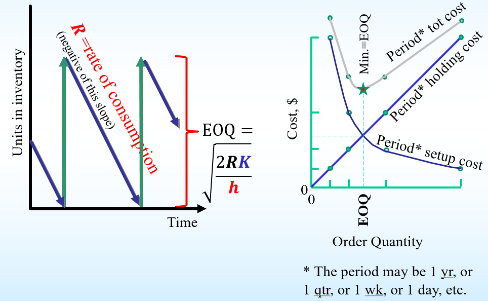
Question: The picture on the left shows a typical inventory graph when demand is stable over time. The picture on the right shows that the Economic
The picture on the left shows a typical inventory graph when demand is stable over time. The picture on the right shows that the Economic Order Quantity is reached at the point where the holding cost and the setup cost are equal.
In the picture on the left, what do the green upward arrows represent?
Step by Step Solution
There are 3 Steps involved in it
1 Expert Approved Answer
Step: 1 Unlock

Question Has Been Solved by an Expert!
Get step-by-step solutions from verified subject matter experts
Step: 2 Unlock
Step: 3 Unlock