

Question: The pink line in the graph below can be explained by: Cost of capital (%) RA WACC Rox (1-T Debt-equity ratio (D/E) a. M&M Proposition
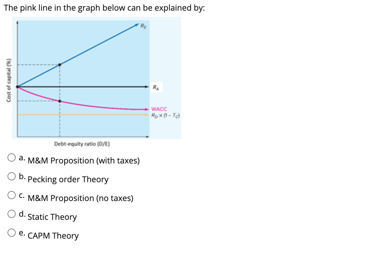
The pink line in the graph below can be explained by: Cost of capital (%) RA WACC Rox (1-T Debt-equity ratio (D/E) a. M&M Proposition (with taxes) O b. Pecking order Theory O C. M&M Proposition (no taxes) d. Static Theory O e. CAPM Theory
Step by Step Solution
There are 3 Steps involved in it
1 Expert Approved Answer
Step: 1 Unlock

Question Has Been Solved by an Expert!
Get step-by-step solutions from verified subject matter experts
Step: 2 Unlock
Step: 3 Unlock