

Question: These are all the choices but some are wrong so can you help me match with the correct choices? Match the information you want to
These are all the choices but some are wrong so can you help me match with the correct choices?
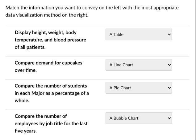
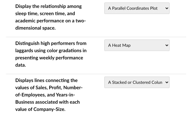
Match the information you want to convey on the left with the most appropriate data visualization method on the right. A Table Display height, weight, body temperature, and blood pressure of all patients. Compare demand for cupcakes over time. A Line Chart A Pie Chart Compare the number of students in each Major as a percentage of a whole. A Bubble Chart Compare the number of employees by job title for the last five years. A Parallel Coordinates Plot Display the relationship among sleep time, screen time, and academic performance on a two- dimensional space. A Heat Map Distinguish high performers from laggards using color gradations in presenting weekly performance data. A Stacked or Clustered Colun Displays lines connecting the values of Sales, Profit, Number- of-Employees, and Years-in- Business associated with each value of Company-SizeStep by Step Solution
There are 3 Steps involved in it
1 Expert Approved Answer
Step: 1 Unlock

Question Has Been Solved by an Expert!
Get step-by-step solutions from verified subject matter experts
Step: 2 Unlock
Step: 3 Unlock