

Question: This assignment is about CSS and HTML for layout, positioning, and the CSS box model. You will create files for a fake movie review web
This assignment is about CSS and HTML for layout, positioning, and the CSS box model. You will create files for a fake movie review web site named Rancid Tomatoes for the film TMNT Turn in the following fles:
A tmnthtml
A movie.css the style sheet for tmnthtml
You will recreate the page below. Your page must match the appearance specified in this document.
We do not expect you to produce a pixelperfect page that exactly matches this image. But your page should follow the styles specified in this document and match the look, layout, and behavior shown here as closely as possible.
We will provide you a skeleton of tmnthtml with the page contents, but no page sections or styles. The only modifications you should make are to divide it into sections using divspan tags, and add id and class attributes. You should also replace the last two "YOUR REVIEW HERE" reviews with text of pour choice. You are also allowed to add the HTML necessary to enable the "favorites icon" or "favicon" specified on the next page.
Appearance Details:
All images on the page and mentioned in the following text are hosted on the web with the following file names.
The page's title is TMNT Rancid Tomatoes. The page has a "favorites icon" favicon of rottengif.
The page background is background.png Page text uses pt font, using Verdana, Tahoma, or any sansserif font on the system. The page body has no margin or padding, so its contents stretch to the very edge of the browser window.
The top of the page is an image banner. The center of this banner is bannerpng Behind this banner bannerbgpng repeats horizontally across the length of the page. Each image is tall. Hint: To make the banner stretch to the edges of the page, use the bannerbg.png as the background image of a block element that is bebind banner.png Underneath the image banner is a centered heading containing the movie name and year in a bold font. The preferred fonts for this heading are Tahoma, Verdana, or any sansserif font available on the system. The text in the header has a "shadow" located px right and px down from the original text, using the color #
Below the main heading is the page's overall content area, with an overall rating for the film, several critics' reviews, and an overview of the film at right. Taken together this content occupies in width and is centered horizontally within the page. If the page resizes horizontally, this px section should move dynamically so that it remains centered horizontally on the page. This overall section has a px gray solid border with a px round radius and should be sized large enough to contain all of its contents.
In the overall area there is a pxwide left section for the "rotten" rating and the critics' reviews of the film. The section is topped by a smaller section containing a large "rotten" image rottenbigpng vertically aligned to be even with the bottom of the text around it Behind this the image rbgpng repeats horizontally across the entire length of the section. Each of these images is tall. This is followed by the overall rating for the film, which is shown in a pt red bold font.
Below the overall rating, there are two columns of reviews. The columns each occupy of the width of
the overall leftcenter section of the page. There is a horizontal spacing of between the columns and neighboring content.
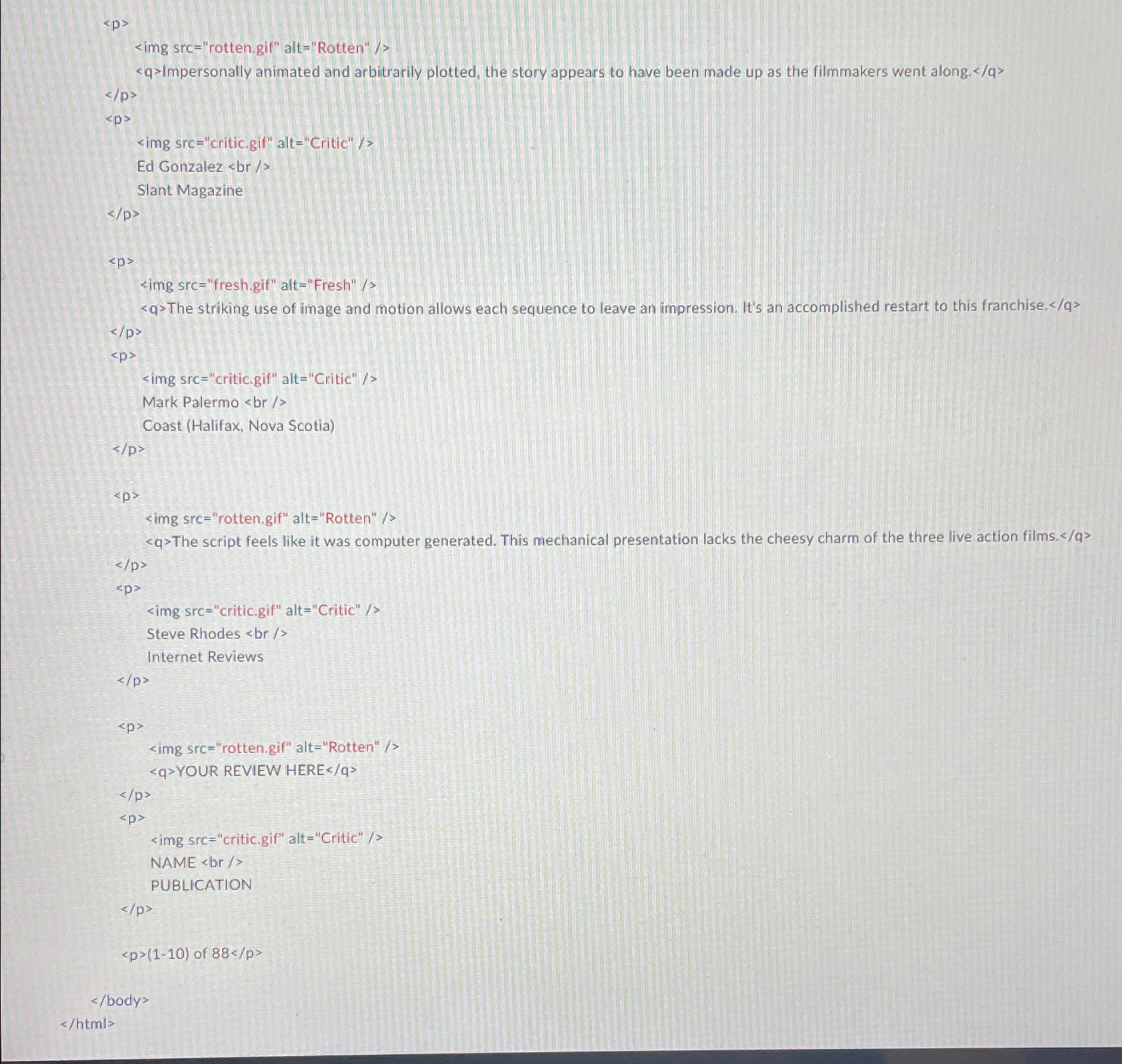
Each review is a box with a quote about the movie, in bold font. The quote box has a background color of #EDCB and a gray border, thick with a round radius. separate the quote box's content from its border. Each box has an icon freshgif or rotten.gif for whether the reviewer liked or disliked the movie on the left side of the quote box, with px separating it from text to its right. Text wraps around the images as needed.
The reviewer's personal information follows under the quote box, including: the reviewer's name; and the publication in italic. A reviewer icon critic gif is shown to the left of the text, with px of horizontal space separating it from the text. There is pt of vertical space between reviews. Hint: Paragraphs in movie reviews should be made large enough to contain all their content, including any floating content.
The top eight reviews should be as shown, but you should change the last two to hold any text that you like.
To the right of the critics' reviews is a General Overview section of the page with a list of information about the movie, with a background color
Step by Step Solution
There are 3 Steps involved in it
1 Expert Approved Answer
Step: 1 Unlock

Question Has Been Solved by an Expert!
Get step-by-step solutions from verified subject matter experts
Step: 2 Unlock
Step: 3 Unlock