

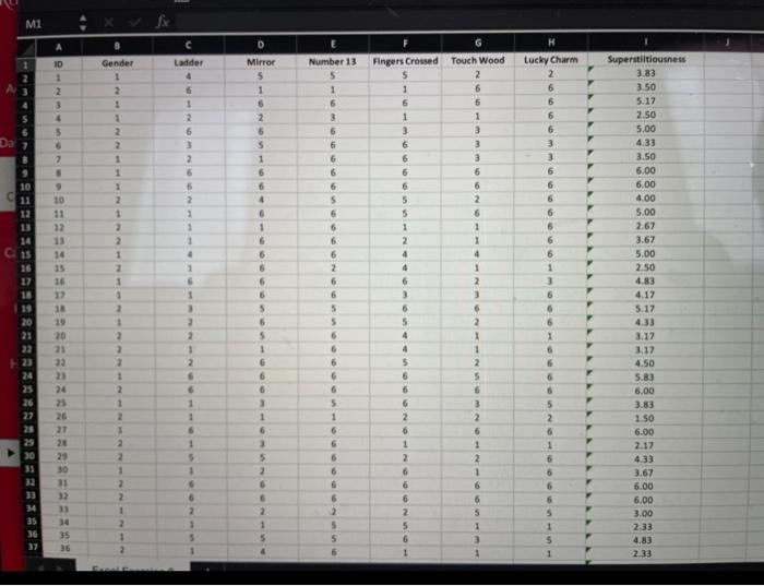
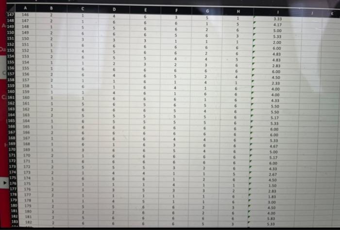
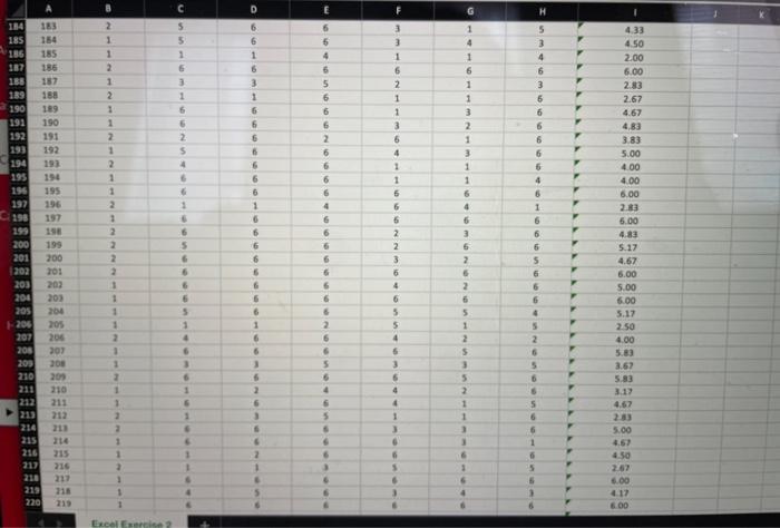
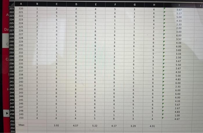
Question: This exercise involves using PivotTable data to create a graph of a frequency distribution. The file Exercise 3 data contains the data from Exercise 3.
This exercise involves using PivotTable data to create a graph of a frequency distribution.
The file Exercise 3 data contains the data from Exercise 3. The assignment is to:
- Use the PivotTable data to create a column chart.
- Expand the chart so that all x-values are visible and reduce the size of the gaps between the bars.
- Add a chart title and axis labels.
- Insert a text box and in it describe what the graph tells us about the data that the mean superstitiousness value does not.
When you are done, submit your Excel file as your response to Excel Exercise 4.
Step by Step Solution
There are 3 Steps involved in it
1 Expert Approved Answer
Step: 1 Unlock

Question Has Been Solved by an Expert!
Get step-by-step solutions from verified subject matter experts
Step: 2 Unlock
Step: 3 Unlock