

Question: This is a scatter plot comparing the correlation between departure delays and arrival delays from a dataset of 300,000 flights compiled by all of the
This is a scatter plot comparing the correlation between departure delays and arrival delays from a dataset of 300,000 flights compiled by all of the New York airports in 2013:
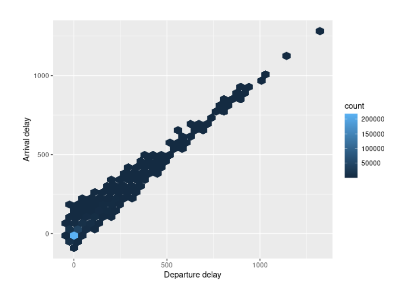
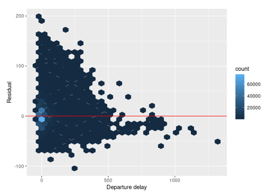
1000 - count 200000 Arrival delay 150000 500 - 100000 50000 0 - 500 1000 Departure delay200 - 100 - count 60000 Residual 40000 20000 -100 - 500 1000 Departure delay
Step by Step Solution
There are 3 Steps involved in it
1 Expert Approved Answer
Step: 1 Unlock

Question Has Been Solved by an Expert!
Get step-by-step solutions from verified subject matter experts
Step: 2 Unlock
Step: 3 Unlock