

Question: This is an example of a poorly designed dashboard. It displays key performance measures of a fictitious company. Various sales and profit measures are shown.?
This is an example of a poorly designed dashboard. It displays key performance measures of a fictitious company. Various sales and profit measures are shown.?
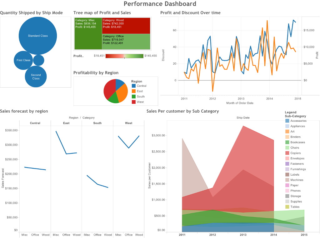
Comment on what does not work well in this dashboard, how to improve the design of the dashboard, choice of charts and the ability of this dashboard to communicate a story effectively.
Quantity Shipped by Ship Mode First Class $350,000 Sales forecast by region $300.000- $250,000 $200,000 $150,000- $100,000 Standard Class $50,000 SO Second Class Central East Tree map of Profit and Sales Category: Misc Sales: $836,154 Profit: $145,455 Category: Wood Sales: $742,000 Profit: $18,451 Profit.. $18,451 Region / Category Profitability by Region Performance Dashboard Category: Office Sales: $719,047 Profit: $122,491 South Region West $145,455 Central East South West Misc Office Wood Misc Office Wood Misc Office Wood Misc Office Wood Profit and Discount Over time $3,000.00 $2,500.00 $2,000.00 $1,500.00- Sales Per customer by Sub Category $1,000.00 $500.00- 60 $0.00 40 20 2011 2012 2011 2012 wt My 2013 Month of Order Date Ship Date 2013 2014 2014 2015 Labels Machines Paper Phones $15,000 Storage Supplies Tables $10,000 Legend Sub-Category Accessories Appliances Art Binders Bookcases Chairs Copiers Envelopes Fasteners Furnishings $5,000 $0 2015
Step by Step Solution
3.46 Rating (146 Votes )
There are 3 Steps involved in it
When analyzing the dashboard several design issues and opportunities for improvement can be identified What Doesnt Work Well 1 Clutter and Complexity ... View full answer

Get step-by-step solutions from verified subject matter experts