Question: This is done in R studio, how do I create the plot comparisons.? The World Bank was very impressed with your deliverables on the previous


This is done in R studio, how do I create the plot comparisons.?
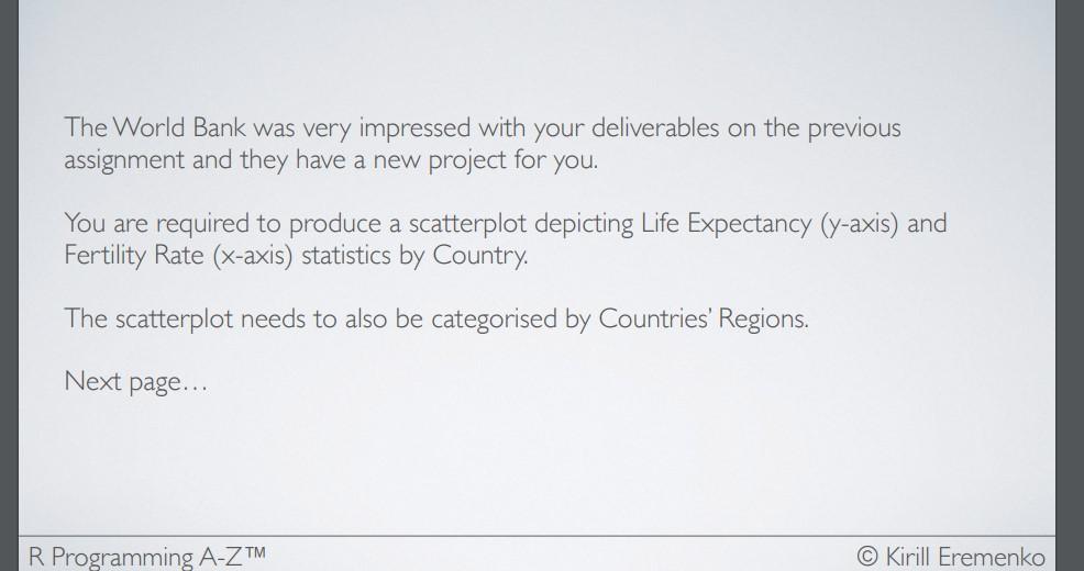
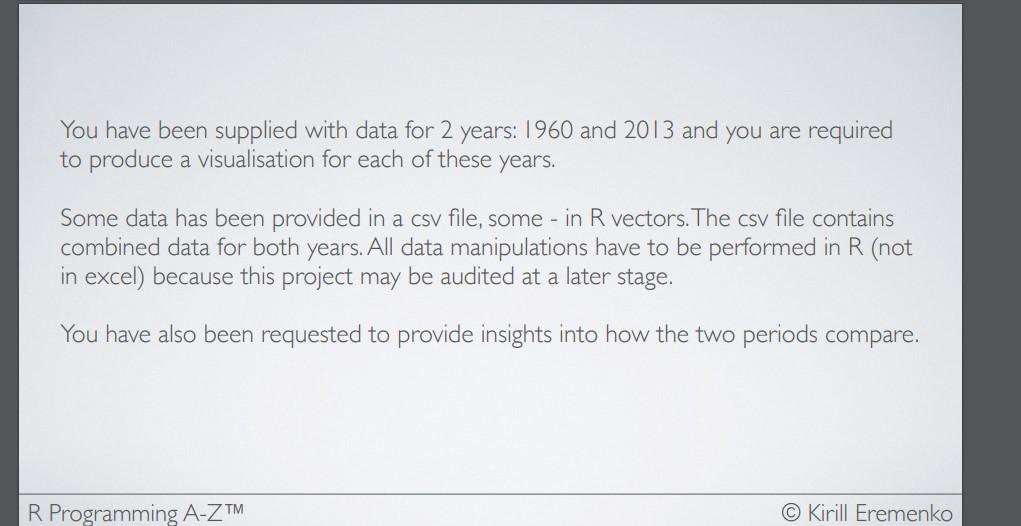
The World Bank was very impressed with your deliverables on the previous assignment and they have a new project for you. You are required to produce a scatterplot depicting Life Expectancy ( y-axis) and Fertility Rate ( x-axis) statistics by Country. The scatterplot needs to also be categorised by Countries' Regions. Next page... You have been supplied with data for 2 years: 1960 and 2013 and you are required to produce a visualisation for each of these years. Some data has been provided in a csv file, some - in R vectors. The csv file contains combined data for both years. All data manipulations have to be performed in R (not in excel) because this project may be audited at a later stage. You have also been requested to provide insights into how the two periods compare
Step by Step Solution
There are 3 Steps involved in it

Get step-by-step solutions from verified subject matter experts


