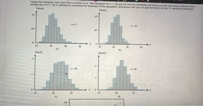
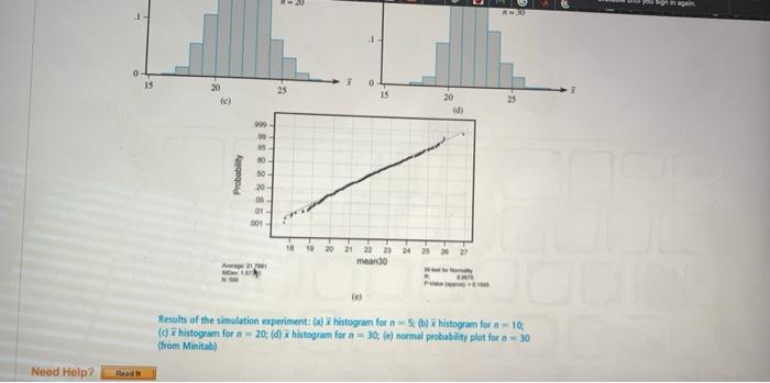
Question: This is ONE question. 2. (-/10 Points) DETAILS DEVORESTAT9 S.AE.024 MY NOTES ASK YOUR TEACHER Example 5.23 Consider a simulation experiment in which the population

This is ONE question. This is ONE question. 2. (-/10 Points) DETAILS
This is ONE question. 2. (-/10 Points) DETAILS
2. (-/10 Points) DETAILS DEVORESTAT9 S.AE.024 MY NOTES ASK YOUR TEACHER Example 5.23 Consider a simulation experiment in which the population distribution is quite skewed. The figure below shows the density curve for lifetimes of a certain type of electronic control (this is actually a lognormal distribution with Ein(x) = 3 and Vin(x) = 0.16). The statistic of interest is the sample mean X. The experiment utilized 500 replications and considered these sample sizes: -5.1-10, n = 20, and 30. The resulting histograms along with a normal probability plot from MINITAB for the x values based on n = 30 are shown in the figures below. 05 04 03 .01 50 75 Density curve for the simulation experiment 121.7584,00 82.1449 Unlike the normal case, these histograms all differ in shape. In particular, they become progressively Select B skewed as the sample size increases The average of the 500 x values for the four different sample sizes are all quite close to the mean value of the population distribution. If each histogram had been based on an unending sequence of x values rather than just 500, all four would have been centered at exactly 21.7584. Thus different values of n change the shape but not the center of the sampling distribution of X Comparison of the four histograms in the figures below also shows that as n Increases, the spread of the histograms Belt Increasing n results in a greater degree of concentration about the population mean value and makes the histogram look more like a normal curve. The histogram for n = 30 and the normal probability plot below provide convincing evidence that a sample size of n = 30 is sufficient to overcome the skewness of the population distribution and give an approximately normal sampling distribution makes the histogram look more like a normal curve. The histogram for 30 and the normal probability plot below provide convincing evidence that a sample size of n = 30 is sufficient to overcome the skewness of the population distribution and give an approximately normal x sampling distribution Density Density 10 10 10 05 - 06 0 1 0 TO 30 10 20 40 Density Density 2 15 25 15 25 20 fe) 20 d 15 25 te) (d) 90 00 Probability 10 20 03 01 001 10 20 21 23 man30 w Results of the simulation experiment: (a) Whistogram for 1 - 5 (b) histogram for n=1 (histogram for n = 20 (d) histogram for a = 30; (e) normal probability plot for a = 30 (from Minitab) Need Help? Read 2. (-/10 Points) DETAILS DEVORESTAT9 S.AE.024 MY NOTES ASK YOUR TEACHER Example 5.23 Consider a simulation experiment in which the population distribution is quite skewed. The figure below shows the density curve for lifetimes of a certain type of electronic control (this is actually a lognormal distribution with Ein(x) = 3 and Vin(x) = 0.16). The statistic of interest is the sample mean X. The experiment utilized 500 replications and considered these sample sizes: -5.1-10, n = 20, and 30. The resulting histograms along with a normal probability plot from MINITAB for the x values based on n = 30 are shown in the figures below. 05 04 03 .01 50 75 Density curve for the simulation experiment 121.7584,00 82.1449 Unlike the normal case, these histograms all differ in shape. In particular, they become progressively Select B skewed as the sample size increases The average of the 500 x values for the four different sample sizes are all quite close to the mean value of the population distribution. If each histogram had been based on an unending sequence of x values rather than just 500, all four would have been centered at exactly 21.7584. Thus different values of n change the shape but not the center of the sampling distribution of X Comparison of the four histograms in the figures below also shows that as n Increases, the spread of the histograms Belt Increasing n results in a greater degree of concentration about the population mean value and makes the histogram look more like a normal curve. The histogram for n = 30 and the normal probability plot below provide convincing evidence that a sample size of n = 30 is sufficient to overcome the skewness of the population distribution and give an approximately normal sampling distribution makes the histogram look more like a normal curve. The histogram for 30 and the normal probability plot below provide convincing evidence that a sample size of n = 30 is sufficient to overcome the skewness of the population distribution and give an approximately normal x sampling distribution Density Density 10 10 10 05 - 06 0 1 0 TO 30 10 20 40 Density Density 2 15 25 15 25 20 fe) 20 d 15 25 te) (d) 90 00 Probability 10 20 03 01 001 10 20 21 23 man30 w Results of the simulation experiment: (a) Whistogram for 1 - 5 (b) histogram for n=1 (histogram for n = 20 (d) histogram for a = 30; (e) normal probability plot for a = 30 (from Minitab) Need Help? Read

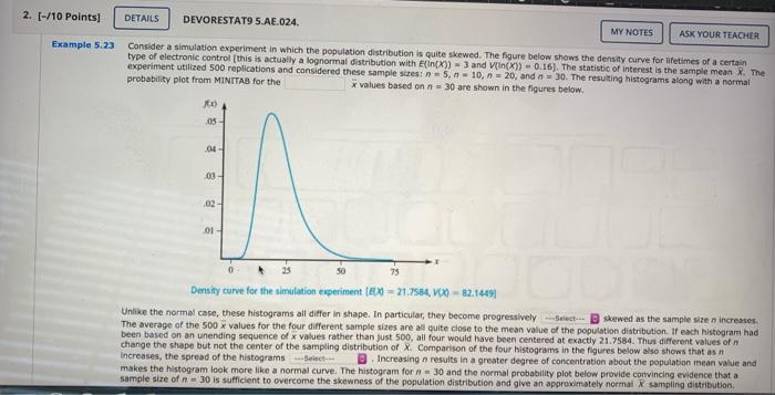
Step by Step Solution

There are 3 Steps involved in it

1 Expert Approved Answer
Step: 1 Unlock blur-text-image
Question Has Been Solved by an Expert!

Get step-by-step solutions from verified subject matter experts

Step: 2 Unlock
Step: 3 Unlock

Students Have Also Explored These Related General Management Questions!