

Question: this is statistic problems A medical researcher obtains a sample of adults suffering from diabetes. She randomly assigns 30 people to a treatment group and
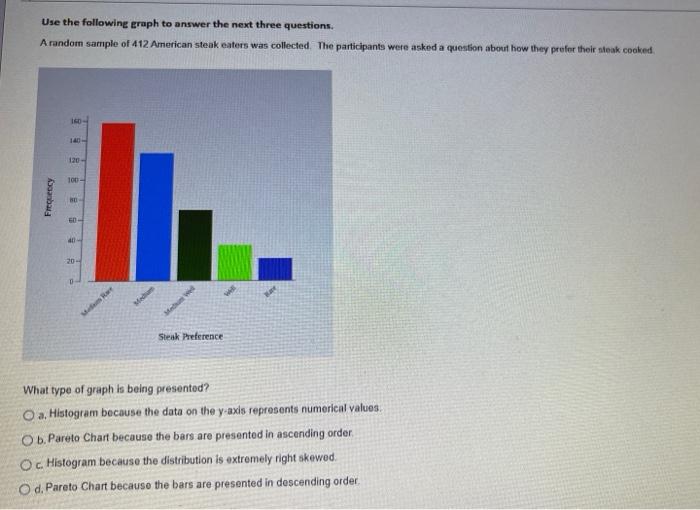
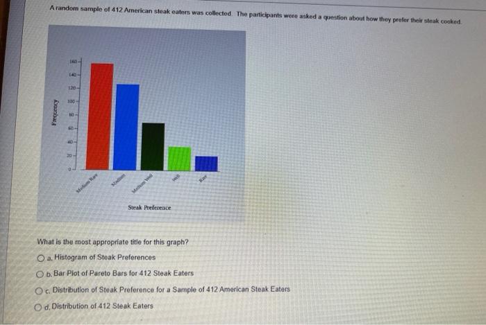
A medical researcher obtains a sample of adults suffering from diabetes. She randomly assigns 30 people to a treatment group and 30 to a control group. The treatment group receives a medical over a period of three months and t frame. At the end of three months the patients' symptoms are evaluated. This is an example of what type of data collection method? O a. An observational study Ob. A cluster sample OcA confounding study Od. An experiment The distribution of a set of data... O a. tells us what values the data set takes and how often it takes those values. O b. can be visualized with a graph. Oc can summarized numerically. O d. All of the above are correct. Which of the following describes one of the differences between a bar plot and a histogram? O a. Bar plots are used for quantitative data and histograms are used for categorical data. Ob, Bar plots have bars that can be rearranged and histograms have bars that are in a fixed order. Oc Bar plots are only used for showing the frequency and histograms are only used for showing the relative frequency O d. Bar plots can have bars with different widths and histograms have bars with the width proportional to the height Use the following graph to answer the next three questions. A random sample of 412 American steak eaters was collected. The participants were asked a question about how they prefer their steak cooked. Frequency 160- 140- 120- 100- 80- 60- 40- 20- IL.. Medium Ra Median Medum We Steak Preference. What type of graph is being presented? O a. Histogram because the data on the y-axis represents numerical values. O b. Pareto Chart because the bars are presented in ascending order Oc. Histogram because the distribution is extremely right skewed. O d. Pareto Chart because the bars are presented in descending order. A random sample of 412 American steak eaters was collected. The participants were asked a question about how they prefer their steak cooked. Anbar 140- 100 304 Medium Ra Made Men W Steak Preference What is the most appropriate title for this graph? O a. Histogram of Steak Preferences O b. Bar Plot of Pareto Bars for 412 Steak Eaters Oc. Distribution of Steak Preference for a Sample of 412 American Steak Eaters Od. Distribution of 412 Steak Eaters
Step by Step Solution
There are 3 Steps involved in it

Get step-by-step solutions from verified subject matter experts