

Question: TS Case Problem 1 Golden Pulps FILETREE | Mobile Devices 2gp back1 png gp cover html gp designs.css gp_layout.css gp logo.png gp next.png BP page1.html
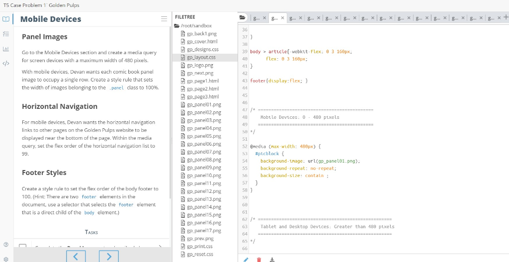
TS Case Problem 1 Golden Pulps FILETREE | Mobile Devices 2gp back1 png gp cover html gp designs.css gp_layout.css gp logo.png gp next.png BP page1.html gp-page2.html gp page3.html gp-panelo1.png Panel Images 37 39 body article[-webkit-flex: 8 3 160px, Go to the Mobile Devices section and create a media query for screen devices with a maximum width of 480 pixels. flex: 3 168px; With mobile devices, Devan wants each comic book panel image to occupy a single row. Create a style rule that sets the width of images belonging to the_panel class to 100%. 41 42 43 footer display:flex; Horizontal Navigation Hobtle Devices: 480 ptxels gp-panel03.png For mobile devices, Devan wants the horizontal navigation links to other pages on the Golden Pulps website to be displayed near the bottom of the page. Within the nedia query, set the flex order of the horizontal navigation list to 50 52 @nedia (nax width: 480px) 53 #picblock { 54 background-tmage: url(gp_panel01.png) 55 background-repeat: no-repeat 56 background-size: contain gp-panel07.png gp-panel08.png Footer Styles Create a style rule to set the flex order of the body footer to 100. (Hint: There are two footer elerments in the document, use a selector that selects the footer element that is a direct child of the body element.) gp panel10.png gp panel11.png 2gp panel12.png gp-panell 3.png gp-panel14.png gp-panel15.png gP panel16.png gp panel17.png 62 63 Tablet and Desktop Devices: Greater than 488 pixels gp-prev.png 65 / gp print.cs gp.-reset.css
Step by Step Solution
There are 3 Steps involved in it

Get step-by-step solutions from verified subject matter experts
 Study Help