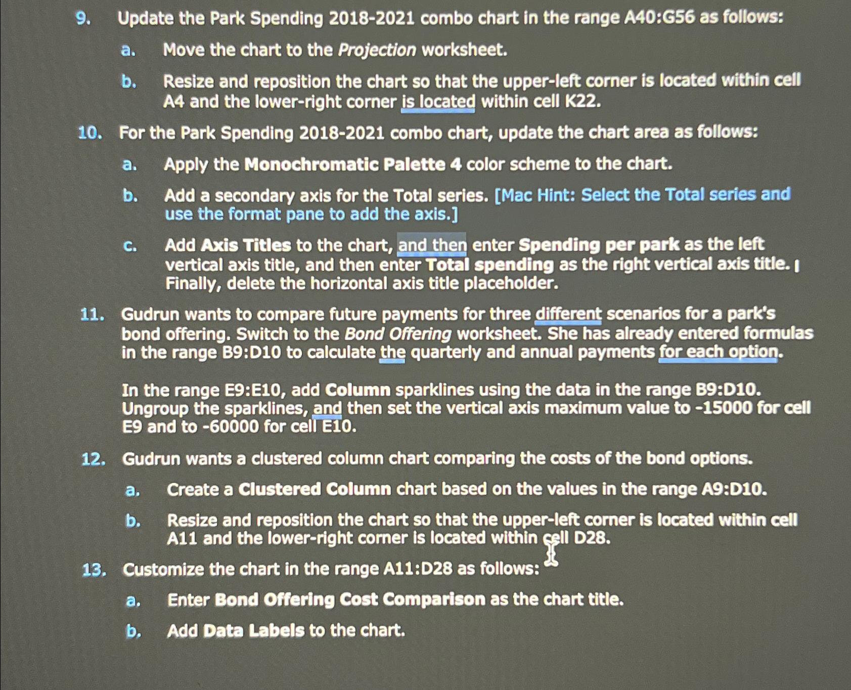
Question: Update the Park Spending 2 0 1 8 - 2 0 2 1 combo chart in the range A 4 0 :G 5 6 as
Update the Park Spending combo chart in the range A:G as follows:
a Move the chart to the Projection worksheet.
b Resize and reposition the chart so that the upperleft corner is located within cell A and the lowerright corner is located within cell K
For the Park Spending combo chart, update the chart area as follows:
a Apply the Monochromatic Palette color scheme to the chart.
b Add a secondary axis for the Total series. Mac Hint: Select the Total series and use the format pane to add the axis.
c Add Axis Titles to the chart, and then enter Spending per park as the left vertical axis title, and then enter Total spending as the right vertical axis title. I Finally, delete the horizontal axis title placeholder.
Gudrun wants to compare future payments for three different scenarios for a park's bond offering. Switch to the Bond Offering worksheet. She has already entered formulas in the range B:D to calculate the quarterly and annual payments for each option.
In the range E:E add Column sparklines using the data in the range B:D Ungroup the sparklines, and then set the vertical axis maximum value to for cell and to for cell
Gudrun wants a clustered column chart comparing the costs of the bond options.
a Create a Clustered Column chart based on the values in the range A:D
b Resize and reposition the chart so that the upperleft corner is located within cell A and the lowerright corner is located within call D
Customize the chart in the range A:D as follows:
a Enter Bond Offering Cost Comparison as the chart title.
b Add Data Labels to the chart.

Step by Step Solution
There are 3 Steps involved in it
1 Expert Approved Answer
Step: 1 Unlock


Question Has Been Solved by an Expert!
Get step-by-step solutions from verified subject matter experts
Step: 2 Unlock
Step: 3 Unlock


