

Question: Use a time series chat to display the data shown in tho tablo avalable below. The data represent the numbers of bachelor degrees in engineering
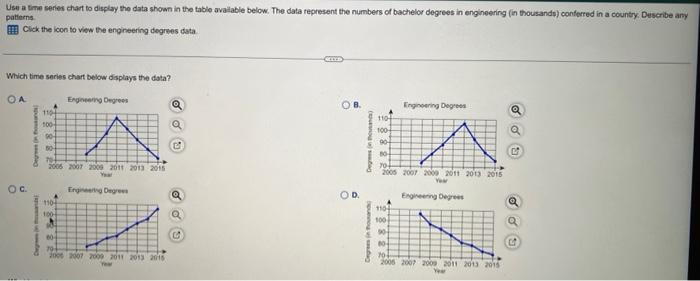
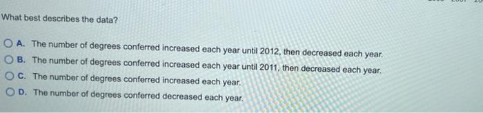
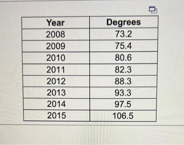
Use a time series chat to display the data shown in tho tablo avalable below. The data represent the numbers of bachelor degrees in engineering (in thousandp) conferred in a country: Describe any patterns. Click the licon to viow the engineering degreses data Wich time series chart below displays the dsta? What best describes the data? A. The number of degrees conferred increased each year until 2012, then decreased each year. B. The number of degrees conferred increased each year until 2011, then decreased each year. C. The number of degrees conferred increased each year. D. The number of degrees conferred decreased each year. \begin{tabular}{|c|c|} \hline Year & Degrees \\ \hline 2008 & 73.2 \\ \hline 2009 & 75.4 \\ \hline 2010 & 80.6 \\ \hline 2011 & 82.3 \\ \hline 2012 & 88.3 \\ \hline 2013 & 93.3 \\ \hline 2014 & 97.5 \\ \hline 2015 & 106.5 \\ \hline \end{tabular}
Step by Step Solution
There are 3 Steps involved in it

Get step-by-step solutions from verified subject matter experts