

Question: Use the black point (plus symbol) to indicate the equilibrium price and quantity of suitcases. Then use the green point (triangle symbol) to fill the
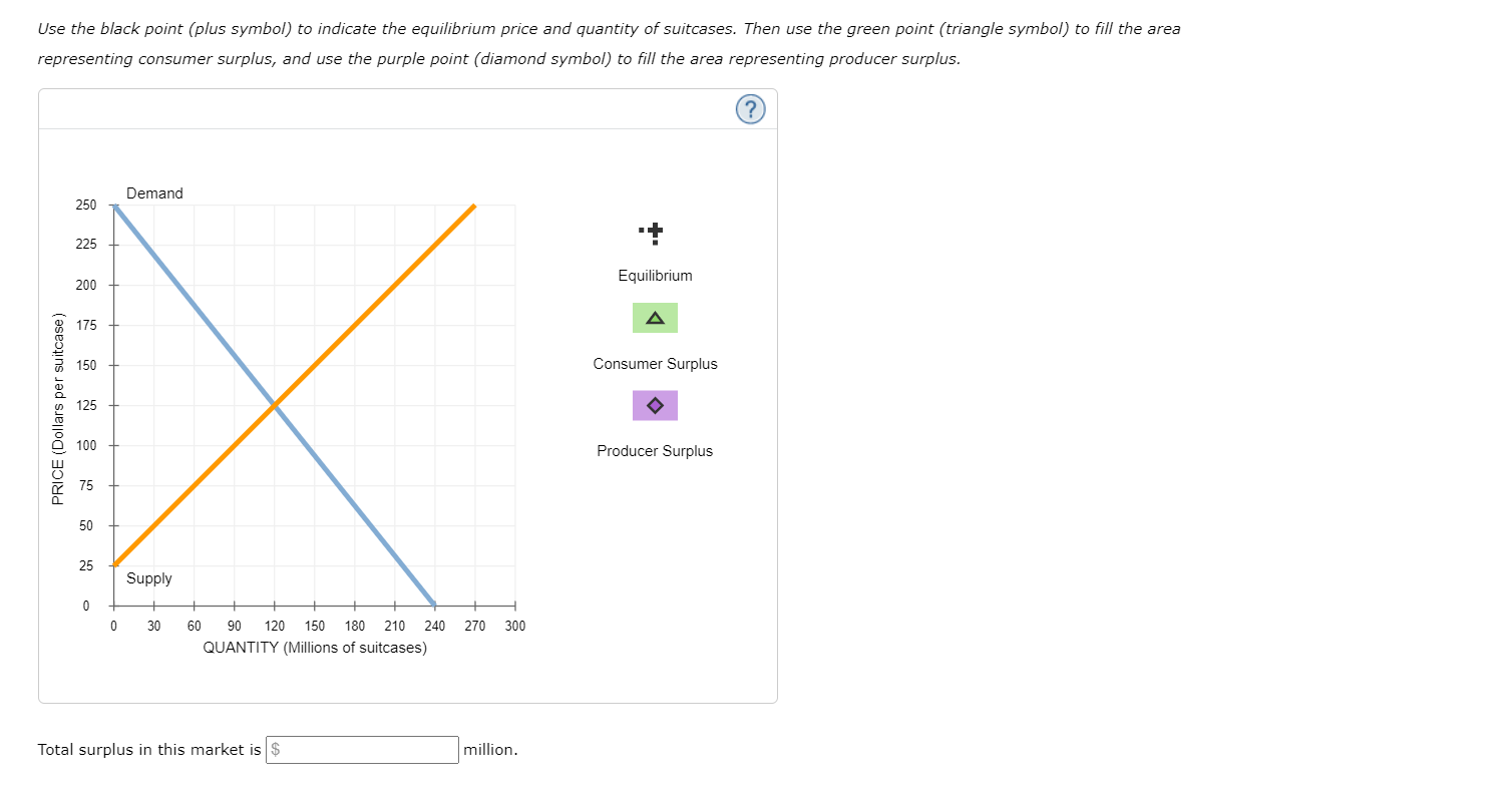
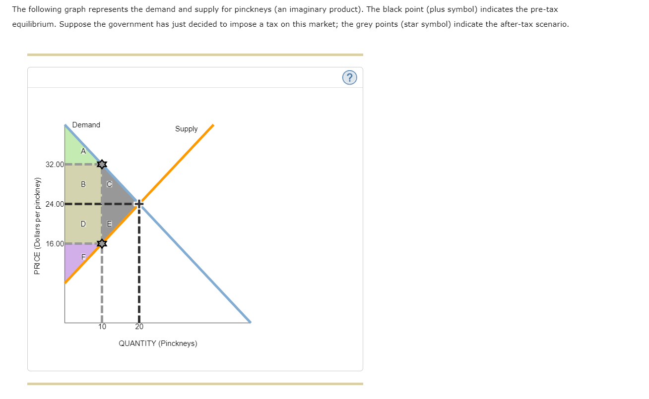
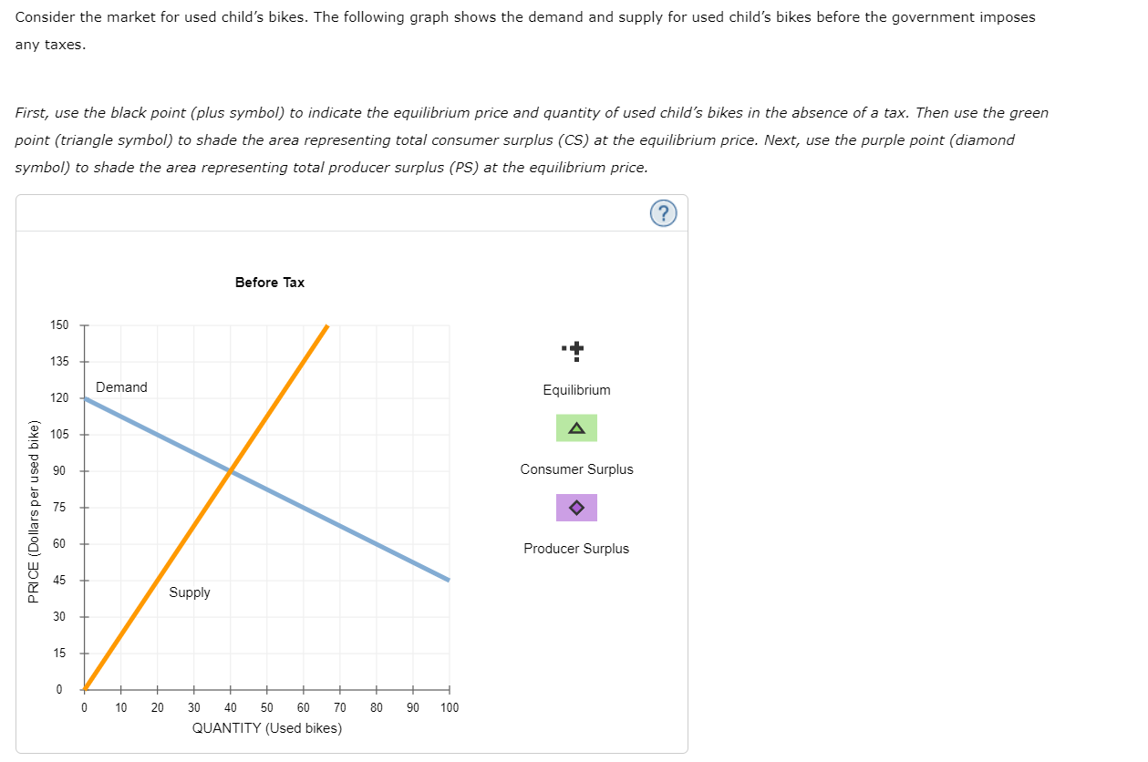
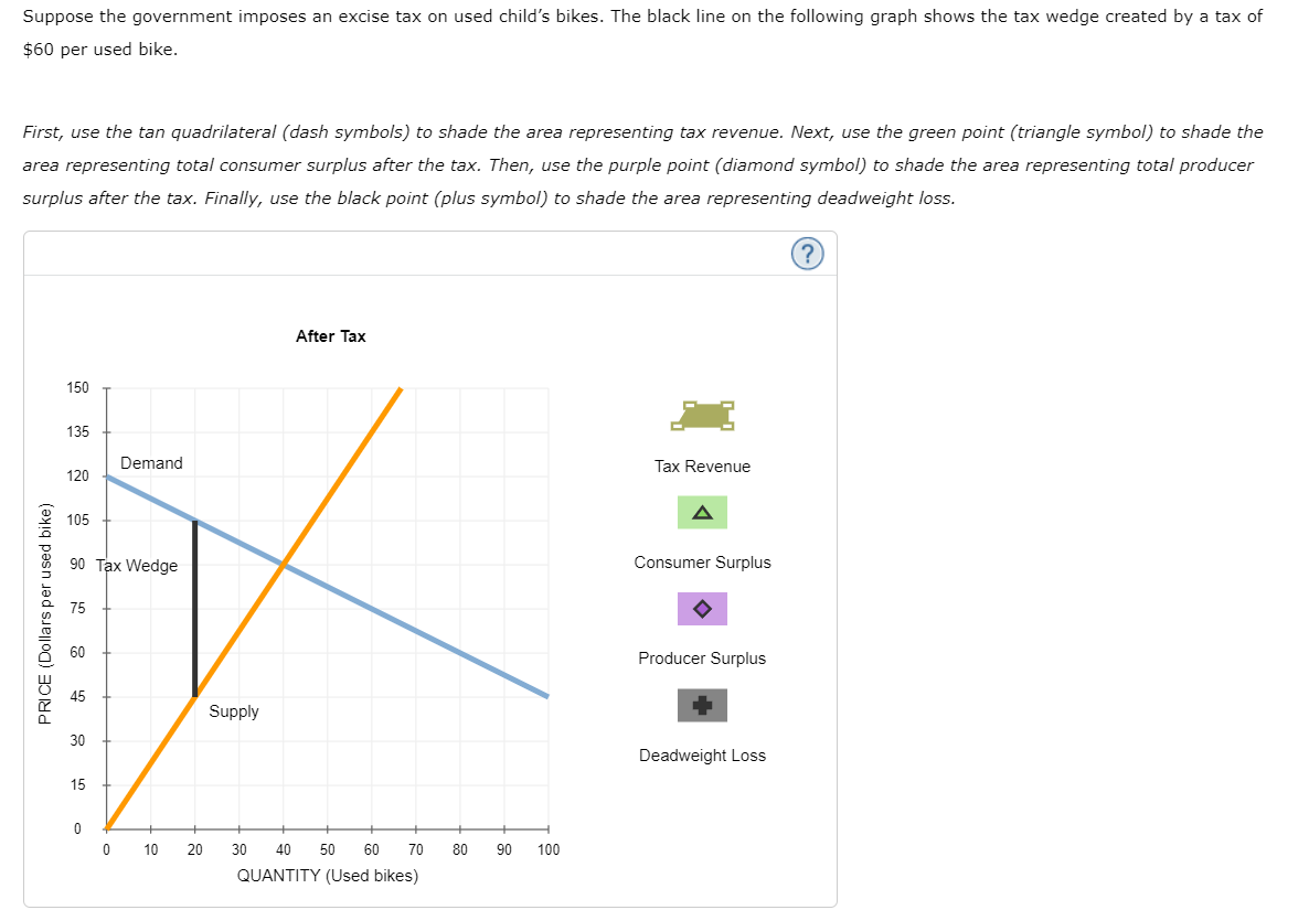
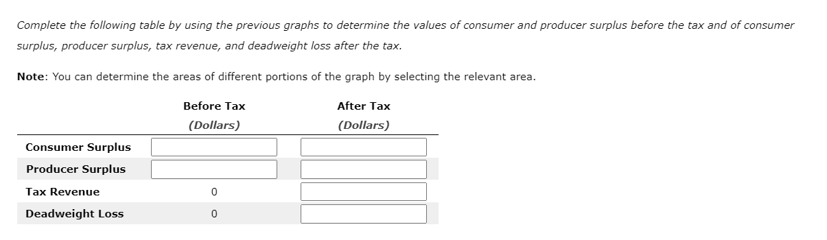
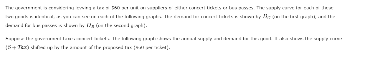
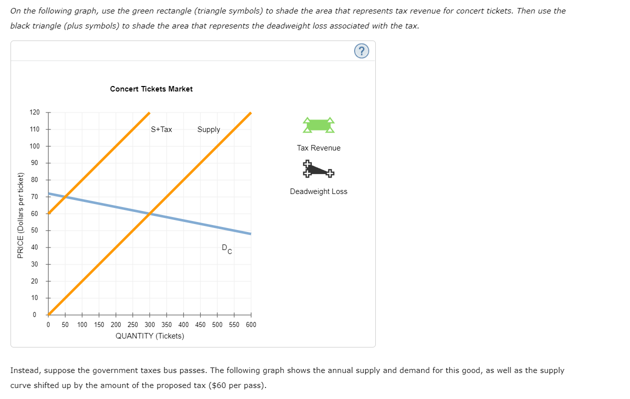
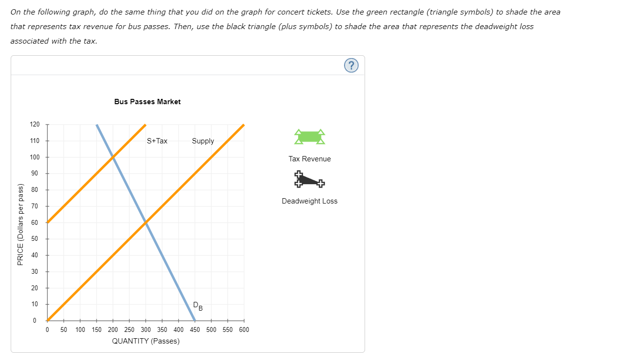
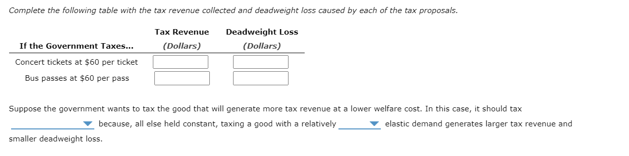
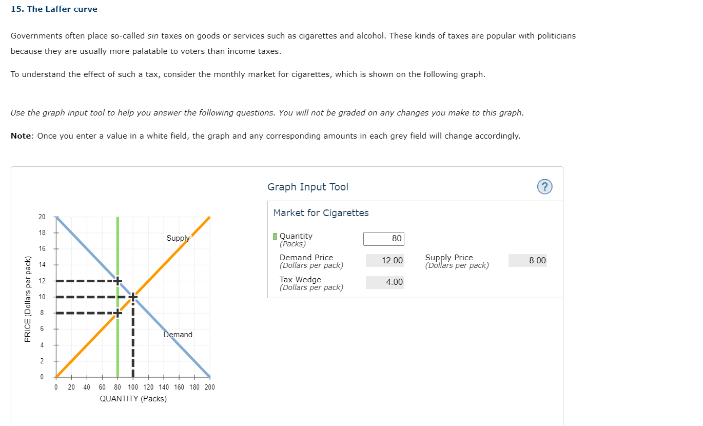
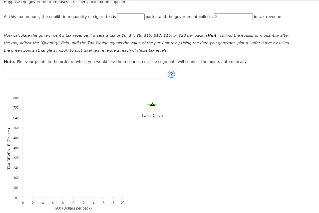
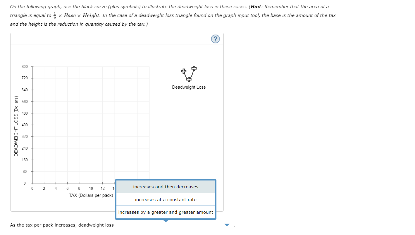
Use the black point (plus symbol) to indicate the equilibrium price and quantity of suitcases. Then use the green point (triangle symbol) to fill the area representing consumer surplus, and use the purple point (diamond symbol) to fill the area representing producer surplus. Demand 250 225 Equilibrium 200 A 175 150 Consumer Surplus 125 PRICE (Dollars per suitcase ) 100 Producer Surplus 75 50 25 Supply 30 60 90 120 150 180 210 240 270 300 QUANTITY (Millions of suitcases) Total surplus in this market is $ million.The following graph represents the demand and supply for pinckneys (an imaginary product). The black point (plus symbol) indicates the pre-tax equilibrium. Suppose the government has just decided to impose a tax on this market; the grey points (star symbol) indicate the after-tax scenario. Demand Supply A 32.00 C 24.00 E PRICE (Dollars per pinckney) 16.00 10 20 QUANTITY (Pinckneys)Complete the following table, given the information presented on the graph. Result Value Price consumers pay after tax $ Per unit tax $ Equilibrium quantity before tax In the following table, indicate which areas on the previous graph correspond to each concept. Check all that apply. Concept A B C D E F Producer surplus after the tax is imposed O O O O O O Deadweight loss after the tax is imposed O O O 0 O O Consumer surplus after the tax is imposed O O 0 O O 0Consider the market for used child's bikes. The following graph shows the demand and supply for used child's bikes before the government imposes any taxes. First, use the black point (plus symbol) to indicate the equilibrium price and quantity of used child's bikes in the absence of a tax. Then use the green point (triangle symbol) to shade the area representing total consumer surplus (CS) at the equilibrium price. Next, use the purple point (diamond symbol) to shade the area representing total producer surplus (PS) at the equilibrium price. Before Tax 150 135 Demand Equilibrium 120 A 105 90 Consumer Surplus 75 PRICE (Dollars per used bike) 60 Producer Surplus 45 Supply 30 15 0 0 10 20 30 40 50 60 70 80 90 100 QUANTITY (Used bikes)Suppose the government imposes an excise tax on used child's bikes. The black line on the following graph shows the tax wedge created by a tax of $60 per used bike. First, use the tan quadrilateral (dash symbols) to shade the area representing tax revenue. Next, use the green point (triangle symbol) to shade the area representing total consumer surplus after the tax. Then, use the purple point (diamond symbol) to shade the area representing total producer surplus after the tax. Finally, use the black point (plus symbol) to shade the area representing deadweight loss. After Tax 150 135 Demand 120 Tax Revenue 105 A 90 Tax Wedge Consumer Surplus 75 PRICE (Dollars per used bike) 60 Producer Surplus 45 Supply 30 Deadweight Loss 15 0 10 20 30 40 50 60 70 80 90 100 QUANTITY (Used bikes)Complete the following table by using the previous graphs to determine the values of consumer and producer surplus before the tax and of consumer surplus, producer surplus, tax revenue, and deadweight loss after the tax. Note: You can determine the areas of different portions of the graph by selecting the relevant area. Before Tax After Tax (Dollars) (Dollars) Consumer Surplus Producer Surplus Tax Revenue O O Deadweight LossThe government is considering levying a tax of $60 per unit on suppliers of either concert tickets or bus passes. The supply curve for each of these two goods is identical, as you can see on each of the following graphs. The demand for concert tickets is shown by Do (on the first graph), and the demand for bus passes is shown by DB (on the second graph). Suppose the government taxes concert tickets. The following graph shows the annual supply and demand for this good. It also shows the supply curve (S + Tax) shifted up by the amount of the proposed tax ($60 per ticket).On the following graph, use the green rectangle (triangle symbols) to shade the area that represents tax revenue for concert tickets. Then use the black triangle (plus symbols) to shade the area that represents the deadweight loss associated with the tax. Concert Tickets Market 120 110 S+Tax Supply 100 Tax Revenue 90 Deadweight Loss 70 60 PRICE (Dollars per ticket) 50 40 DC 30 20 10 0 50 100 150 200 250 300 350 400 450 500 550 600 QUANTITY (Tickets) Instead, suppose the government taxes bus passes. The following graph shows the annual supply and demand for this good, as well as the supply curve shifted up by the amount of the proposed tax ($60 per pass).On the following graph, do the same thing that you did on the graph for concert tickets. Use the green rectangle (triangle symbols) to shade the area that represents tax revenue for bus passes. Then, use the black triangle (plus symbols) to shade the area that represents the deadweight loss associated with the tax. Bus Passes Market 120 110 S+ Tax Supply 100 Tax Revenue 90 80 Deadweight Loss 70 60 PRICE (Dollars per pass) 50 40 30 20 DB 0 0 50 100 150 200 250 300 350 400 450 500 550 600 QUANTITY (Passes)Complete the following table with the tax revenue collected and deadwei'ght loss cacrseor by each of the tax proposals. Tax Revenue Deadweight Loss If the Government Taxes... (Dollars) (Dollars) Concert tickets at 560 per ticket \\: \\: Suppose the government wants to tax the good that will generate more tax revenue at a lower welfare cost. In this caseI it should tax V because, all else held constant, taXIng a good With a relatively V elastic demand generates larger tax revenue and smaller deadweight loss. 15. The Laffer curve Governments often place so-called sin taxes on goods or services such as cigarettes and alcohol. These kinds of taxes are popular with politicians because they are usually more palatable to voters than income taxes. To understand the effect of such a tax, consider the monthly market for cigarettes, which is shown on the following graph. Use the graph input tool to help you answer the following questions. You will not be graded on any changes you make to this graph. Note: Once you enter a value in a white field, the graph and any corresponding amounts in each grey field will change accordingly. Graph Input Tool (? 20 Market for Cigarettes Supply Quantity 80 (Packs) Demand Price 12.00 Supply Price (Dollars per pack) 8.00 (Dollars per pack) Tax Wedge 4.00 (Dollars per pack) PRICE (Dollars per pack) Demand 0 0 20 40 60 80 100 120 140 160 180 200 QUANTITY (Packs)Suppose the government imposes a $4-per-pack tax on suppliers. At this tax amount, the equilibrium quantity of cigarettes is packs, and the government collects $ in tax revenue. Now calculate the government's tax revenue if it sets a tax of $0, $4, $8, $10, $12, $16, or $20 per pack. (Hint: To find the equilibrium quantity after the tax, adjust the "Quantity" field until the Tax Wedge equals the value of the per-unit tax. ) Using the data you generate, plot a Laffer curve by using the green points (triangle symbol) to plot total tax revenue at each of those tax levels. Note: Plot your points in the order in which you would like them connected. Line segments will connect the points automatically. 800 A 720 640 Laffer Curve 560 480 TAX REVENUE (Dollars) 400 320 240 160 80 2 6 8 10 12 14 16 18 20 TAX (Dollars per pack)Suppose the government is currently imposing a $12perpack tax on cigarettes. True or False: The government can raise its tax revenue by increasing the perunit tax on cigarettes. 0 True 0 False Consider the deadweight loss generated in each of the following cases: no tax, a tax of $8 per pack, and a tax of $16 per pack. On the following graph, use the black curve (plus symbols) to illustrate the deadweight loss in these cases. (Hint: Remember that the area of a triangle is equal to - x Base x Height. In the case of a deadweight loss triangle found on the graph input tool, the base is the amount of the tax and the height is the reduction in quantity caused by the tax.) 800 720 Deadweight Loss 640 560 480 400 DEADWEIGHT LOSS (Dollars) 320 240 160 80 6 8 10 12 increases and then decreases TAX (Dollars per pack) increases at a constant rate increases by a greater and greater amount As the tax per pack increases, deadweight loss
Step by Step Solution
There are 3 Steps involved in it

Get step-by-step solutions from verified subject matter experts