

Question: Use the image below for this question. * (3 Points) The graph below shows the relationship between life expectancy and income in a random sample
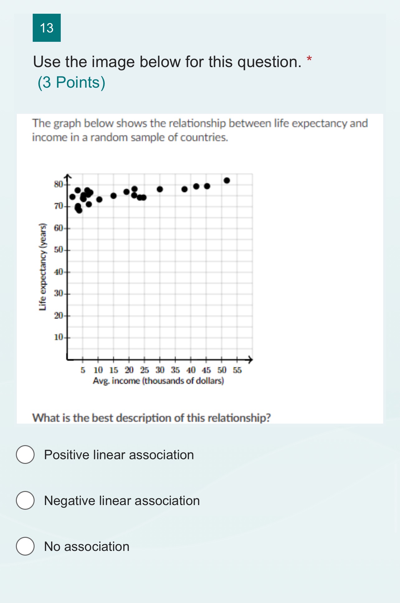
Use the image below for this question. * (3 Points) The graph below shows the relationship between life expectancy and income in a random sample of countries. Life expectancy (years) 510152025113540455055 Avg income (thousands of dollars) What is the best description of this relationship? 0 Positive linear association 0 Negative linear association 0 No association
Step by Step Solution
There are 3 Steps involved in it
1 Expert Approved Answer
Step: 1 Unlock

Question Has Been Solved by an Expert!
Get step-by-step solutions from verified subject matter experts
Step: 2 Unlock
Step: 3 Unlock