

Question: Use the numbers from the table below to draw a graph showing how to put increases with the quality of workers Quantity of Workers Output
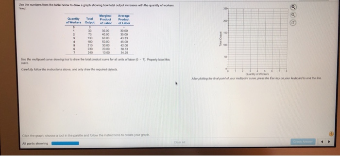
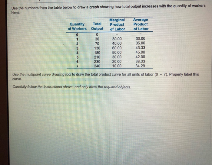
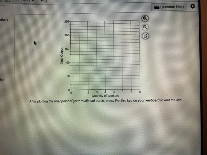
Use the numbers from the table below to draw a graph showing how to put increases with the quality of workers Quantity of Workers Output efla Use the mutin curve to the procurve for l o w - Perly label Cryotes above and w here Ale the l your mone, prethe day on your keyboard and the Click the graph, choose a tool in the palette and follow the inst All parts showing Use the numbers from the table below to draw a graph showing how total output increases with the quantity of workers hired. Quantity Total of Workers Output Marginal Product of Labor Average Product of Labor 180 30.00 30.00 40.00 35.00 60.00 43.33 50.00 45.00 210 30.00 42.00 230 20.00 38.33 240 10.00 34.29 Use the multipoint curve drawing tool to draw the total product curve for all units of labor (0 - 7). Properly label this curve. Carefully follow the instructions above, and only draw the required objects. Question Help Total Output Quantity of Workers After plotting the final point of your multipoint curve, press the Esc key on your keyboard to end the line
Step by Step Solution
There are 3 Steps involved in it

Get step-by-step solutions from verified subject matter experts