

Question: Use this and the excel file and create a new hypothesis : This case study concerns a problem of interest to real estate appraisers, tax
Use this and the excel file and create a new hypothesis : This case study concerns a problem of interest to real estate appraisers, tax asses- sors, real estate investors, and homebuyersnamely, the relationship between the appraised value of a property and its sale price. The sale price for any given property will vary depending on the price set by the seller, the strength of appeal of the property to a specific buyer, and the state of the money and real estate markets. Therefore, we can think of the sale price of a specific property as possessing a relative frequency distribution. The mean of this distribution might be regarded as a measure of the fair value of the property. Presumably, this is the value that a property appraiser or a tax assessor would like to attach to a given property.
The purpose of this case study is to examine the relationship between the mean sale price E(y) of a property and the following independent variables:
1. Appraised land value of the property 2. Appraised value of the improvements on the property 3. Neighborhood in which the property is listed
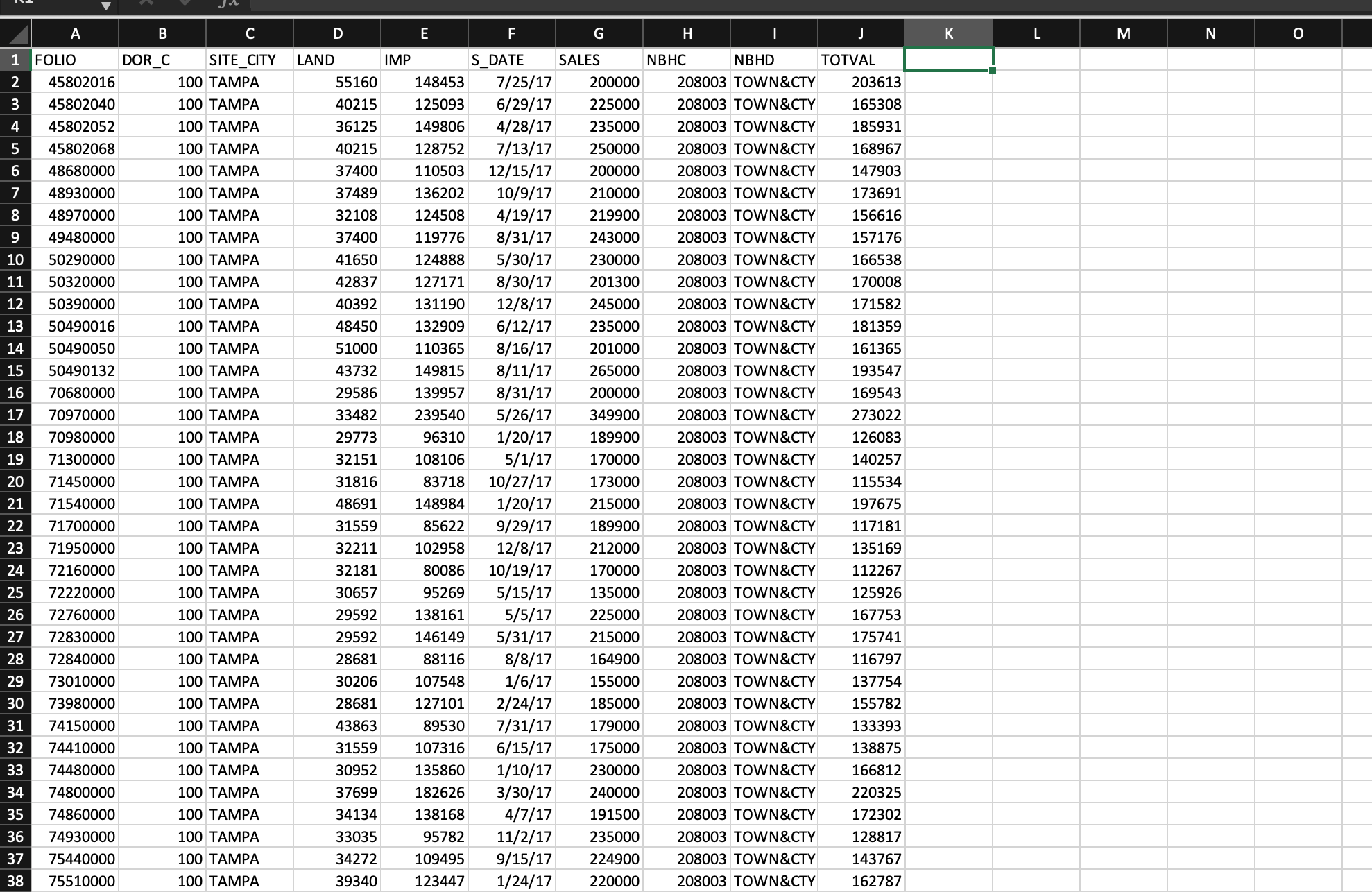
The data for the study were supplied by the property appraisers office of Hillsbor- ough County, Florida, and consist of the appraised land and improvement values and sale prices for residential properties sold in the city of Tampa, Florida, during the period May 2008 to June 2009. Four neighborhoods (Hyde Park, Cheval, Hunters Green, and Davis Isles), each relatively homogeneous but differing sociologically

248
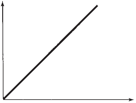
Figure CS2.1 The E(y) theoretical relationship between mean sale price and appraised value x
0
x
and in property types and values, were identified within the city and surrounding area. The subset of sales and appraisal data pertinent to these four neighbor- hoodsa total of 176 observationswas used to develop a prediction equation relating sale prices to appraised land and improvement values. The data (recorded in thousands of dollars) are saved in the TAMSALES4 file and are fully described in Appendix E.
The Theoretical Model
If the mean sale price E(y) of a property were, in fact, equal to its appraised value, x, the relationship between E(y) and x would be a straight line with slope equal to 1, as shown in Figure CS2.1. But does this situation exist in reality? The property appraisers data could be several years old and consequently may represent (because of inflation) only a percentage of the actual mean sale price. Also, experience has shown that the sale priceappraisal relationship is sometimes curvilinear in nature. One reason is that appraisers have a tendency to overappraise or underappraise properties in specific price ranges, say, very low-priced or very high-priced properties. In fact, it is common for realtors and real estate appraisers to model the natural logarithm of sales price, ln(y), as a function of appraised value, x. We learn (Section 7.7) that modeling ln(y) as a linear function of x introduces a curvilinear relationship between y and x.
The Hypothesized Regression Models 249
Appraised value
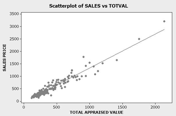
To gain insight into the sales appraisal relationship, we used MINITAB to con- struct a scatterplot of sales price versus total appraised value for all 176 observations in the data set. The plotted points are shown in Figure CS2.2, as well as a graph of a straight-line fit to the data. Despite the concerns mentioned above, it appears that a linear model will fit the data well. Consequently, we use y = sale price (in thousands of dollars) as the dependent variable and consider only straight-line models. Later in this case study, we compare the linear model to a model with ln(y) as the dependent variable.
The Hypothesized Regression Models
We want to relate sale price y to three independent variables: the qualitative factor, neighborhood (four levels), and the two quantitative factors, appraised land value and appraised improvement value. We consider the following four models as candidates for this relationship.
Model 1 is a first-order model that will trace a response plane for mean of sale price, E(y), as a function of x1 = appraised land value (in thousands of dollars)
Mean sale price
250 Case Study 2 Modeling the Sale Prices of Residential Properties in Four Neighborhoods
Figure CS2.2 MINITAB scatterplot of sales-appraisal data
Model 1
First-order model, identical for all neighborhoods
Appraised land
Appraised improvement value
2x2
and x2 = appraised improvement value (in thousands of dollars). This model will assume that the response planes are identical for all four neighborhoods, that is, that a first-order model is appropriate for relating y to x1 and x2 and that the relationship between the sale price and the appraised value of a property is the same for all neighborhoods. This model is:
value


Model 2
In Model 1, we are assuming that the change in sale price y for every $1,000 (1-unit) increase in appraised land value x1 (represented by 1) is constant for a fixed appraised improvements value, x2. Likewise, the change in y for every $1,000 increase in x2 (represented by 2) is constant for fixed x1.
Model 2 will assume that the relationship between E(y) and x1 and x2 is first- order (a planar response surface), but that the planes y-intercepts differ depending on the neighborhood. This model would be appropriate if the appraisers procedure for establishing appraised values produced a relationship between mean sale price and x1 and x2 that differed in at least two neighborhoods, but the differences remained constant for different values of x1 and x2. Model 2 is
First-order model, constant differences between neighborhoods
E(y)=0 + where
E(y) = 0 + 1x1
+
Appraised land Appraised Main effect terms value improvement value for neighborhoods


1x1 + 2x2 + 3x3 +4x4 +5x5
x1 = Appraised land value x2 = Appraised improvement value
Model 3
The fourth neighborhood, Hunters Green, was chosen as the base level. Conse- quently, the model will predict E(y) for this neighborhood when x3 = x4 = x5 = 0. Although it allows for neighborhood differences, Model 2 assumes that change in sale price y for every $1,000 increase in either x1 or x2 does not depend on neighborhood.
Model 3 is similar to Model 2 except that we will add interaction terms between the neighborhood dummy variables and x1 and between the neighborhood dummy variables and x2. These interaction terms allow the change in y for increases in x1 or x2 to vary depending on the neighborhood. The equation of Model 3 is
First-order model, no restrictions on neighborhood differences
x3= 1 0
x4= 1 0
x5= 1 0
The Hypothesized Regression Models 251 if Cheval neighborhood
ifnot
if Davis Isles neighborhood ifnot
if Hyde Park neighborhood ifnot
Appraised land
value
Appraised improvement
value


+
+ 3x3 + 4x4 + 5x5 Interaction, appraised land by neighborhood
+ 6x1x3 + 7x1x4 + 8x1x5 Interaction, appraised improvement by neighborhood
+ 9x2x3 + 10x2x4 + 11x2x5
Note that for Model 3, the change in sale price y for every $1,000 increase in appraised land value x1 (holding x2 fixed) is (1) in Hunters Green and (1 + 6) in Cheval.
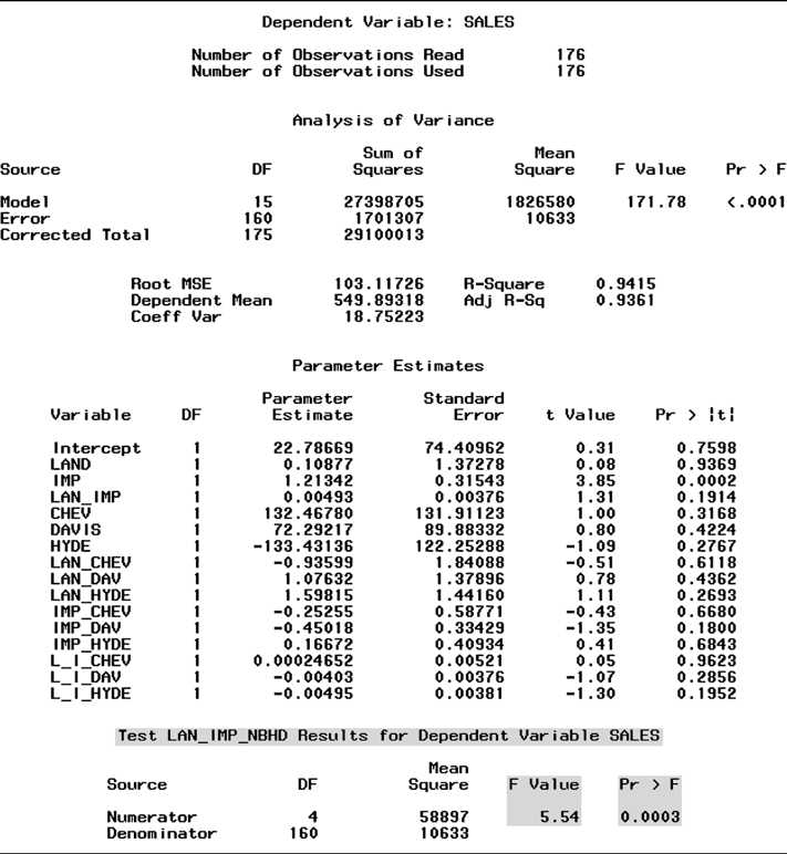
Model 4 differs from the previous three models by the addition of terms for x1 , x2 -interaction. Thus, Model 4 is a second-order (interaction) model that will trace (geometrically) a second-order response surface, one for each neighborhood. The interaction model follows:
Interaction model in x1 and x2 that differs from one neighborhood to another Interaction model in x1 and x2 Main effect terms for neighborhoods
E(y)=0 + 1x1 Main effect terms for neighborhoods
2x2


Model 4


E(y) =


0 +1x1 +2x2 +3x1x2 + 4x3 +5x4 +6x5 +xx +xx +xx + xx Interactionterms:x,
7 1 3 8 1 4 9 1 5 1 0 2 3 1
+11x2x4 + 12x2x5 + 13x1x2x3 x2, and x1x2 terms by
+ xxx + xxx neighborhood 14 1 2 4 15 1 2 5
252 Case Study 2 Modeling the Sale Prices of Residential Properties in Four Neighborhoods
| Table CS2.1 Summary of regressions of the models |
|
Model MSE Ra2 s |
| 1 12,748 .923 2 12,380 .926 3 11,810 .929 4 10,633 .936 112.9 111.3 108.7 103.1 |


Figure CS2.3 SAS regression output for Model 1
Unlike Models 13, Model 4 allows the change in y for increases in x1 to depend on x2, and vice versa. For example, the change in sale price for a $1,000 increase in appraised land value in the base-level neighborhood (Hunters Green) is (1 + 3x2). Model 4 also allows for these sale price changes to vary from neighborhood to neighborhood (due to the neighborhood interaction terms).
We fit Models 14 to the data. Then, we compare the models using the nested model F test outlined in Section 4.13. Conservatively, we conduct each test at = .01.
Model Comparisons
The SAS printouts for Models 14 are shown in Figures CS2.3CS2.6, respectively. These printouts yield the values of MSE, Ra2, and s listed in Table CS2.1.
Test Model 1 versus Model 2 #1 To test the hypothesis that a single first-order model is appropriate for all neigh-
borhoods, we wish to test the null hypothesis that the neighborhood parameters in Model 2 are all equal to 0, that is,
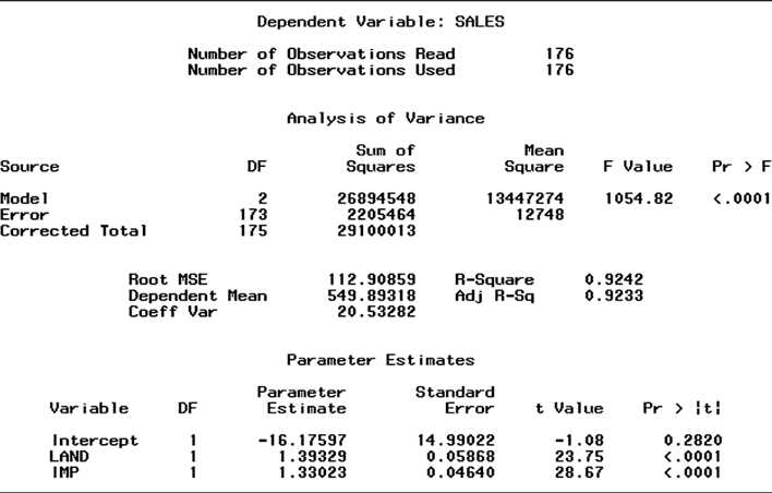
H0:3 =4 =5 =0
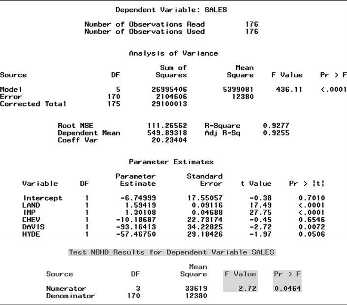
Figure CS2.4 SAS regression output for Model 2
That is, we want to compare the complete model, Model 2, to the reduced model, Model 1. The test statistic is
F = (SSER SSEC)/Number of parameters in H0 MSEC
= (SSE1 SSE2)/3 MSE2
Although the information is available to compute this value by hand, we utilize the SAS option to conduct the nested model F test. The test statistic value, shaded at the bottom of Figure CS2.4, is F = 2.72. The p-value of the test, also shaded, is .0464. Since = .05 exceeds this p-value, we have evidence to indicate that the addition of the neighborhood dummy variables in Model 2 contributes significantly to the prediction of y. The practical implication of this result is that the appraiser is not assigning appraised values to properties in such a way that the first-order relationship between (sales), y, and appraised values x1 and x2 is the same for all neighborhoods.
Test Model 2 versus Model 3 #2 Can the prediction equation be improved by the addition of interactions between
neighborhood and x1 and neighborhood and x2 ? That is, do the data provide sufficient evidence to indicate that Model 3 is a better predictor of sale price than Model 2? To answer this question, we test the null hypothesis that the parameters associated
Model Comparisons 253


254 Case Study 2 Modeling the Sale Prices of Residential Properties in Four Neighborhoods
Figure CS2.5 SAS regression output for Model 3
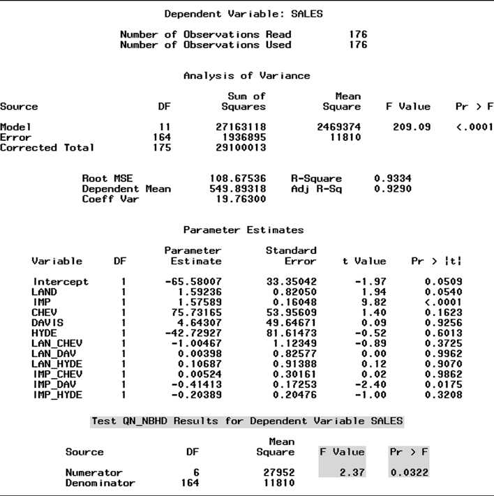
with all neighborhood interaction terms in Model 3 equal 0. Thus, Model 2 is now the reduced model and Model 3 is the complete model.
Checking the equation of Model 3, you will see that there are six neighborhood interaction terms and that the parameters included in H0 will be
H0:6 =7 =8 =9 =10 =11 =0
To test H0, we require the test statistic F = (SSER SSEC)/Number of parameters in H0 = (SSE2 SSE3)/6
MSEC MSE3
This value, F = 2.37, is shaded at the bottom of the SAS printout for Model 3, Figure CS2.5. The p-value of the test (also shaded) is .0322. Thus, there is sufficient evidence (at = .05) to indicate that the neighborhood interaction terms of Model 3 contribute information for the prediction of y. Practically, this test implies that the rate of change of sale price y with either appraised value, x1 or x2, differs for each of the four neighborhoods.
Test Model 3 versus Model 4 #3 We have already shown that the first-order prediction equations vary among neigh-
borhoods. To determine whether the (second-order) interaction terms involving the appraised values, x1 and x2, contribute significantly to the prediction of y, we test


Figure CS2.6 SAS regression output for Model 4
the hypothesis that the four parameters involving x1x2 in Model 4 all equal 0. The null hypothesis is
H0:3 =13 =14 =15 =0
and the alternative hypothesis is that at least one of these parameters does not equal 0. Using Model 4 as the complete model and Model 3 as the reduced model, the test statistic required is:
F = (SSER SSEC)/Number of parameters in H0 = (SSE3 SSE4)/4 MSEC MSE4
This value (shaded at the bottom of the SAS printout for Model 4, Figure CS2.6) is F = 5.54. Again, the p-value of the test (.0003) is less than = .05. This small p-value supports the alternative hypothesis that the x1x2 interaction terms of Model 4 contribute significantly to the prediction of y.
The results of the preceding tests suggest that Model 4 is the best of the four models for modeling sale price y. The global F value for testing
H0:1 =2 ==15 =0
is highly significant (F = 171.78, p-value
Model Comparisons 255


256 Case Study 2 Modeling the Sale Prices of Residential Properties in Four Neighborhoods nonsignificant. Be careful not to conclude that these terms should be dropped from
Figure CS2.7 Portion of SAS regression output for Model 5
the model.
Whenever a model includes a large number of interactions (as in Model 4) and/or squared terms, several t tests will often be nonsignificant even if the global F test is highly significant. This result is due partly to the unavoidable intercorrelations among the main effects for a variable, its interactions, and its squared terms (see the discussion on multicollinearity in Section 7.5). We warned in Chapter 4 of the dangers of conducting a series of t tests to determine model adequacy. For a model with a large number of s, such as Model 4, you should avoid conducting any t tests at all and rely on the global F test and partial F tests to determine the important terms for predicting y.
Before we proceed to estimation and prediction with Model 4, we conduct
one final test. Recall our earlier discussion of the theoretical relationship between
sale price and appraised value. Will a model with the natural log of y as the
dependent variable outperform Model 4? To check this, we fit a model identical to
Model 4call it Model 5but with y = ln(y) as the dependent variable. A portion
of the SAS printout for Model 5 is displayed in Figure CS2.7. From the printout, we
obtain Ra2 = .90, s = .18, and global F = 110.73 (p-value
statistically useful for predicting sale price based on the global F test. However,
we must be careful not to judge which of the two models is better based on the
values of R2 and s shown on the printouts because the dependent variable is not the
same for each model. (Recall the warning given at the end of Section 4.11.) An
informal procedure for comparing the two models requires that we obtain predicted
values for ln(y) using the prediction equation for Model 5, transform these predicted
log values back to sale prices using the equation, eln(y), then recalculate the Ra2 and s values for Model 5 using the formulas given in Chapter 4. We used the programming language of SAS to compute these values; they are compared to the values of Ra2 and s for Model 4 in Table CS2.2.
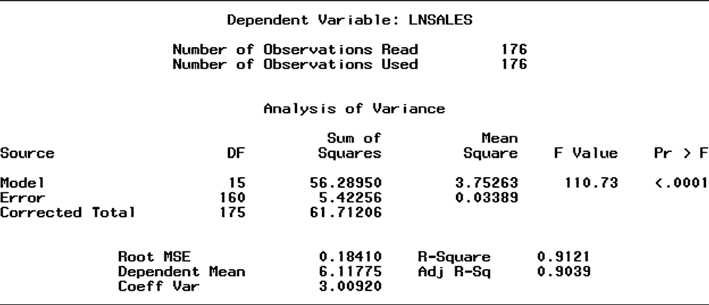
| Table CS2.2 Comparison of Ra2 and s for Models 4 and 5 |
|
Ra2 s |
| Model 4: .936 (from Figure CS2.6) 103.1 (from Figure CS2.6) Model 5: .904 (using transformation) 127.6 (using transformation) |


You can see that Model 4 outperforms Model 5 with respect to both statistics. Model 4 has a slightly higher Ra2 value and a lower model standard deviation. These results support our decision to build a model with sale price y rather than ln(y) as the dependent variable.
Interpreting the Prediction Equation
Substituting the estimates of the Model 4 parameters (Figure CS2.6) into the pre- diction equation, we have
y = 22.79 + .11x1 + 1.21x2 + .0049x1x2 + 132.5x3 + 72.3x4 133.4x5 .94x1x3 + 1.08x1x4 + 1.60x1x5 .25x2x3 .45x2x4 + .17x2x5 + .0002x1x2x3 .004x1x2x4 .005x1x2x5
We have noted that the model yields four response surfaces, one for each neighborhood. One way to interpret the prediction equation is to first find the equation of the response surface for each neighborhood. Substituting the appropriate values of the neighborhood dummy variables, x3,x4, and x5, into the equation and combining like terms, we obtain the following:
Cheval:(x3 =1,x4 =x5 =0) y = (22.79 + 132.5) + (.11 .94)x1 + (1.21 .25)x2 + (.0049 + .0002)x1x2
= 155.29 .83x1 + .96x2 + .005x1x2 Davis Isles: (x3 = 0,x4 = 1,x5 = 0)
y = (22.79 + 72.3) + (.11 + 1.08)x1 + (1.21 .45)x2 + (.0049 .004)x1x2 = 95.09 + 1.19x1 + .76x2 + .001x1x2
HydePark:(x3 =x4 =0,x5 =1) y = (22.79 133.4) + (.11 + 1.60)x1 + (1.21 + .17)x2 + (.0049 .00495)x1x2
= 110.61 + 1.71x1 + 1.38x2 .00005x1x2 Hunters Green: (x3 = x4 = x5 = 0)
y = 22.79 + .11x1 + 1.21x2 + .0049x1x2
Note that each equation is in the form of an interaction model involving appraised land value x1 and appraised improvements x2. To interpret the estimates of each interaction equation, we hold one independent variable fixed, say, x1, and focus on the slope of the line relating y to x2. For example, holding appraised land value constant at $50,000 (x1 = 50), the slope of the line relating y to x2 for Hunters Green (the base level neighborhood) is
2 + 3x1 = 1.21 + .0049(50) = 1.455
Thus, for residential properties in Hunters Green with appraised land value of $50,000, the sale price will increase $1,455 for every $1,000 increase in appraised improvements.
Similar interpretations can be made for the slopes for other combinations of neighborhoods and appraised land value x1. The estimated slopes for several of these combinations are computed and shown in Table CS2.3. Because of the interaction
Interpreting the Prediction Equation 257
258 Case Study 2 Modeling the Sale Prices of Residential Properties in Four Neighborhoods
| Table CS2.3 Estimated dollar increase in sale price for $1,000 increase in appraised improvements |
|
Neighborhood Cheval Davis Isles Hyde Park Hunters Green
|
| $50,000 1,210 810 1,377 APPRAISED LAND $75,000 1,335 835 1,376 VALUE $100,000 1,460 860 1,375 $150,000 1,710 910 1,373 1,455 1,577 1,700 1,945 |


Figure CS2.8 SAS graph of predicted sales for land value of $150,000
terms in the model, the increases in sale price for a $1,000 increase in appraised improvements, x2, differ for each neighborhood and for different levels of land value, x1.
Some trends are evident from Table CS2.3. For fixed appraised land value (x1) the increase in sales price (y) for every $1,000 increase in appraised improvements (x2) is smallest for Davis Isles and largest for Hunters Green. For three of the four neighborhoods (Cheval, Davis Isles, and Hunters Green), the slope increases as appraised land value increases. You can see this graphically in Figure CS2.8, which shows the slopes for the four neighborhoods when appraised land value is held fixed at $150,000.
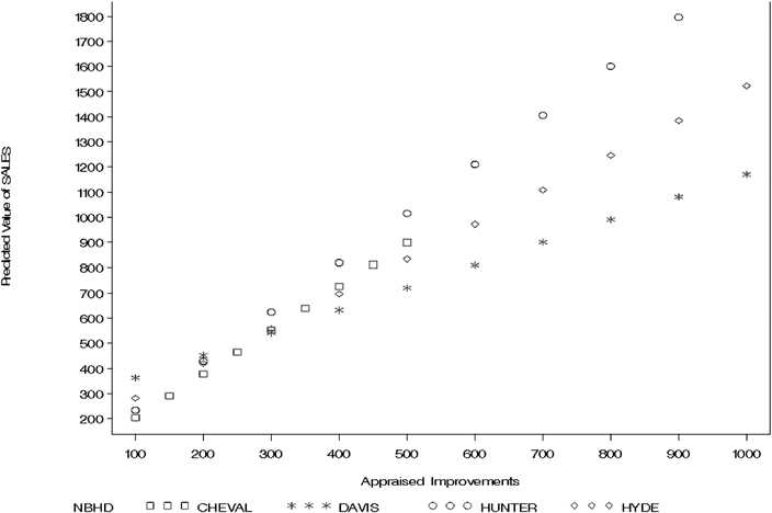
More information concerning the nature of the neighborhoods can be gleaned from the SAS printout shown in Figure CS2.9. This printout gives descriptive statistics (mean, standard deviation, minimum, and maximum) for sale price (y), land value (x1), and improvements (x2) for each of the neighborhoods. The mean sale prices confirm what realtors know to be true, that is, that neighborhoods Davis Isles and Hyde Park are two of the most expensive residential areas in the city. Most of the inhabitants are highly successful professionals or business entrepreneurs. In contrast, Cheval and Hunters Green, although also relatively high-priced, are less
Predicting the Sale Price of a Property 259
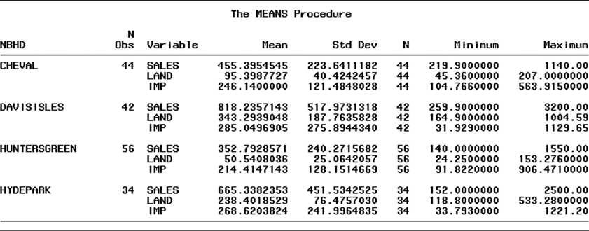
Figure CS2.9 SAS descriptive statistics, by neighborhood
expensive residential areas inhabited primarily by either younger, upscale married couples or older, retired couples.
Examining Figure CS2.8 and Table CS2.3 again, notice that the less expensive neighborhoods tend to have the steeper slopes, and their estimated lines tend to be above the lines of the more expensive neighborhoods. Consequently, a property in Cheval is estimated to sell at a higher price than one in the more expensive Davis Isles when appraised land value is held fixed. This would suggest that the appraised values of properties in Davis Isles are too low (i.e., they are underappraised) compared with similar properties in Cheval. Perhaps a low appraised property value in Davis Isles corresponds to a smaller, less desirable lot; this may have a strong depressive effect on sale prices.
The two major points to be derived from an analysis of the sale price appraised value lines are as follows:
The rate at which sale price increases with appraised value differs for differ- ent neighborhoods. This increase tends to be largest for the more expensive neighborhoods.
The lines for Cheval and Hunters Green lie above those for Davis Isle and Hyde Park, indicating that properties in the higher-priced neighborhoods are being underappraised relative to sale price compared with properties in the lower-priced neighborhoods.
To answer the questions on the picture

l Scatterplot of SALES vS TOTVAL Dependent Variable: SALES NumberofObservationsReadNumberofObservationsUsed176176 Analys is of Var iance Dependent Variable: SALES Numberof0bservationsReadNumberofObservationsUsed176176 Analys is of Variance SourceModelErrorDF5170SumofSquares269954062104606Mean539908112380Square436.11FValue<.0001pr>F Root MSE 111.26562 R-Square 0.9277 Parameter Estinates VariableInterceptLANDIMPCHEUDAUISHYDEDF111111ParameterEstimate6.749991.594191.3010810.1868793.1641357.46750StandardError17.550570.091160.0468822.7317434.2282529.18426tValue0.3817.4927.750.452.721.97Pr>t0.7010<.0001 test nbhd results for dependent variable sales source df square f value pr>F \\ Numerator & 3 & 33619 & 2.72 & 0.0464 \\ Denoninator & 170 & 12380 & & \end{tabular} Analys is of Var iance Parameter Est inates Analys is of Var iance Parameter Est imates Dependent Var iable: LNSALES of Observat ions Read of Observations Used Analysis of Variance The MEANS Procedure 2. Research Method :- - Describe the hypothesis/hypotheses you plan to test - Provide the main regression equation(s) you estimate - Consider starting with a primary equation. If you also estimate slight variants of the main model, it is acceptable to simply explain the changes to the model directly in the text without writing out a new equation. - Explain what the dependent and key independent variables are - Discuss the expected signs of the key regression coefficients, whether non-linear relations might be present, what kind of interactions among independent variables you should look for and so on. - Explain why you choose the control variables--- this is when the literary review matters! 3. Data Overview : - What is the unit of analysis (individuals, states, counties, products, etc.)? - How many observations? Generally speaking, more degrees of freedom and hence more observations lead to better estimations. The minimum number of observations is 30. - Where and when? (e.g. US counties from 1990, 2000, 2010) - What is the data source? (e.g. US Population Census, US Census Bureau website) - Did you assemble the data set yourself? - Did you drop any observations? What rules did you use in deciding what data to drop? - Include summary statistics of the main variables (means, standard deviations, correlations, etc.) in a table (required) - Provide the correlation matrix of independent variables (required) - Extra credits are given to additional exhibits that reveal the relationship between dependent and independent variables 4. Results and Discussion : - Key results Report regression coefficient estimates and their standard errors or P-values by column in each output table (required). You cannot copy the original output table from Excel or R - Explain adjusted R2 and F statistics - Interpretation: What do we learn from the regression results? - Are there other ways to interpret your results? Alternative explanations? Why did you choose your main explanation over these? - Are there important limitations to your analysis? Other caveats? - Any suggestions for further research? l Scatterplot of SALES vS TOTVAL Dependent Variable: SALES NumberofObservationsReadNumberofObservationsUsed176176 Analys is of Var iance Dependent Variable: SALES Numberof0bservationsReadNumberofObservationsUsed176176 Analys is of Variance SourceModelErrorDF5170SumofSquares269954062104606Mean539908112380Square436.11FValue<.0001pr>F Root MSE 111.26562 R-Square 0.9277 Parameter Estinates VariableInterceptLANDIMPCHEUDAUISHYDEDF111111ParameterEstimate6.749991.594191.3010810.1868793.1641357.46750StandardError17.550570.091160.0468822.7317434.2282529.18426tValue0.3817.4927.750.452.721.97Pr>t0.7010<.0001 test nbhd results for dependent variable sales source df square f value pr>F \\ Numerator & 3 & 33619 & 2.72 & 0.0464 \\ Denoninator & 170 & 12380 & & \end{tabular} Analys is of Var iance Parameter Est inates Analys is of Var iance Parameter Est imates Dependent Var iable: LNSALES of Observat ions Read of Observations Used Analysis of Variance The MEANS Procedure 2. Research Method :- - Describe the hypothesis/hypotheses you plan to test - Provide the main regression equation(s) you estimate - Consider starting with a primary equation. If you also estimate slight variants of the main model, it is acceptable to simply explain the changes to the model directly in the text without writing out a new equation. - Explain what the dependent and key independent variables are - Discuss the expected signs of the key regression coefficients, whether non-linear relations might be present, what kind of interactions among independent variables you should look for and so on. - Explain why you choose the control variables--- this is when the literary review matters! 3. Data Overview : - What is the unit of analysis (individuals, states, counties, products, etc.)? - How many observations? Generally speaking, more degrees of freedom and hence more observations lead to better estimations. The minimum number of observations is 30. - Where and when? (e.g. US counties from 1990, 2000, 2010) - What is the data source? (e.g. US Population Census, US Census Bureau website) - Did you assemble the data set yourself? - Did you drop any observations? What rules did you use in deciding what data to drop? - Include summary statistics of the main variables (means, standard deviations, correlations, etc.) in a table (required) - Provide the correlation matrix of independent variables (required) - Extra credits are given to additional exhibits that reveal the relationship between dependent and independent variables 4. Results and Discussion : - Key results Report regression coefficient estimates and their standard errors or P-values by column in each output table (required). You cannot copy the original output table from Excel or R - Explain adjusted R2 and F statistics - Interpretation: What do we learn from the regression results? - Are there other ways to interpret your results? Alternative explanations? Why did you choose your main explanation over these? - Are there important limitations to your analysis? Other caveats? - Any suggestions for further research
Step by Step Solution
There are 3 Steps involved in it

Get step-by-step solutions from verified subject matter experts