

Question: Use visualizations to understand the relationships among the major items in an income statement. In order to compare your company's income performance with your competitors,
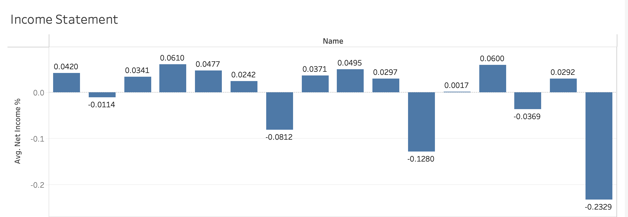
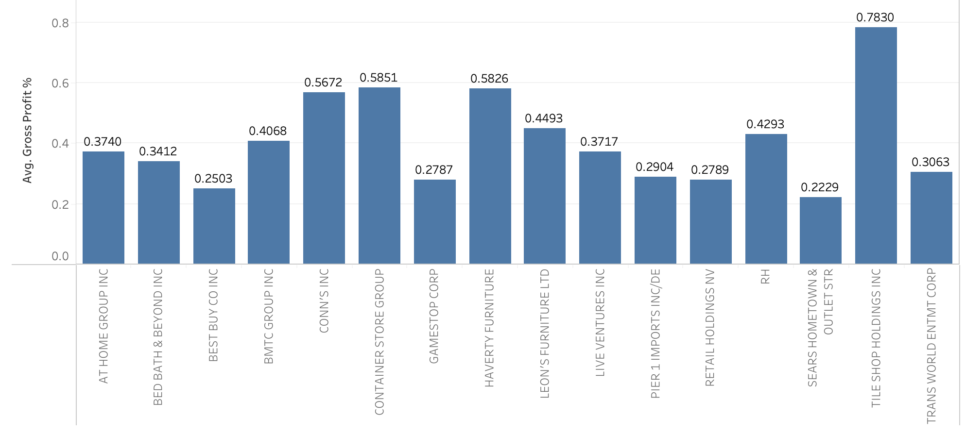
Use visualizations to understand the relationships among the major items in an income statement. In order to compare your company's income performance with your competitors, you collect 26 different companies income statements in the past ten years, if available. These companies are all in the "Home Furniture, Furnishings, And Equipment Stores" industry. Your team just generated the visualization for the average net income to sales percentage and the average gross profit to sales percentage. Based on this visualization, please answer the following questions. Click here to view the data in Tableau, and here to view it in Power BI. (The Tableau and Power BI files contain the same data; you can use either to answer the questions in this assignment. Your instructor may specify which program they prefer you to use!) How to Access Tableau: You can open the Tableau file in this problem statement with Tableau Desktop software. If you don't have Tableau Desktop, you can download Tableau Reader, a free program that allows you to open Tableau visualizations. To get it, search for "Tableau Reader" in your internet browser, or click here. How to Access Power BI: You can open the Power BI file in this problem statement with Power BI Desktop. If you don't have it already, search for "Power BI download" in your internet browser, or click here for a free download. Gross profit to sales percentage is often used as an indicator to show whether a specific industry or company is more towards labor intensive (lower gross profit to sales ratio) or more towards knowledge intensive (higher gross profit to sales ratio). If this is the case, would we consider these companies all in the same industry? When you look at the visualization, you notice that some companies have a significant drop from the average gross profit to sales percentage to the average net income to sales percentage while others do not though their average gross profit to sales ratios are not too high. How can we explain these differences? Income Statement Inillibuibh Use visualizations to understand the relationships among the major items in an income statement. In order to compare your company's income performance with your competitors, you collect 26 different companies income statements in the past ten years, if available. These companies are all in the "Home Furniture, Furnishings, And Equipment Stores" industry. Your team just generated the visualization for the average net income to sales percentage and the average gross profit to sales percentage. Based on this visualization, please answer the following questions. Click here to view the data in Tableau, and here to view it in Power BI. (The Tableau and Power BI files contain the same data; you can use either to answer the questions in this assignment. Your instructor may specify which program they prefer you to use!) How to Access Tableau: You can open the Tableau file in this problem statement with Tableau Desktop software. If you don't have Tableau Desktop, you can download Tableau Reader, a free program that allows you to open Tableau visualizations. To get it, search for "Tableau Reader" in your internet browser, or click here. How to Access Power BI: You can open the Power BI file in this problem statement with Power BI Desktop. If you don't have it already, search for "Power BI download" in your internet browser, or click here for a free download. Gross profit to sales percentage is often used as an indicator to show whether a specific industry or company is more towards labor intensive (lower gross profit to sales ratio) or more towards knowledge intensive (higher gross profit to sales ratio). If this is the case, would we consider these companies all in the same industry? When you look at the visualization, you notice that some companies have a significant drop from the average gross profit to sales percentage to the average net income to sales percentage while others do not though their average gross profit to sales ratios are not too high. How can we explain these differences? Income Statement Inillibuibh
Step by Step Solution
There are 3 Steps involved in it

Get step-by-step solutions from verified subject matter experts