

Question: Using daily close data from the last 5 years, plot the exchange rate on a line graph, and indicate TWO specific points on the line
Using daily close data from the last 5 years, plot the exchange rate on a line graph, and indicate TWO specific points on the line where the trend changes. Indicate both these points with arrows on your line graph. There is an example chart at the end of this document.
?NOTE: You are required to download the exchange rate data and create your own graph. It is not acceptable to copy a chart with the data from another source.
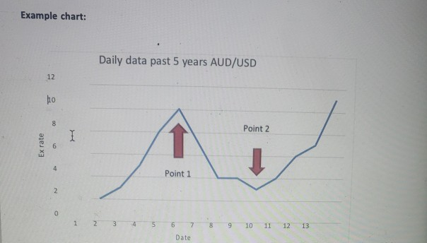
Example chart: Ex rate 12 ho 8 00 6 2 0 H 1 Daily data past 5 years AUD/USD w Point 1 6 Date 00 9 Point 2 10 11 12 13
Step by Step Solution
3.33 Rating (144 Votes )
There are 3 Steps involved in it
Exchange rate Indian rupees per US... View full answer

Get step-by-step solutions from verified subject matter experts