

Question: Using Data Visualization to Analyze Data DA2 Data visualization can be used to enhance accuracy of cost estimation. Problem a. Recall the Hanson Trucking example
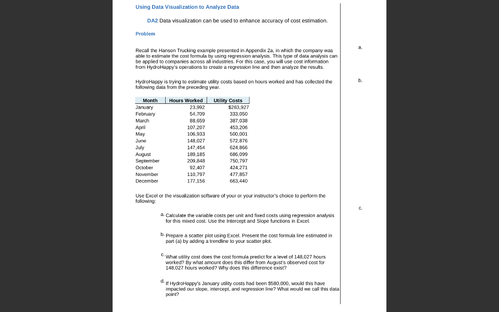
Using Data Visualization to Analyze Data DA2 Data visualization can be used to enhance accuracy of cost estimation. Problem a. Recall the Hanson Trucking example presented in Appendix 2a, in which the company was able to estimate the cost formula by using regression analysis. This type of data analysis can be applied to companies across all industries. For this case, you will use cost information from HydroHappy's operations to create a regression line and then analyze the results. b. Hydro Happy is trying to estimate utility costs based on hours worked and has collected the following data from the preceding year. 54,709 Month January February March April May June July August September October November December | Hours Worked Utility Costs 23,992 $263,927 333,050 88,659 387,038 107.207 453,206 106,933 500,001 148,027 572,876 147,454 624,866 189,185 686,099 209,848 750,797 92,407 424,271 110,797 477,857 177.156 663,440 Use Excel or the visualization software of your or your instructor's choice to perform the following: C. a. Calculate the variable costs per unit and fixed costs using regression analysis for this mixed cost. Use the Intercept and Slope functions in Excel b. Prepare a scatter plot using Excel. Present the cost formula line estimated in part (a) by adding a trendline to your scatter plot. C. What utility cost does the cost formula predict for a level of 148,027 hours worked? By what amount does this differ from August's observed cost for 148,027 hours worked? Why does this difference exist? if HydroHappy's January utility costs had been $580,000, would this have impacted our slope, intercept, and regression line? What would we call this data point
Step by Step Solution
There are 3 Steps involved in it

Get step-by-step solutions from verified subject matter experts