

Question: Using ggplot2, generate a histogram plot (binsize = 1) that looks like below. Use facet wrap to separate the plots for the different columns. You
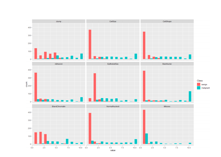
Using ggplot2, generate a histogram plot (binsize = 1) that looks like below. Use facet wrap to separate the plots for the different columns. You will need to use melt function from reshape2 package (covered in lecture notes and video) to prepare the data frame in a usable input format for ggplot2. Write a few lines to describe what inferences you can make from this analysis.
Cena malignant BlandChromatin - - - 25 50 75 10.0 0.0 25 50 value 75 10.0 0.0 25 - 50 - 75 - 100 Cena malignant BlandChromatin - - - 25 50 75 10.0 0.0 25 50 value 75 10.0 0.0 25 - 50 - 75 - 100
Step by Step Solution
There are 3 Steps involved in it
1 Expert Approved Answer
Step: 1 Unlock

Question Has Been Solved by an Expert!
Get step-by-step solutions from verified subject matter experts
Step: 2 Unlock
Step: 3 Unlock