

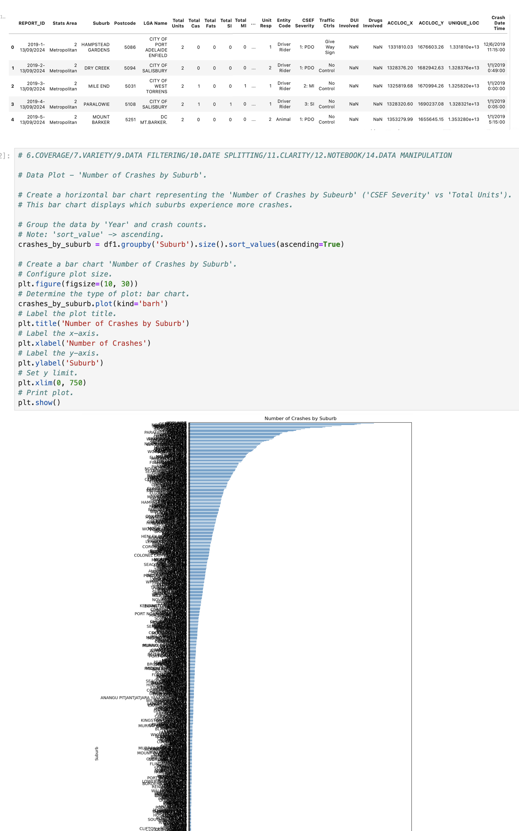
Question: Using Python, I have a bar chart that a lot of data to represent and the resulting output ( graph ) is huge. So much
Using Python, I have a bar chart that a lot of data to represent and the resulting output graph is huge. So much so that it looks horrible and I don't think it will be useful for my assessment.
How can I break this bar chart up into sections into selected ranges of the data that can be stacked or represented in separate parts of the data so it's far more useful and readable?
I have included the first four rows of my data, along with my code for the bar chart and the resulting bar chart.
In addition, if the bar chart is segmented, it may be better off flipping the result too.
Thanks.
Step by Step Solution
There are 3 Steps involved in it
1 Expert Approved Answer
Step: 1 Unlock

Question Has Been Solved by an Expert!
Get step-by-step solutions from verified subject matter experts
Step: 2 Unlock
Step: 3 Unlock