

Question: Using Python Run the following code cell. By using dfPlot as simulated, write codes to use the functions offered in matplotlib.pyplot and generate a scatterplot
Using Python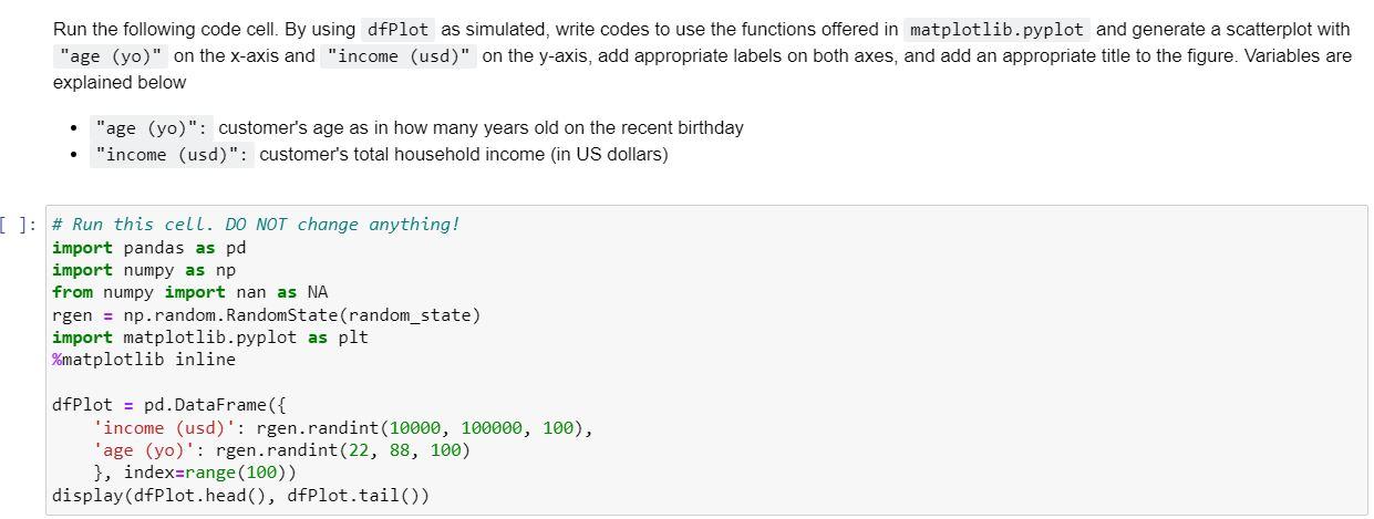
Run the following code cell. By using dfPlot as simulated, write codes to use the functions offered in matplotlib.pyplot and generate a scatterplot with "age (yo)" on the x-axis and "income (usd)" on the y-axis, add appropriate labels on both axes, and add an appropriate title to the figure. Variables are explained below - "age (yo)": customer's age as in how many years old on the recent birthday - "income (usd)": customer's total household income (in US dollars) \# Run this cell. DO NOT change anything! import pandas as pd import numpy as np from numpy import nan as NA rgen = np.random. RandomState(random_state) import matplotlib.pyplot as plt \%matplotlib inline dfPlot = pd.DataFrame(\{ 'income (usd)': rgen.randint (10000,100000,100), 'age (yo)': rgen.randint(22, 88, 100) \}, index=range(100)) display(dfPlot.head(), dfPlot.tail())
Step by Step Solution
There are 3 Steps involved in it

Get step-by-step solutions from verified subject matter experts