

Question: Using the data provided in the spreadsheet linked in the Supporting Materials section below, calculate the annual turnover rates for three consecutive years. Create a
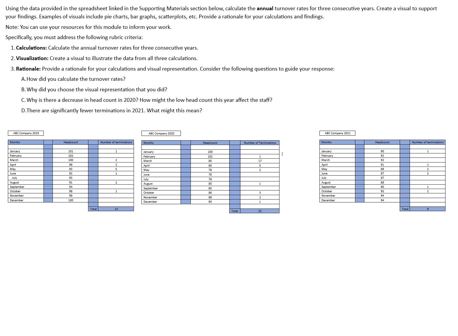
Using the data provided in the spreadsheet linked in the Supporting Materials section below, calculate theannualturnover rates for three consecutive years. Create a visual to support your findings. Examples of visuals include pie charts, bar graphs, scatterplots, etc. Provide a rationale for your calculations and findings.
Note: You can use your resources for this module to inform your work.
Specifically, you must address the following rubric criteria:
Calculations:Calculate the annual turnover rates for three consecutive years.
Visualization:Create a visual to illustrate the data from all three calculations.
Rationale:Provide a rationale for your calculations and visual representation. Consider the following questions to guide your response:
A How did you calculate the turnover rates?
B Why did you choose the visual representation that you did?
C Why is there a decrease in head count in How might the low head count this year affect the staff?
D There are significantly fewer terminations in What might this mean?
Step by Step Solution
There are 3 Steps involved in it
1 Expert Approved Answer
Step: 1 Unlock

Question Has Been Solved by an Expert!
Get step-by-step solutions from verified subject matter experts
Step: 2 Unlock
Step: 3 Unlock