

Question: Vertical List Go to the Mobile Devices section and create a media query for screen devices with a maximum width of 480 pixels For mobile
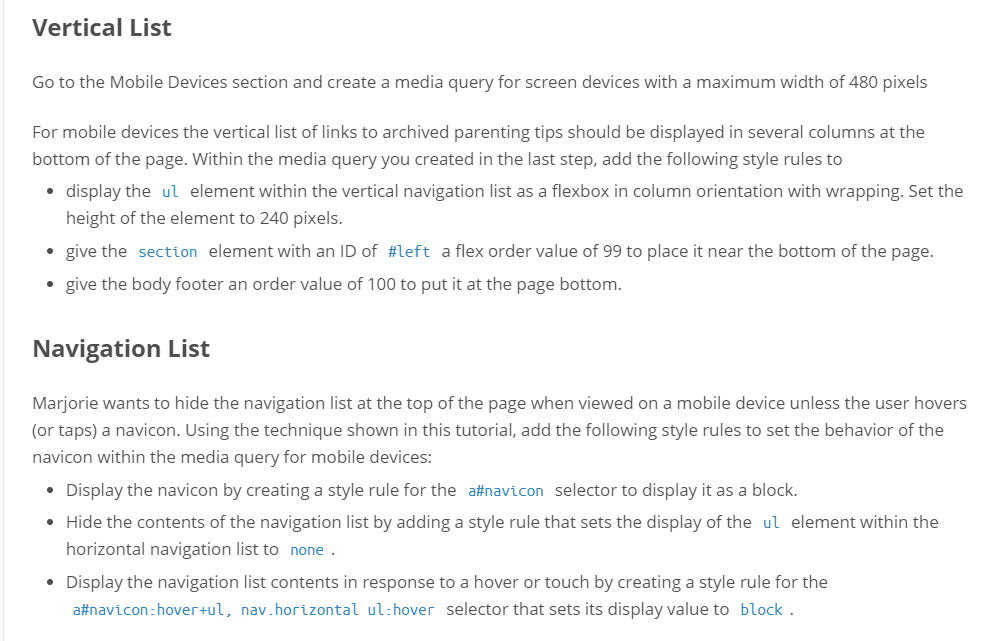
Vertical List Go to the Mobile Devices section and create a media query for screen devices with a maximum width of 480 pixels For mobile devices the vertical list of links to archived parenting tips should be displayed in several columns at the bottom of the page. Within the media query you created in the last step, add the following style rules to display the ul element within the vertical navigation list as a flexbox in column orientation with wrapping. Set the height of the element to 240 pixels. . give the section element with an ID of #left a flex order value of 99 to place it near the bottom of the page. give the body footer an order value of 100 to put it at the page bottom. Navigation List Marjorie wants to hide the navigation list at the top of the page when viewed on a mobile device unless the user hovers or taps) a navicon. Using the technique shown in this tutorial, add the following style rules to set the behavior of the navicon within the media query for mobile devices Display the navicon by creating a style rule for the a#navicon selector to display it as a block. Hide the contents of the navigation list by adding a style rule that sets the display of the ul element within the horizontal navigation list to none Display the navigation list contents in response to a hover or touch by creating a style rule for the a#navcon:hovertul, nav.horizontalul:hover selector that sets its display value to block Vertical List Go to the Mobile Devices section and create a media query for screen devices with a maximum width of 480 pixels For mobile devices the vertical list of links to archived parenting tips should be displayed in several columns at the bottom of the page. Within the media query you created in the last step, add the following style rules to display the ul element within the vertical navigation list as a flexbox in column orientation with wrapping. Set the height of the element to 240 pixels. . give the section element with an ID of #left a flex order value of 99 to place it near the bottom of the page. give the body footer an order value of 100 to put it at the page bottom. Navigation List Marjorie wants to hide the navigation list at the top of the page when viewed on a mobile device unless the user hovers or taps) a navicon. Using the technique shown in this tutorial, add the following style rules to set the behavior of the navicon within the media query for mobile devices Display the navicon by creating a style rule for the a#navicon selector to display it as a block. Hide the contents of the navigation list by adding a style rule that sets the display of the ul element within the horizontal navigation list to none Display the navigation list contents in response to a hover or touch by creating a style rule for the a#navcon:hovertul, nav.horizontalul:hover selector that sets its display value to block
Step by Step Solution
There are 3 Steps involved in it

Get step-by-step solutions from verified subject matter experts
 Study Help