

Question: We begin this lab by developing some graphical tool to better visualise to solutions to dif- ferential equations. We begin with Quiver plots: A
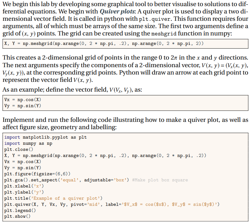
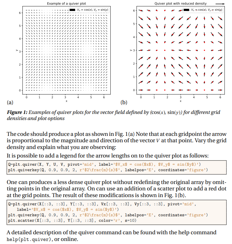
We begin this lab by developing some graphical tool to better visualise to solutions to dif- ferential equations. We begin with Quiver plots: A quiver plot is used to display a two di- mensional vector field. It is called in python with plt.quiver. This function requires four arguments, all of which must be arrays of the same size. The first two arguments define a grid of (x, y) points. The grid can be created using the meshgrid function in numpy: |X, Y = np.meshgrid(np.arange(0, 2 * np.pi, .2), np.arange(0, 2 * np.pi, 2)) This creates a 2-dimensional grid of points in the range 0 to 2 in the x and y directions. The next arguments specify the components of a 2-dimensional vector, V(x, y) = (Vx(x, y), Vy(x, y)), at the corresponding grid points. Python will draw an arrow at each grid point to represent the vector field V(x, y). As an example; define the vector field, V(Vx, Vy), as: Vx = np.cos (X) Vy = np. sin (Y) Implement and run the following code illustrating how to make a quiver plot, as well as affect figure size, geometry and labelling: import matplotlib.pyplot as plt import numpy as np np.meshgrid(np. arange (0, 2 np.pi, .2), np.arange (0, 2* np.pi, .2)) plt.close() X, Y = Vx = np.cos(X) Vy np.sin(Y) = plt.figure (figsize=(6,6)) plt.gca ().set_aspect ('equal', adjustable='box') #Make plot box square plt.xlabel('x') plt.ylabel('y') plt.title('Example of a quiver plot') plt.quiver (X, Y, Vx, Vy, pivot='mid', label='$V_x$ plt.legend () plt.show() = cos ($x$), $V_y$ = sin ($y$)') 6 5 4 31 2 1 Example of a quiver plot | V = cos(x), V, = sin(y) > 3 0- Quiver plot with reduced density V = cos(x), Vy= sin(y) 4 (a) (b) Figure 1: Examples of quiver plots for the vector field defined by (cos(x), sin(y)) for different grid densities and plot options The code should produce a plot as shown in Fig. 1(a) Note that at each gridpoint the arrow is proportional to the magnitude and direction of the vector V at that point. Vary the grid density and explain what you are observing: It is possible to add a legend for the arrow lengths on to the quiver plot as follows: Q-plt.quiver (X, Y, U, V, pivot='mid', label='$V_x$ = cos($x$), $V_y$ = sin($y$)') plt.quiverkey (Q, 0.9, 0.9, 2, r'$2\frac{m} {s}$', labelpos='E', coordinates='figure') One can produces a less dense quiver plot without redefining the original array by omit- ting points in the original array. On can use an addition of a scatter plot to add a red dot at the grid points. The result of these modifications is shown in Fig. 1(b). Q-plt.quiver (X[::3, ::3], Y[::3, ::3], Vx[::3, 1:3], Vy[::3, ::3], pivot='mid', label='$V_x$ = cos ($x$), $V_y$ = sin($y$)') plt.quiverkey (Q, 0.9, 0.9, 2, r'$2\frac{m} {s}$', labelpos='E', coordinates='figure') plt.scatter (X[::3, ::3], Y[::3, ::3], color='r', s=10) A detailed description of the quiver command can be found with the help command help (plt.quiver), or online.
Step by Step Solution
3.45 Rating (171 Votes )
There are 3 Steps involved in it
To vary the grid density in the quiver plot and observe the differences you can adjust the slicing i... View full answer

Get step-by-step solutions from verified subject matter experts