Question: We can make line charts using plt.plot. Analyze and show the result of this python program: from matplotlib import pyplot as plt variance =

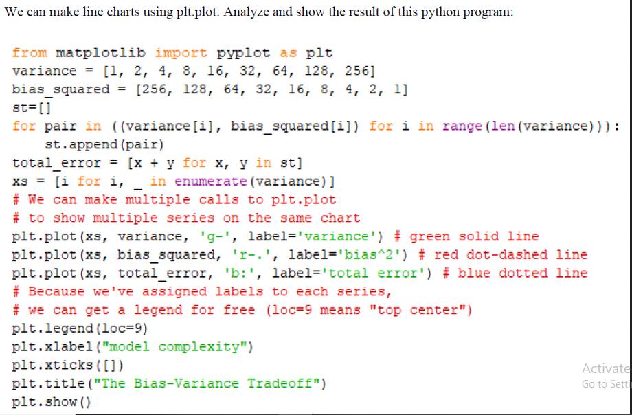
We can make line charts using plt.plot. Analyze and show the result of this python program: from matplotlib import pyplot as plt variance = [1, 2, 4, 8, 16, 32, 64, 128, 256] bias_squared= [256, 128, 64, 32, 16, 8, 4, 2, 1] st=[] for pair in ((variance [i], bias_squared[i]) for i in range (len (variance))) : st.append (pair) total error = [x + y for x, y in st] XS = [i for i, in enumerate (variance)] # We can make multiple calls to plt.plot # to show multiple series on the same chart plt.plot (xs, variance, 'g-', label='variance') # green solid line plt.plot (xs, bias_squared, 'r-.', label='bias^2') # red dot-dashed line plt.plot (xs, total error, 'b:', label='total error') # blue dotted line # Because we've assigned labels to each series, #we can get a legend for free (loc-9 means "top center") plt.legend (loc-9) plt.xlabel ("model complexity") plt.xticks ([]) plt.title ("The Bias-Variance Tradeoff") plt.show () Activate Go to Setti
Step by Step Solution
3.38 Rating (154 Votes )
There are 3 Steps involved in it
python code matplotlib from matplotlib import pyplot as plt vari... View full answer

Get step-by-step solutions from verified subject matter experts


