Question: Week 7 Data Assignment Using Pivot Tables to Evaluate Catalog Marketing In this assignment you will be working with the full version of the Catalog
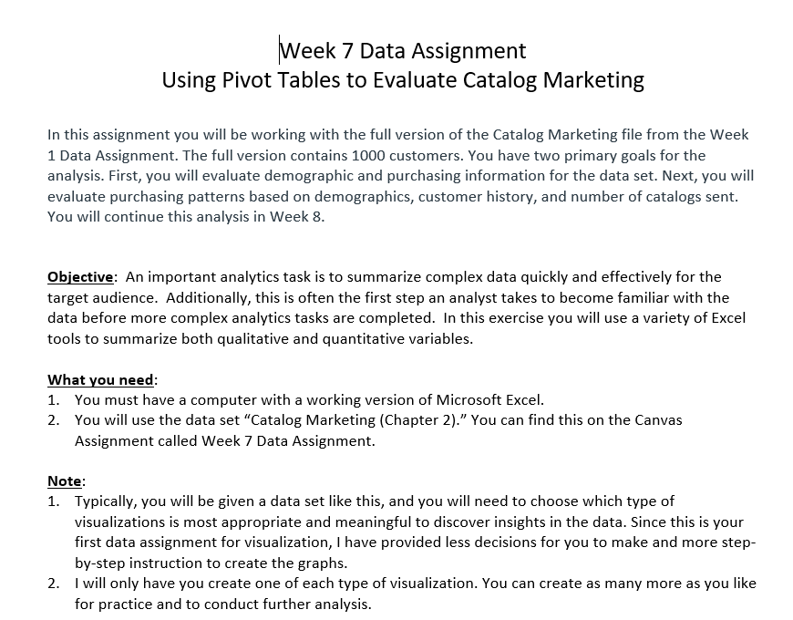
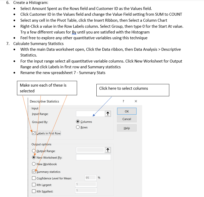
Week 7 Data Assignment Using Pivot Tables to Evaluate Catalog Marketing In this assignment you will be working with the full version of the Catalog Marketing file from the Week 1 Data Assignment. The full version contains 1000 customers. You have two primary goals for the analysis. First, you will evaluate demographic and purchasing information for the data set. Next, you will evaluate purchasing patterns based on demographics, customer history, and number of catalogs sent. You will continue this analysis in Week 8. Objective: An important analytics task is to summarize complex data quickly and effectively for the target audience. Additionally, this is often the first step an analyst takes to become familiar with the data before more complex analytics tasks are completed. In this exercise you will use a variety of Excel tools to summarize both qualitative and quantitative variables. What you need: 1. You must have a computer with a working version of Microsoft Excel. 2. You will use the data set "Catalog Marketing (Chapter 2)." You can find this on the Canvas Assignment called Week 7 Data Assignment. Note: 1. Typically, you will be given a data set like this, and you will need to choose which type of visualizations is most appropriate and meaningful to discover insights in the data. Since this is your first data assignment for visualization, I have provided less decisions for you to make and more stepby-step instruction to create the graphs. 2. I will only have you create one of each type of visualization. You can create as many more as you like for practice and to conduct further analysis. Assignment/Activity: Complete each of the following tasks on the next two pages. You may want to create a new tab for each of these tasks and name those tabs accordingly. Preliminary Work: 1. Data Preparation - Age, Gender, Own Home, Married, Close, and History are all variables that have been entered into the data set as numeric codes. Create new variables with appropriate names for each category using the IF or \& functions. In this case I would rename each of the existing variables as Age code, Gender code, etc. and name the new variables Age, Gender, etc. Ex.) to "recode" Home you could use a function like =IF (cell reference =1, ,Owner","Renter") 2. Re-order your file to put the variables in the following order. The easiest way to do this is to left-click the column header to select the whole column, then "grab" the box outlining the selection to drag it to the intended location. You may have to insert a column or two to give yourself room. Use the variables you created in Step 1 , not the original coded versions. - Customer ID - Qualitative, nominal variables - Qualitative, ordinal variables - Quantitative, discrete variables - Quantitative, continuous variables - Location variables - Date variables For steps 3-6 and steps 8-12 you should start by creating a Pivot Table. To do this just click on any cell in the full data set, click the Insert ribbon, then select Pivot Table. Excel will automatically select the entire data set. For the required tasks please select New Worksheet so that each task is on its on sheet. Please rename each worksheet as something appropriate like Task #3 or Pie Chart so that I can easily grade your work! Evaluating Individual Variables: 3. Create a Pie Chart: - Select Married as the Rows field and Customer ID as the Values field. - Click Customer ID in the Values field and change the Value Field setting from SUM to COUNT - Select any cell in the Pivot Table, click the Insert Ribbon, then Select a Pie Chart - Right-Click the pie chart you've created and select Add Data Labels - Right-Click a value in the Count of Customer ID column. Select Show Values As >% Column Total. - Feel free to explore any other nominal-qualitative variables using this technique 4. Create a Column Chart: - Select Catalogs as the Rows field and Customer ID as the Values field. - Click Customer ID in the Values field and change the Value Field setting from SUM to COUNT - Select any cell in the Pivot Table, click the Insert Ribbon, then Select a Column Chart - Check the Vertical Axis labels to make sure the values begin at zero - Feel free to explore any other qualitative-nominal, qualitative-ordinal, or quantitative discrete variable using this technique 5. Create a Bar Chart: - Select State as the Rows field and Customer ID as the Values field. - Click Customer ID in the Values field and change the Value Field setting from SUM to COUNT - Select any cell in the Pivot Table, click the Insert Ribbon, then Select a Bar Chart - Resize the graph so you can see all the state labels - Right-Click a value in the Count of Customer ID column. Select Sort > Smallest to Largest. - Feel free to explore any other qualitative-nominal variable using this technique 6. Create a Histogram: - Select Amount Spent as the Rows field and Customer ID as the Values field. - Click Customer ID in the Values field and change the Value Field setting from SUM to COUNT - Select any cell in the Pivot Table, click the Insert Ribbon, then Select a Column Chart - Right-Click a value in the Row Labels column. Select Group, then type 0 for the Start At value. Try a few different values for By until you are satisfied with the Histogram - Feel free to explore any other quantitative variables using this technique 7. Calculate Summary Statistics - With the main Data worksheet open, Click the Data ribbon, then Data Analysis > Descriptive Statistics. - For the input range select all quantitative variable columns. Click New Worksheet for Output Range and click Labels in first row and Summary statistics - Rename the new spreadsheet 7 - Summary Stats Evaluating Multiple Demographic Variables: 8. Create a Clustered Column Chart: - Select Married as the Rows field, Customer ID for Values, and Gender as the Columns field - Click Customer ID in the Values field and change the Value Field setting from SUM to COUNT - Select any cell in the Pivot Table, click the Insert Ribbon, then Select a Clustered Column Chart - Make any observations for the relationship between Married and Gender in our customers. - Replace Gender with Own Home. Make any observations about the relationship between Married and Own Home in our customer database. 9. Create a Stacked Column Chart: - Select Region as the Rows field, Customer ID as the Values field, and Married as the Columns field - Click Customer ID in the Values field and change the Value Field setting from SUM to COUNT - Select any cell in the Pivot Table, click the Insert Ribbon, then Select a Stacked Column Chart - Make any observations about any patterns in Married and Region in our customer database. - You can repeat this by replacing Married with Gender and/or Own Home to look for more regional differences in our customers. Evaluating Spending Patterns: 10. Evaluating Regional Spending Differences - Select Region as the Rows field and Amount Spent as the Values field. - Make sure that Amount Spend is set to SUM in the Value Field Settings - Select any cell in the Pivot Table, click the Insert Ribbon, then Select a Pie Chart - Right-Click the pie chart you've created and select Add Data Labels - Right-Click a value in the Sum of Amount Spent column. Select Show Values As >% Column Total. - Make any observations about spending by region 11. Evaluating City Spending Differences - Select State as the Rows field and Amount Spent as the Values field. - Make sure that Amount Spend is set to SUM in the Value Field Settings - Select any cell in the Pivot Table, click the Insert Ribbon, then Select a Bar Chart - Resize the graph so you can see all the state labels - Right-Click a value in the Sum of Amount Spent column. Select Sort > Smallest to Largest. - Make any observations based on spending in cities. 12. Evaluating the Impact of Customer History and Marital Status on Spending - Select History as the Rows field, Amount Spent as the Values field, and Married as the Columns field - Make sure that Amount Spend is set to SUM in the Value Field Settings - Select any cell in the Pivot Table, click the Insert Ribbon, then Select a Clustered or Stacked Column Chart - Make any observations about the impact of marital status and/or history on spending. - Change the Value Field Setting to Average. Does this impact your observations at all? 13. Evaluating Amount Spent based on Age - Select Amount Spent as the Rows field, Customer ID as the Values field, and Age as the Columns field - Click Customer ID in the Values field and change the Value Field setting from SUM to COUNT - Select any cell in the Pivot Table, click the Insert Ribbon, then Select a Clustered or Stacked Column Chart - Right-Click a value in the Row Labels column. Select Group, then type 0 for the Start At value. Try a few different values for By until you are satisfied with the adapted histogram - Make any observations about the impact of age on spending Week 7 Data Assignment Using Pivot Tables to Evaluate Catalog Marketing In this assignment you will be working with the full version of the Catalog Marketing file from the Week 1 Data Assignment. The full version contains 1000 customers. You have two primary goals for the analysis. First, you will evaluate demographic and purchasing information for the data set. Next, you will evaluate purchasing patterns based on demographics, customer history, and number of catalogs sent. You will continue this analysis in Week 8. Objective: An important analytics task is to summarize complex data quickly and effectively for the target audience. Additionally, this is often the first step an analyst takes to become familiar with the data before more complex analytics tasks are completed. In this exercise you will use a variety of Excel tools to summarize both qualitative and quantitative variables. What you need: 1. You must have a computer with a working version of Microsoft Excel. 2. You will use the data set "Catalog Marketing (Chapter 2)." You can find this on the Canvas Assignment called Week 7 Data Assignment. Note: 1. Typically, you will be given a data set like this, and you will need to choose which type of visualizations is most appropriate and meaningful to discover insights in the data. Since this is your first data assignment for visualization, I have provided less decisions for you to make and more stepby-step instruction to create the graphs. 2. I will only have you create one of each type of visualization. You can create as many more as you like for practice and to conduct further analysis. Assignment/Activity: Complete each of the following tasks on the next two pages. You may want to create a new tab for each of these tasks and name those tabs accordingly. Preliminary Work: 1. Data Preparation - Age, Gender, Own Home, Married, Close, and History are all variables that have been entered into the data set as numeric codes. Create new variables with appropriate names for each category using the IF or \& functions. In this case I would rename each of the existing variables as Age code, Gender code, etc. and name the new variables Age, Gender, etc. Ex.) to "recode" Home you could use a function like =IF (cell reference =1, ,Owner","Renter") 2. Re-order your file to put the variables in the following order. The easiest way to do this is to left-click the column header to select the whole column, then "grab" the box outlining the selection to drag it to the intended location. You may have to insert a column or two to give yourself room. Use the variables you created in Step 1 , not the original coded versions. - Customer ID - Qualitative, nominal variables - Qualitative, ordinal variables - Quantitative, discrete variables - Quantitative, continuous variables - Location variables - Date variables For steps 3-6 and steps 8-12 you should start by creating a Pivot Table. To do this just click on any cell in the full data set, click the Insert ribbon, then select Pivot Table. Excel will automatically select the entire data set. For the required tasks please select New Worksheet so that each task is on its on sheet. Please rename each worksheet as something appropriate like Task #3 or Pie Chart so that I can easily grade your work! Evaluating Individual Variables: 3. Create a Pie Chart: - Select Married as the Rows field and Customer ID as the Values field. - Click Customer ID in the Values field and change the Value Field setting from SUM to COUNT - Select any cell in the Pivot Table, click the Insert Ribbon, then Select a Pie Chart - Right-Click the pie chart you've created and select Add Data Labels - Right-Click a value in the Count of Customer ID column. Select Show Values As >% Column Total. - Feel free to explore any other nominal-qualitative variables using this technique 4. Create a Column Chart: - Select Catalogs as the Rows field and Customer ID as the Values field. - Click Customer ID in the Values field and change the Value Field setting from SUM to COUNT - Select any cell in the Pivot Table, click the Insert Ribbon, then Select a Column Chart - Check the Vertical Axis labels to make sure the values begin at zero - Feel free to explore any other qualitative-nominal, qualitative-ordinal, or quantitative discrete variable using this technique 5. Create a Bar Chart: - Select State as the Rows field and Customer ID as the Values field. - Click Customer ID in the Values field and change the Value Field setting from SUM to COUNT - Select any cell in the Pivot Table, click the Insert Ribbon, then Select a Bar Chart - Resize the graph so you can see all the state labels - Right-Click a value in the Count of Customer ID column. Select Sort > Smallest to Largest. - Feel free to explore any other qualitative-nominal variable using this technique 6. Create a Histogram: - Select Amount Spent as the Rows field and Customer ID as the Values field. - Click Customer ID in the Values field and change the Value Field setting from SUM to COUNT - Select any cell in the Pivot Table, click the Insert Ribbon, then Select a Column Chart - Right-Click a value in the Row Labels column. Select Group, then type 0 for the Start At value. Try a few different values for By until you are satisfied with the Histogram - Feel free to explore any other quantitative variables using this technique 7. Calculate Summary Statistics - With the main Data worksheet open, Click the Data ribbon, then Data Analysis > Descriptive Statistics. - For the input range select all quantitative variable columns. Click New Worksheet for Output Range and click Labels in first row and Summary statistics - Rename the new spreadsheet 7 - Summary Stats Evaluating Multiple Demographic Variables: 8. Create a Clustered Column Chart: - Select Married as the Rows field, Customer ID for Values, and Gender as the Columns field - Click Customer ID in the Values field and change the Value Field setting from SUM to COUNT - Select any cell in the Pivot Table, click the Insert Ribbon, then Select a Clustered Column Chart - Make any observations for the relationship between Married and Gender in our customers. - Replace Gender with Own Home. Make any observations about the relationship between Married and Own Home in our customer database. 9. Create a Stacked Column Chart: - Select Region as the Rows field, Customer ID as the Values field, and Married as the Columns field - Click Customer ID in the Values field and change the Value Field setting from SUM to COUNT - Select any cell in the Pivot Table, click the Insert Ribbon, then Select a Stacked Column Chart - Make any observations about any patterns in Married and Region in our customer database. - You can repeat this by replacing Married with Gender and/or Own Home to look for more regional differences in our customers. Evaluating Spending Patterns: 10. Evaluating Regional Spending Differences - Select Region as the Rows field and Amount Spent as the Values field. - Make sure that Amount Spend is set to SUM in the Value Field Settings - Select any cell in the Pivot Table, click the Insert Ribbon, then Select a Pie Chart - Right-Click the pie chart you've created and select Add Data Labels - Right-Click a value in the Sum of Amount Spent column. Select Show Values As >% Column Total. - Make any observations about spending by region 11. Evaluating City Spending Differences - Select State as the Rows field and Amount Spent as the Values field. - Make sure that Amount Spend is set to SUM in the Value Field Settings - Select any cell in the Pivot Table, click the Insert Ribbon, then Select a Bar Chart - Resize the graph so you can see all the state labels - Right-Click a value in the Sum of Amount Spent column. Select Sort > Smallest to Largest. - Make any observations based on spending in cities. 12. Evaluating the Impact of Customer History and Marital Status on Spending - Select History as the Rows field, Amount Spent as the Values field, and Married as the Columns field - Make sure that Amount Spend is set to SUM in the Value Field Settings - Select any cell in the Pivot Table, click the Insert Ribbon, then Select a Clustered or Stacked Column Chart - Make any observations about the impact of marital status and/or history on spending. - Change the Value Field Setting to Average. Does this impact your observations at all? 13. Evaluating Amount Spent based on Age - Select Amount Spent as the Rows field, Customer ID as the Values field, and Age as the Columns field - Click Customer ID in the Values field and change the Value Field setting from SUM to COUNT - Select any cell in the Pivot Table, click the Insert Ribbon, then Select a Clustered or Stacked Column Chart - Right-Click a value in the Row Labels column. Select Group, then type 0 for the Start At value. Try a few different values for By until you are satisfied with the adapted histogram - Make any observations about the impact of age on spending


