

Question: what story can i tell in Visualizing & Analyzing Data with R with the following dataset. this is the assignment i need the story for:
what story can i tell in Visualizing & Analyzing Data with R with the following dataset. this is the assignment i need the story for: he United States has resettled more than refugees from different countries since
In this assignment, you will use R ggplot to explore where these refugees have come from. Feel free to use also graphical tools like InkscapeLinks to an external site..
Instructions
Heres what you need to do:
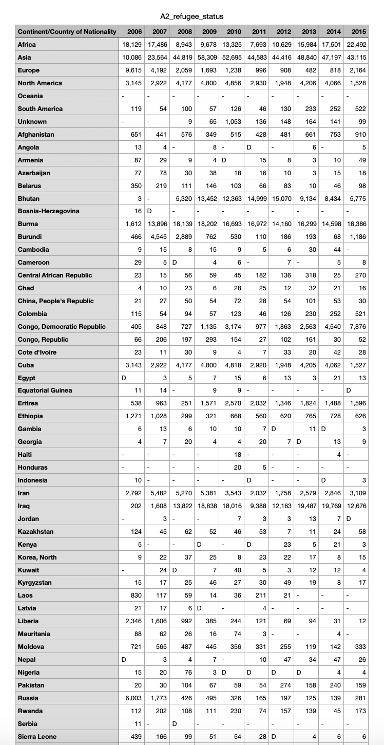
Use the Department of Homeland Securitys annual count of people granted refugee status between :
Arefugeestatus.csvDownload Arefugeestatus.csv
Create a new R Markdown file
Clean the data using the suggestions Ive given you below.
Summarize the data somehow. There is data for countries over years, so youll probably need to aggregate or reshape the data somehow unless you do a country sparkline Ive included some examples down below.
Create an appropriate timebased visualization based on the data. Dont just calculate overall averages or totals per countrythe visualization needs to deal with change over time. Do as much polishing and refining in Rmake adjustments to the colors, scales, labels, grid lines, and even fonts, etc.
Step by Step Solution
There are 3 Steps involved in it
1 Expert Approved Answer
Step: 1 Unlock

Question Has Been Solved by an Expert!
Get step-by-step solutions from verified subject matter experts
Step: 2 Unlock
Step: 3 Unlock