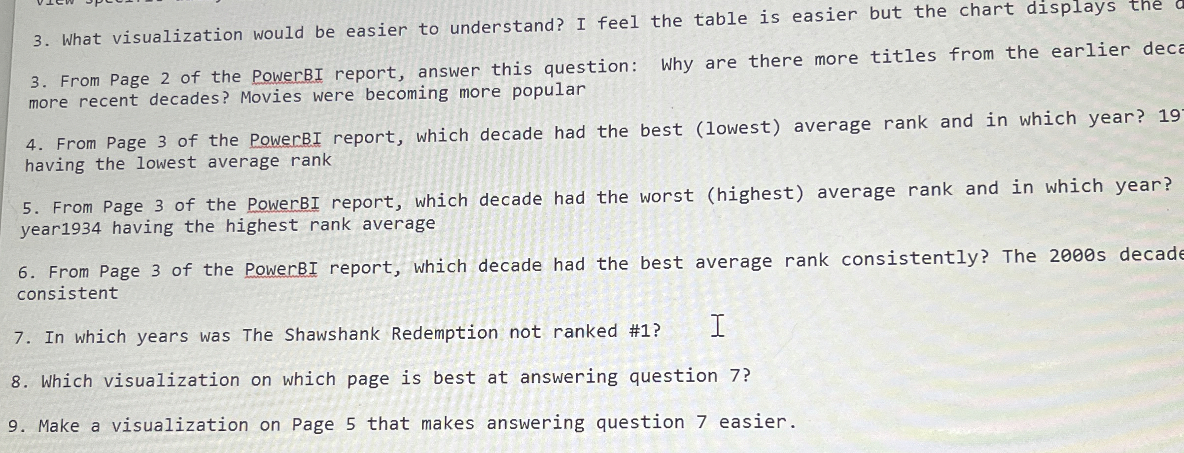
Question: What visualization would be easier to understand? I feel the table is easier but the chart displays the From Page 2 of the PowerBI report,
What visualization would be easier to understand? I feel the table is easier but the chart displays the
From Page of the PowerBI report, answer this question: Why are there more titles from the earlier dece more recent decades? Movies were becoming more popular
From Page of the PowerBI report, which decade had the best lowest average rank and in which year? having the lowest average rank
From Page of the PowerBI report, which decade had the worst highest average rank and in which year? year having the highest rank average
From Page of the PowerBI report, which decade had the best average rank consistently? The s decade consistent
In which years was The Shawshank Redemption not ranked # I
Which visualization on which page is best at answering question
Make a visualization on Page that makes answering question easier.

Step by Step Solution
There are 3 Steps involved in it
1 Expert Approved Answer
Step: 1 Unlock


Question Has Been Solved by an Expert!
Get step-by-step solutions from verified subject matter experts
Step: 2 Unlock
Step: 3 Unlock


