

Question: What would be the best way to visually represent this data? i.e. line graph, bar graph, etc PILOT WITH RESTRAINTS Type 1 crash Head Torso
What would be the best way to visually represent this data? i.e. line graph, bar graph, etc
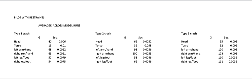
PILOT WITH RESTRAINTS Type 1 crash Head Torso left arm/hand right arm/hand left leg/foot right leg/foot AVERAGED ACROSS MODEL RUNS 40 15 68 65 52 Sec, 0.006 0.01 0.0062 0.0061 0.0079 0.0075 Type 2 crash Head Torso left arm/hand right arm/hand left leg/foot right leg/foot 65 36 98 100 58 62 0.0052 0.098 0.0056 0.0055 0.0046 0.0046 Type 3 crash Head Torso left arrm/hand right arm/hand left leg/foot right leg/foot 95 52 120 123 110 111 Sec, 0.003 0.005 0.003 0.003 0.0036 0.0036
Step by Step Solution
There are 3 Steps involved in it
1 Expert Approved Answer
Step: 1 Unlock

Question Has Been Solved by an Expert!
Get step-by-step solutions from verified subject matter experts
Step: 2 Unlock
Step: 3 Unlock