

Question: When you display your data visually in Excel 2010, choosing the right type of chart is just as important as deciding to use a chart
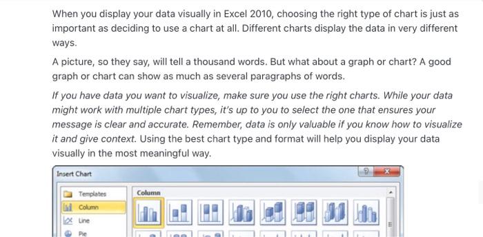
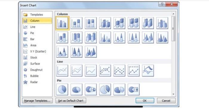

When you display your data visually in Excel 2010, choosing the right type of chart is just as important as deciding to use a chart at all. Different charts display the data in very different ways. A picture, so they say, will tell a thousand words. But what about a graph or chart? A good graph or chart can show as much as several paragraphs of words. If you have data you want to visualize, make sure you use the right charts. While your data might work with multiple chart types, it's up to you to select the one that ensures your message is clear and accurate. Remember, data is only valuable if you know how to visualize it and give context. Using the best chart type and format will help you display your data visually in the most meaningful way. Insert Chart Column Templates Column Line Pie Insert Chart Column Templates Column une Pie JAAM Line Area XY (Scatter) i Stock Surface Doughout Bubble Radar Pie Manage Templates... Set as Default Chart OK Cancel How do you choose which style of graph to use? Justify the suitable graph or chart with your own example How do you pick the right chart or graph for your data? Add source of Reference
Step by Step Solution
There are 3 Steps involved in it

Get step-by-step solutions from verified subject matter experts