

Question: Why do you consider the graph misleading What should be changed or added to the graph to make the information accurate Average Monthly Average Monthly
Why do you consider the graph misleading What should be changed or added to the graph to make the information accurate
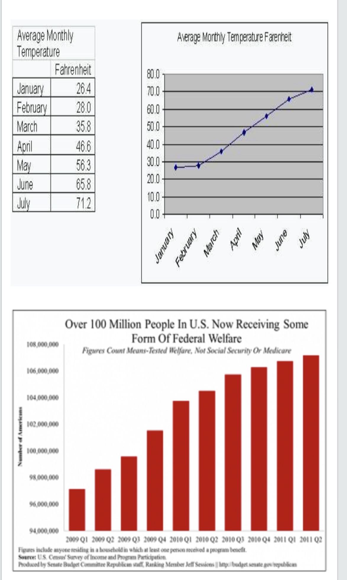
Average Monthly Average Monthly Temperature Farenheit Temperature Fahrenheit 80.0 January 26.4 70.0 February 28.0 60.0 March 35.8 50.0 April 46.6 40.0- May 56.3 30.0 - June 65.8 20.0 July 71.2 10.0 0.0 - April May June July March January February Over 100 Million People In U.S. Now Receiving Some 108,000,000 Form Of Federal Welfare Figures Count Means-Tested Welfare, Not Social Security Or Medicare 106,009,000 104,000,000 102.000.000 Number of Americans 100,000,000 98,600,000 96,000,000 94,000,000 2009 Q1 2009 Q2 2009 Q3 2009 Q4 2010 Q1 2010 Q2 2010 Q3 2010 Q4 2011 Q1 2011 Q2 Figures include anyone residing in a household in which at least one person received a program benefit. Source: U.S. Census' Survey of Income and Program Participation Produced by Settle Budget Commince Republican staff, Ranking Member Jeff Sessions /| butpo/ budget senate gowbepubbears
Step by Step Solution
There are 3 Steps involved in it

Get step-by-step solutions from verified subject matter experts