

Question: You are a financial analyst working for Tommy Tim Electronics. Your management would like you to create a monthly dashboard highlighting Key Monthly Performance.
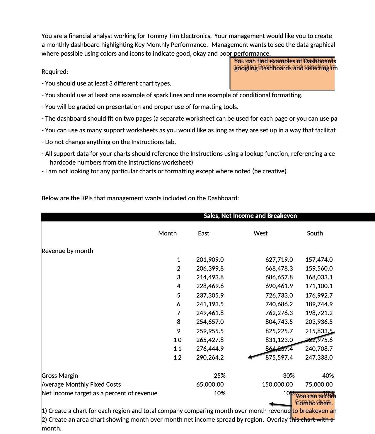
You are a financial analyst working for Tommy Tim Electronics. Your management would like you to create a monthly dashboard highlighting Key Monthly Performance. Management wants to see the data graphical where possible using colors and icons to indicate good, okay and poor performance. You can find examples of Dashboards googling Dashboards and selecting im Required: - You should use at least 3 different chart types. - You should use at least one example of spark lines and one example of conditional formatting. - You will be graded on presentation and proper use of formatting tools. - The dashboard should fit on two pages (a separate worksheet can be used for each page or you can use pa - You can use as many support worksheets as you would like as long as they are set up in a way that facilitat - Do not change anything on the Instructions tab. - All support data for your charts should reference the Instructions using a lookup function, referencing a ce hardcode numbers from the instructions worksheet) - I am not looking for any particular charts or formatting except where noted (be creative) Below are the KPIs that management wants included on the Dashboard: Revenue by month Gross Margin Average Monthly Fixed Costs Net Income target as a percent of revenue Month 1 2 3 4 5 6 D a 7 8 9 10 11 12 Sales, Net Income and Breakeven East 201,909.0 206,399.8 214,493.8 228,469.6 237,305.9 241,193.5 249,461.8 254,657.0 259,955.5 265,427.8 276,444.9 290,264.2 25% 65,000.00 10% West 627,719.0 157,474.0 668,478.3 159,560.0 686,657.8 168,033.1 690,461.9 171,100.1 726,733.0 740,686.2 762,276.3 804,743.5 825,225.7 831,123.0 215,833,5 222,975.6 864 237.4 240,708.7 875,597.4 247,338.0 30% South 150,000.00 10% 176,992.7 189,744.9 198,721.2 203,936.5 40% 75,000.00 A% You can accom Combo chart. 1) Create a chart for each region and total company comparing month over month revenue to breakeven an 2) Create an area chart showing month over month net income spread by region. Overlay this chart with a month.
Step by Step Solution
3.29 Rating (161 Votes )
There are 3 Steps involved in it

Get step-by-step solutions from verified subject matter experts