

Question: Your first task is to define the data resulting from each survey question as qualitative or quantitative. If the variable is qualitative, indicate if it
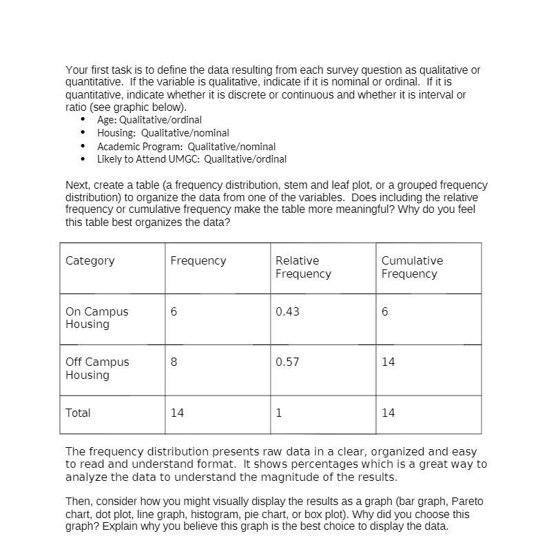
Your first task is to define the data resulting from each survey question as qualitative or quantitative. If the variable is qualitative, indicate if it is nominal or ordinal. If it is quantitative, indicate whether it is discrete or continuous and whether it is interval or ratio (see graphic below). Age: Qualitative/ordinal Housing: Qualitativeominal Academic Program: Qualitativeominal . Likely to Attend UMGC: Qualitative/ordinal Next, create a table (a frequency distribution, stem and leaf plot, or a grouped frequency distribution) to organize the data from one of the variables. Does including the relative frequency or cumulative frequency make the table more meaningful? Why do you feel this table best organizes the data? Category Frequency Relative Cumulative Frequency Frequency On Campus 6 0.43 6 Housing Off Campus 8 0.57 14 Housing Total 14 1 14 The frequency distribution presents raw data in a clear, organized and easy to read and understand format. It shows percentages which is a great way to analyze the data to understand the magnitude of the results. Then, consider how you might visually display the results as a graph (bar graph, Pareto chart, dot plot, line graph, histogram, pie chart, or box plot). Why did you choose this graph? Explain why you believe this graph is the best choice to display the data
Step by Step Solution
There are 3 Steps involved in it

Get step-by-step solutions from verified subject matter experts