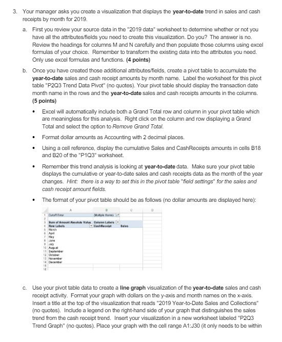
Question: Your manager asks you create a visualization that displays the year-to-date trend in sales and cash receipts by month for 2019. a. First you review

Your manager asks you create a visualization that
Your manager asks you create a visualization that displays the year-to-date trend in sales and cash receipts by month for 2019. a. First you review your source data in the "2019 data" workshoot to determine whether or not you have all the attributes/fields you need to create this visualization. Do you? The answer is no. Review the headings for columns M and N carefully and then populate those columns using excel formulas of your choice. Remember to transform the existing data into the attributes you need. Only use excel formulas and functions. (4 points) Once you have created those additional attributes/fields, create a pivot table to accumulate the year-to-date sales and cash receipt amounts by month name. Label the worksheet for this pivot table "P203 Trend Data Pivot" (no quotes). Your pivot table should display the transaction date month name in the rows and the year-to-date sales and cash receipts amounts in the columns. (5 points) . Excel will automatically include both a Grand Total row and column in your pivot table which are meaningless for this analysis. Right click on the column and row displaying a Grand Total and select the option to Remove Grand Total. Format dollar amounts as Accounting with 2 decimal places. . Using a cell reference, display the cumulative Sales and CashReceipts amounts in cells B18 and B20 of the "P103" workshoot. Remember this trend analysis is looking at year-to-date data. Make sure your pivot table displays the cumulative or year-to-date sales and cash receipts data as the month of the year changes. Hint: there is a way to set this in the pivot table "field settings" for the sales and cash receipt amount fields. . The format of your pivot table should be as follows (no dollar amounts are displayed here): c. Use your pivot table data to create a line graph visualization of the year-to-date sales and cash receipt activity. Format your graph with dollars on the y-axis and month names on the x-axis. Insert a title at the top of the visualization that reads "2019 Year-to-Date Sales and Collections" (no quotes). Include a legend on the right-hand side of your graph that distinguishes the sales trend from the cash receipt trend. Insert your visualization in a new worksheet labeled "P203 Trend Graph" (no quotes). Place your graph with the cell range A1:J30 (it only needs to be within

Step by Step Solution

There are 3 Steps involved in it

1 Expert Approved Answer
Step: 1 Unlock blur-text-image
Question Has Been Solved by an Expert!

Get step-by-step solutions from verified subject matter experts

Step: 2 Unlock
Step: 3 Unlock

Students Have Also Explored These Related Accounting Questions!