

Question: Your mission Your task is to make this work for any general time series dataset. You will be coding the horizonChart ( . . .
Your mission
Your task is to make this work for any general time series dataset. You will be coding the horizonChart function described below to produce a mirrored horizon chart.
The arguments for the function are:
source the source dataframe
bands the number of bands. If the data is only positive or only negative a here means two bandscolors If there are both positive and negative values and we enter that means bands positive, negative
timecol the string of the time x column in the source dataframe
valcol the string of the value y column in the source dataframe
width the desired width of the horizon chart default
height the desired height of the horizon chart default
poscolors the colors to use for the positive values the default here is so if there are more bands than colors, there should be some kind of error or other reasonable behavior
negcolors the colors to use for the negative values the default here is so if there are more bands than bands, there should be some kind of error or other reasonable behavior
xaxis an alt.Axis object describing how we want the xaxis to appear. Default is no xaxis tickslabelsetc but we could say something like alt.Axistitle'TIME' to configure this
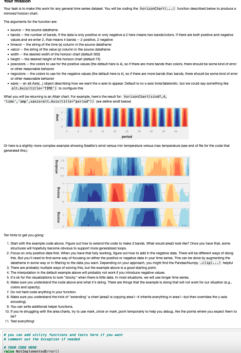
What you will be returning is an Altair chart. For example, here's the result for: horizonChartsindf'time','amp',xaxisalt.Axistitle"period"we define sindf below
Ten hints to get you going:
Start with the example code above. Figure out how to extend the code to make bands. What would area look like? Once you have that, some structures will hopefully become obvious to support more generalized loops.
Focus on only positive data first. When you have that fully working, figure out how to add in the negative data. There will be different ways of doing this. But you'll need to find some way of focusing on either the positive or negative data in your time series. This can be done by augmenting the dataframe in some way or in filtering to the data you want. Depending on your approach, you might find the PandasNumpy clip helpful
There are probably multiple ways of solving this, but the example above is a good starting point.
The interpolation in the default example above will probably not work if you introduce negative values.
It's ok for the visualizations to look "blocky" when there is little data. In most situations, we will use longer time series.
Make sure you understand the code above and what it's doing. There are things that the example is doing that will not work for our situation eg colors and opacity
Do not hard code anything in your function.
Make sure you understand the trick of "extending" a chart area is copying areait inherits everything in areabut then overrides the yaxis encoding
You can write additional helper functions.
If you're struggling with the area charts, try to use markcircle or markpoint temporarily to help you debug. Are the points where you expect them to be
Test everything!
Step by Step Solution
There are 3 Steps involved in it
1 Expert Approved Answer
Step: 1 Unlock

Question Has Been Solved by an Expert!
Get step-by-step solutions from verified subject matter experts
Step: 2 Unlock
Step: 3 Unlock