

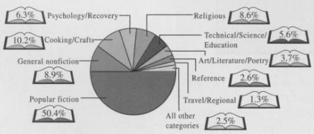
The pie chart in Figure 3.11 shows the results of a survey about what people are reading.
Question:
The pie chart in Figure 3.11 shows the results of a survey about what people are reading.
a. Summarize these data in a table of relative frequencies.
b. Construct a Pareto chart for these data.
c. Which do you think is a better representation of the data: the pie chart or the Pareto chart? Why?
Figure 3.11
Fantastic news! We've Found the answer you've been seeking!
Step by Step Answer:
a b Pareto Chart c The Pareto chart is easier to read than the pie chart when there ...View the full answer

Answered By
Muhammad Umair
I have done job as Embedded System Engineer for just four months but after it i have decided to open my own lab and to work on projects that i can launch my own product in market. I work on different softwares like Proteus, Mikroc to program Embedded Systems. My basic work is on Embedded Systems. I have skills in Autocad, Proteus, C++, C programming and i love to share these skills to other to enhance my knowledge too.
1+ Reviews
10+ Question Solved
Related Book For 
Statistical Reasoning for Everyday Life
ISBN: 978-0321817624
4th edition
Authors: Jeff Bennett, Bill Briggs, Mario F. Triola
Question Posted:
