

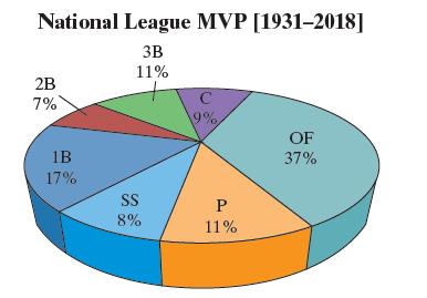
The following pie chart displays the position played by the most valuable player (MVP) in the National
Question:
The following pie chart displays the position played by the most valuable player (MVP) in the National League of Major League Baseball from 1931 through 2018. Explain how the graphic is misleading. What should be done to improve the graphic?
Fantastic news! We've Found the answer you've been seeking!
Step by Step Answer:
Threedimensional graphs are deceptive The area fo...View the full answer

Answered By
Umber Talat
I am providing full time mentoring and tutoring services in Business Finance, Contemporary issue in Global Economy, Quantitative Techniques, Principles of Marketing, strategic marketing, International Marketing, Organizational Behavior (OB), Consumer Behavior, Sales Force Management, Strategic Brand Management, Services Marketing, Integrated Marketing Communication (IMC), Principles of Management, General Management, Strategic Management, Small and Medium Enterprise Management, Innovation Management, Change Management, Knowledge Management, Strategic Planning, Operations Management, Supply Chain Management, Logistics Management, Inventory management, Total Quality Management (TQM), Productions Management, Project Management, Production Planning, Human Resource Management (HRM), Human Resource Development, Strategic HRM, Organizational Planning, Performance and Compensation Management, Recruitment and Selection, Organizational Development, Global Issues in Human Resource Management, Retail Marketing, Entrepreneurship, Entrepreneurial Marketing, International Business, Research Methods in Business, Business Communication, Business Ethics.
158+ Reviews
236+ Question Solved
Related Book For 

Statistics Informed Decisions Using Data
ISBN: 9780135780183
6th Edition
Authors: Michael Sullivan III
Question Posted:
